HOT TOPICS LIST
- MACD
- Fibonacci
- RSI
- Gann
- ADXR
- Stochastics
- Volume
- Triangles
- Futures
- Cycles
- Volatility
- ZIGZAG
- MESA
- Retracement
- Aroon
INDICATORS LIST
LIST OF TOPICS
PRINT THIS ARTICLE
by Mark Rivest
Is the S&P 500 new high the end of the bull market or the beginning of an upside breakout?
Position: N/A
Mark Rivest
Independent investment advisor, trader and writer. He has written articles for Technical Analysis of Stocks & Commodities, Traders.com Advantage,Futuresmag.com and, Finance Magnates. Author of website Four Dimension Trading.
PRINT THIS ARTICLE
ELLIOTT WAVE
On an All Time High
05/09/19 04:22:32 PMby Mark Rivest
Is the S&P 500 new high the end of the bull market or the beginning of an upside breakout?
Position: N/A
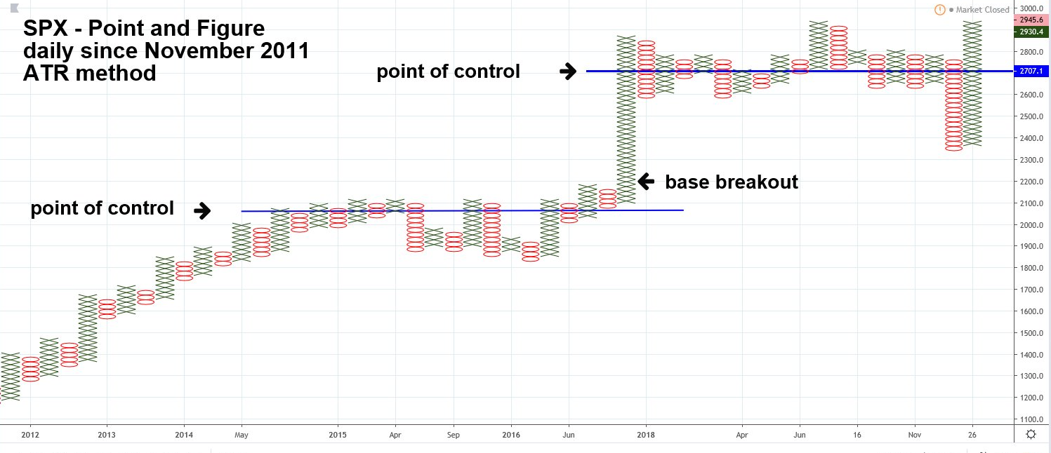
| There's potentially very strong Fibonacci resistance for the S&P 500 (SPX) at 3047 first noted in my February 1, 2018 article "How High is Up?". US stocks are seasonally bearish From May to November. On May 1, 2019, the SPX reached an all-time high of 2954, within a few trading days it could hit 3047, just as the bearish season begins. Is this the end of a ten-year bull market? Are the bears finally going to have their day in the sun? Maybe not, some tantalizing clues are appearing that hint the bull could run for several more months. Point And Figure Chart Using Point and Figure charts gives a different perspective on support/resistance areas. Point and Figure charts do not plot price against time like time-based charts. Instead, they plot price against changes in direction by plotting a column of X's as the price rises and a column of O's as the price falls. The SPX chart illustrated in Figure 1 uses a method called Average True Range (ATR), which means the box size containing the X's and O's will fluctuate based on volatility. Point and Figure charts can be combined with the "Market Profile" method which was discussed in my March 8, 2018 article "Stock Market Rosetta Stone". An important aspect of the Market Profile is discovering a markets maximum value area — called Point of Control (POC). Markets rise and fall towards or away from POC. The longest line of price units, or in the case of Point and Figure X's and O's, is the POC. The lower POC on the chart shows twelve crossings at the SPX 2060 area, this is the maximum value. Subsequently price rose away from the POC and after it broke above the base had a considerable stem before price peaked in the upper 2800 area. The same phenomenon could be taking place at a higher level. POC was fifteen crossing of the 2700 area. Price has so far been rising above the POC, but has yet to break above the upper range. If it does move above the base there's potential for a stem extending up several hundred points. |

|
| Figure 1. Using Point and Figure charts gives a different perspective on support/resistance areas. |
| Graphic provided by: tradingview.com. |
| |
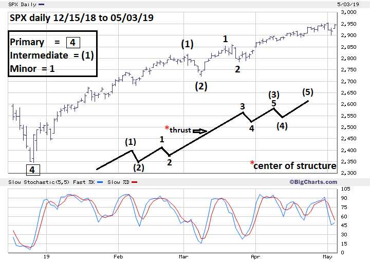
| Elliott Wave And Fibonacci Analysis The potential SPX resistance at 3047 is calculated using a Fibonacci extension of the SPX 2007 to 2009 bear market of 909.30 points multiplied by the Fibonacci ratio of 2.618 yielding 2380.54 points added to the SPX March 2009 bottom of 666.79, which targets SPX 3047.33. Two factors determine the importance and strength of Fibonacci coordinate support/resistance points. 1) time and price distance from the coordinates point of origin. 2) Having two or more Fibonacci coordinates in a close price area. The 3047 target is derived by prices at a much lower area and ten to twelve years away, making it potentially very strong resistance. There are currently no other Fibonacci coordinates derived from the SPX price structure that are near 3047. Just because there's very strong support/resistance doesn't mean it can't be breached, you just need a lot of force to break through. Please see the SPX daily chart illustrated in Figure 2. The best Elliott wave count from the SPX important December 26 bottom at 2346 appears to be what's referred to as a series of one's and two's; in a rising market this is the most bullish Elliott wave formation. The subsequent move up is a third of a third and is usually the most dynamic part of the entire five wave structure — especially the very center of the third of a third. This is the type of force required to break above potentially powerful resistance at 3047, instead of a barrier it could mark an acceleration point. To view the power of a third of a third wave look at the SPX on October 6, 2008. This marks the center of a declining five wave pattern that began in October 2007 and terminated in March 2009. |

|
| Figure 2. The subsequent move up is a third of a third and is usually the most dynamic part of the entire five wave structure. |
| Graphic provided by: BigCharts.com. |
| |
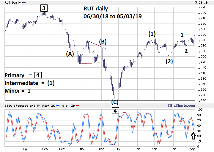
| Russell 2000 Please see the daily Russell 2000 (RUT) chart illustrated in Figure 3. The SPX has exceeded its 2018 high, the RUT, however, has been lagging and well below its 2018 high. However, on May 3 RUT had some very interesting activity, its daily percentage gain was greater than the Nasdaq, SPX, and Dow Industrial Average. Additionally, RUT was the only one of the four indices to make a new 2019 rally high. RUT has the same very bullish series of one's and two's as the SPX. RUT also completed a bullish cup and handle formation that began on February 25 and completed on May 2. On February 15 RUT broke above 1560, the .618 Fibonacci resistance of its August to December 2018 decline. The May 2 decline — the handle of the cup and handle formation bottomed at 1566 — was six points above what was prior resistance. If the US stock market is on the verge of a significant decline why are the stocks of the smallest and weakest companies leading the way up? The bullish events of May 3 imply RUT could be on the way to a new all-time high. |

|
| Figure 3. RUT has the same very bullish series of one�s and two�s as the SPX. |
| Graphic provided by: BigCharts.com. |
| |
| Conclusion Is this the end of the bull market or start of a new phase up? It all depends on who wins the fight for SPX 3047. A break to new highs on the SPX Point and Figure chart could be a big clue the bulls may win. If that happens hold on tight to long positions and let the fight begin. Further Reading: Dalton James. F, Jones Eric. T & Dalton Robert. B (2007) "Markets In Profile" John Wiley & Sons, Inc. Frost A.J and Robert Prechter (1985) "Elliott Wave Principle", New Classics Library. |
Independent investment advisor, trader and writer. He has written articles for Technical Analysis of Stocks & Commodities, Traders.com Advantage,Futuresmag.com and, Finance Magnates. Author of website Four Dimension Trading.
| Website: | www.fourdimensiontrading.com |
| E-mail address: | markrivest@gmail.com |
Click here for more information about our publications!
PRINT THIS ARTICLE

Request Information From Our Sponsors
- StockCharts.com, Inc.
- Candle Patterns
- Candlestick Charting Explained
- Intermarket Technical Analysis
- John Murphy on Chart Analysis
- John Murphy's Chart Pattern Recognition
- John Murphy's Market Message
- MurphyExplainsMarketAnalysis-Intermarket Analysis
- MurphyExplainsMarketAnalysis-Visual Analysis
- StockCharts.com
- Technical Analysis of the Financial Markets
- The Visual Investor
- VectorVest, Inc.
- Executive Premier Workshop
- One-Day Options Course
- OptionsPro
- Retirement Income Workshop
- Sure-Fire Trading Systems (VectorVest, Inc.)
- Trading as a Business Workshop
- VectorVest 7 EOD
- VectorVest 7 RealTime/IntraDay
- VectorVest AutoTester
- VectorVest Educational Services
- VectorVest OnLine
- VectorVest Options Analyzer
- VectorVest ProGraphics v6.0
- VectorVest ProTrader 7
- VectorVest RealTime Derby Tool
- VectorVest Simulator
- VectorVest Variator
- VectorVest Watchdog
