HOT TOPICS LIST
- MACD
- Fibonacci
- RSI
- Gann
- ADXR
- Stochastics
- Volume
- Triangles
- Futures
- Cycles
- Volatility
- ZIGZAG
- MESA
- Retracement
- Aroon
INDICATORS LIST
LIST OF TOPICS
PRINT THIS ARTICLE
by Dennis D. Peterson
Wouldn't it be nice to have an idea when-- that is the date-- the next swing might change direction? Some ideas might prove more profitable than others.
Position: N/A
Dennis D. Peterson
Market index trading on a daily basis.
PRINT THIS ARTICLE
SWING CHART
Swing Prediction (Part 1 of III)
11/19/01 04:28:52 PMby Dennis D. Peterson
Wouldn't it be nice to have an idea when-- that is the date-- the next swing might change direction? Some ideas might prove more profitable than others.
Position: N/A
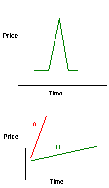
| Part I... Part II... Part III From studying many charts, you can get a feel for chart patterns. After a while you can look at specific charts and know that certain patterns will almost never happen, while others are about to see a correction. For example, price equities almost never look like a spike up (Figure 1: top chart) or down where there is a symmetry about the peak or valley. Prices swing up at a slower rate than they swing down. If you had two price trends and one is considerably steeper than the other you expect that a correction is more likely in the steeper price change (Figure 1: bottom chart price A) than the one with a relative flat slope (Figure 1: bottom chart price B). |
| When you visualize a steep price trend, you are seeing a change in price that is large compared to the amount of time taken. When that price goes up slower than it comes down you are also making an observation about time and price. So if you were to embark on finding something that might predict future events you would want something that incorporates those notions of price and time change. |

|
| Figure 1: Model Price Histories. The top chart illustrates what almost never happens: a spike up in price that is symmetrical, going up and down at the same rate. The bottom chart shows the type of price trend (A) which is more vulnerable to a correction than another (B). |
| Graphic provided by: MetaStock. |
| Graphic provided by: Data vendor: eSignal<. |
| |
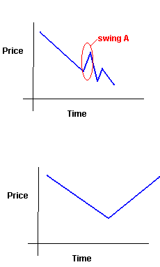
| What events would you be interested in? The upswings and downswings, because they incorporate the amount of change over time. For example, a few bars incorporating large ranges in one direction are an instance of a quick change. But besides being a way to capture the amount of change in time, another observation is this: the longer (in time) the upswing or downswing the stronger the swing. That is, the more likely reaction or rallies will be short in time and not change the direction of the trend or swing. Suppose for a moment that you found an equity in a long prolonged downswing. Just one down day after another, and it had been going on for two weeks. Would you expect to suddenly reverse direction and have a long upswing? No, because you don't see the top chart of Figure 1 much, or hardly at all. You would expect the first upswing to be short in duration or time (Figure 2: top chart) rather than just price pivoting and then going back up at the same rate (Figure 2: bottom chart).  Figure 2: Two Price Patterns. The top pattern depicts an uninterrupted downswing, one down day after another, until a swing up short in duration - swing A. The bottom pattern, which in structure is the same as the top chart of Figure 1 is the less likely of the two to occur. Looking at the top chart of Figure 2, does the price movement seem odd? It just doesn't look very real does it. Why? First, the swing A is rising at a faster rate then the downswing preceding it. Second, the downswing from A is symmetrical. Third, the next downswing is steeper than the first. After viewing many charts you know what is expected and what is not. What you are looking for is a system that incorporates swing strength somehow with time. |
| Part I... Part II... Part III |
Market index trading on a daily basis.
| Title: | Staff Writer |
| Company: | Technical Analysis, Inc. |
| Address: | 4757 California Ave SW |
| Seattle, WA 98116-4499 | |
| Phone # for sales: | 206 938 0570 |
| Fax: | 206 938 1307 |
| Website: | www.traders.com |
| E-mail address: | dpeterson@traders.com |
Traders' Resource Links | |
| Charting the Stock Market: The Wyckoff Method -- Books | |
| Working-Money.com -- Online Trading Services | |
| Traders.com Advantage -- Online Trading Services | |
| Technical Analysis of Stocks & Commodities -- Publications and Newsletters | |
| Working Money, at Working-Money.com -- Publications and Newsletters | |
| Traders.com Advantage -- Publications and Newsletters | |
| Professional Traders Starter Kit -- Software | |
Click here for more information about our publications!
Comments
Date:�11/24/01Rank:�5Comment:�

Request Information From Our Sponsors
- VectorVest, Inc.
- Executive Premier Workshop
- One-Day Options Course
- OptionsPro
- Retirement Income Workshop
- Sure-Fire Trading Systems (VectorVest, Inc.)
- Trading as a Business Workshop
- VectorVest 7 EOD
- VectorVest 7 RealTime/IntraDay
- VectorVest AutoTester
- VectorVest Educational Services
- VectorVest OnLine
- VectorVest Options Analyzer
- VectorVest ProGraphics v6.0
- VectorVest ProTrader 7
- VectorVest RealTime Derby Tool
- VectorVest Simulator
- VectorVest Variator
- VectorVest Watchdog
- StockCharts.com, Inc.
- Candle Patterns
- Candlestick Charting Explained
- Intermarket Technical Analysis
- John Murphy on Chart Analysis
- John Murphy's Chart Pattern Recognition
- John Murphy's Market Message
- MurphyExplainsMarketAnalysis-Intermarket Analysis
- MurphyExplainsMarketAnalysis-Visual Analysis
- StockCharts.com
- Technical Analysis of the Financial Markets
- The Visual Investor
