HOT TOPICS LIST
- MACD
- Fibonacci
- RSI
- Gann
- ADXR
- Stochastics
- Volume
- Triangles
- Futures
- Cycles
- Volatility
- ZIGZAG
- MESA
- Retracement
- Aroon
INDICATORS LIST
LIST OF TOPICS
PRINT THIS ARTICLE
by Dennis D. Peterson
Commonly, stocks will reach a period of congestion or consolidation after making substantial gains. Money flow index (MFI) is examined as a way of gauging which direction the price will take out of the congestion.
Position: N/A
Dennis D. Peterson
Market index trading on a daily basis.
PRINT THIS ARTICLE
MONEY FLOW INDEX
Money Flow Index
07/25/00 12:43:42 PMby Dennis D. Peterson
Commonly, stocks will reach a period of congestion or consolidation after making substantial gains. Money flow index (MFI) is examined as a way of gauging which direction the price will take out of the congestion.
Position: N/A
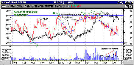
| Stocks often go into periods of congestion where the only movement is sideways. This congestion often occurs after a stock has had a substantial gain and is currently consolidating those gains, such as in Figure 1 of Anadarko Petro (APC). APC had a 100% gain in three months, and has now been consolidating for the last two months. It is now following the classic definition for consolidation: lower volume and no definite broadening [1]. The price will break out of this congenstion eventually, and an indicator that would combine both price and volume would be the most likely to give insight into what direction the price will take. |
| MFI is a momentum indicator that measures the strength of money flowing in and out of a security. It does this by creating a cumulative ratio of positive to negative money flow, and turns it into an index that acts as an oscillator. MFI is considered a leading indicator. In order to calculate money flow the first step is to pick an equity and compare their typical price for today to yesterday's typical price, where: Typical price = (high + low + close)/3. If today's typical price is greater than yesterday's, then money flow, defined as the typical price multiplied by volume, is added to the positive money flow for the selected period of time, which is usually 14 days. If today's typical price is less than yesterday's price, then the money flow is added to the negative money flow. The next step is to calculate the money ratio: (positive money flow) / (negative money flow) The index is calculated using the following formula: Money flow index = - ( 100 / (1+money flow) ) |

|
| Figure 1: Andarko Petro [APC]. APC has risen to a new high and is in congestion. Money Flow Index may indicate which way APC will go out of the congestion. |
| Graphic provided by: MetaStock. |
| |
| The MFI is used to detect reversals. When the MFI reaches 20 it usually means that prices have reached a bottom. When it reaches 80 it means a top has been reached. The MFI values are shown on the left-hand scale in the chart of APC. Divergences between MFI and price trends can also reveal significant clues to price activity. A negative divergence, for example, could be a warning that prices will decline. |
| From Figure 1, threshold penetration at A successfully predicted the price bottom in October. At B it preceded the price top in mid-January. The price top in mid-May was indicated by threshold penetrations at C and D. Like all indicators it has flaws. The MFI index appears to have missed the mid-November high. Linear regression trendlines were used to simplify trend drawing of the MFI index. As you can see, they generally work. So much so, that one wonders if APC is headed for a bit of a downturn. In later postings we will look for patterns to develop. |
| [1] Edwards and Magee, Technical Analysis of Stock Trends, pg 203. |
Market index trading on a daily basis.
| Title: | Staff Writer |
| Company: | Technical Analysis, Inc. |
| Address: | 4757 California Ave SW |
| Seattle, WA 98116-4499 | |
| Phone # for sales: | 206 938 0570 |
| Fax: | 206 938 1307 |
| Website: | www.traders.com |
| E-mail address: | dpeterson@traders.com |
Traders' Resource Links | |
| Charting the Stock Market: The Wyckoff Method -- Books | |
| Working-Money.com -- Online Trading Services | |
| Traders.com Advantage -- Online Trading Services | |
| Technical Analysis of Stocks & Commodities -- Publications and Newsletters | |
| Working Money, at Working-Money.com -- Publications and Newsletters | |
| Traders.com Advantage -- Publications and Newsletters | |
| Professional Traders Starter Kit -- Software | |
Click here for more information about our publications!
Comments
Date:�/ /Rank:�4Comment:�

Request Information From Our Sponsors
- StockCharts.com, Inc.
- Candle Patterns
- Candlestick Charting Explained
- Intermarket Technical Analysis
- John Murphy on Chart Analysis
- John Murphy's Chart Pattern Recognition
- John Murphy's Market Message
- MurphyExplainsMarketAnalysis-Intermarket Analysis
- MurphyExplainsMarketAnalysis-Visual Analysis
- StockCharts.com
- Technical Analysis of the Financial Markets
- The Visual Investor
- VectorVest, Inc.
- Executive Premier Workshop
- One-Day Options Course
- OptionsPro
- Retirement Income Workshop
- Sure-Fire Trading Systems (VectorVest, Inc.)
- Trading as a Business Workshop
- VectorVest 7 EOD
- VectorVest 7 RealTime/IntraDay
- VectorVest AutoTester
- VectorVest Educational Services
- VectorVest OnLine
- VectorVest Options Analyzer
- VectorVest ProGraphics v6.0
- VectorVest ProTrader 7
- VectorVest RealTime Derby Tool
- VectorVest Simulator
- VectorVest Variator
- VectorVest Watchdog
