HOT TOPICS LIST
- MACD
- Fibonacci
- RSI
- Gann
- ADXR
- Stochastics
- Volume
- Triangles
- Futures
- Cycles
- Volatility
- ZIGZAG
- MESA
- Retracement
- Aroon
INDICATORS LIST
LIST OF TOPICS
PRINT THIS ARTICLE
by Andrew Hetherington
IBM has recently broken above its $90.00 resistance area. How far will it go?
Position: N/A
Andrew Hetherington
Classic Dow Theorist who trades as a pure technician, using pattern recognition.
PRINT THIS ARTICLE
CHART ANALYSIS
Big Blue Is On The Move
09/19/03 09:05:28 AMby Andrew Hetherington
IBM has recently broken above its $90.00 resistance area. How far will it go?
Position: N/A
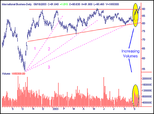
 Figure 1: Daily chart of IBM. IBM's daily chart clearly illustrates that an impending breakout was likely. The increasing volumes off of the most recent bottom, along with a strong upside move, suggested a breakout. There is also the strength coming from the 11-month ascending triangle. The volume on this triangle is near perfect and slowly diminishes throughout the creation of the pattern. The bounce off of the third fan line with the higher volumes demonstrates the strength of the large pattern. But taking a long position on this knowledge before the breakout would have an increased risk since it was still within the pattern, however the downside was limited. |

|
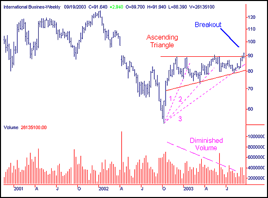
| Figure 2: Weekly chart of IBM. |
| Graphic provided by: SuperCharts. |
| |
| On the weekly chart you can see the diminished volume and the fan lines easier. The breakout should move to the $95.00 area before the inevitable throwback to the line. After which another move higher to the next resistance area of $100.00 and then $108.00 is probable. |
Classic Dow Theorist who trades as a pure technician, using pattern recognition.
| Toronto, Canada |
Click here for more information about our publications!
Comments
Date:�09/19/03Rank:�4Comment:�

Request Information From Our Sponsors
- StockCharts.com, Inc.
- Candle Patterns
- Candlestick Charting Explained
- Intermarket Technical Analysis
- John Murphy on Chart Analysis
- John Murphy's Chart Pattern Recognition
- John Murphy's Market Message
- MurphyExplainsMarketAnalysis-Intermarket Analysis
- MurphyExplainsMarketAnalysis-Visual Analysis
- StockCharts.com
- Technical Analysis of the Financial Markets
- The Visual Investor
- VectorVest, Inc.
- Executive Premier Workshop
- One-Day Options Course
- OptionsPro
- Retirement Income Workshop
- Sure-Fire Trading Systems (VectorVest, Inc.)
- Trading as a Business Workshop
- VectorVest 7 EOD
- VectorVest 7 RealTime/IntraDay
- VectorVest AutoTester
- VectorVest Educational Services
- VectorVest OnLine
- VectorVest Options Analyzer
- VectorVest ProGraphics v6.0
- VectorVest ProTrader 7
- VectorVest RealTime Derby Tool
- VectorVest Simulator
- VectorVest Variator
- VectorVest Watchdog
