HOT TOPICS LIST
- MACD
- Fibonacci
- RSI
- Gann
- ADXR
- Stochastics
- Volume
- Triangles
- Futures
- Cycles
- Volatility
- ZIGZAG
- MESA
- Retracement
- Aroon
INDICATORS LIST
LIST OF TOPICS
PRINT THIS ARTICLE
by Andrew Hetherington
Here are a number of plays to make on a head and shoulders pattern currently forming on Nortel's chart.
Position: N/A
Andrew Hetherington
Classic Dow Theorist who trades as a pure technician, using pattern recognition.
PRINT THIS ARTICLE
CHART ANALYSIS
Nortel Networks is Set to Slide
04/11/03 11:14:56 AMby Andrew Hetherington
Here are a number of plays to make on a head and shoulders pattern currently forming on Nortel's chart.
Position: N/A
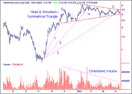
 Figure 1: Nortel's daily chart. |
| Nortel's (NT) daily chart shows a 5-month head and shoulders pattern that some may even consider a symmetrical triangle. I prefer to call it a head and shoulders pattern. This pattern has the required volume diminishing slowly from left to right. There is a third fan line that is breaking which will indicate temporary weakness and a temporary change of direction from up to down. The next supports will be in the $1.30 to $2.00 area and this will be the likely stopping point where accumulation will begin. The all time low in the 0.70 cent area will not likely be seen again for some time but if the $1.30 support does not hold this will be an excellent place to accumulate a long position with a medium to long-term time horizon. |

|
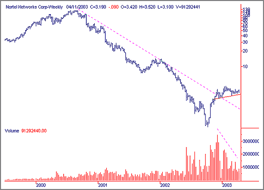
| Figure 2: Nortel's weekly chart. |
| Graphic provided by: SuperCharts. |
| |
| The weekly chart shows the excellent volume after the long downtrend. Normally, after the long trend is broken the equity will come back down and crawl along the trendline. This is the time to accumulate, but be cautious since it could nip below the line a little. Watch the volume carefully. When accumulation begins you will see the increase in volume on a continual basis. |
| These charts are in Canadian dollars but have the identical look form the American charts since it is a duo-listed equity. |
Classic Dow Theorist who trades as a pure technician, using pattern recognition.
| Toronto, Canada |
Click here for more information about our publications!
Comments
Date:�04/30/03Rank:�5Comment:�

Request Information From Our Sponsors
- StockCharts.com, Inc.
- Candle Patterns
- Candlestick Charting Explained
- Intermarket Technical Analysis
- John Murphy on Chart Analysis
- John Murphy's Chart Pattern Recognition
- John Murphy's Market Message
- MurphyExplainsMarketAnalysis-Intermarket Analysis
- MurphyExplainsMarketAnalysis-Visual Analysis
- StockCharts.com
- Technical Analysis of the Financial Markets
- The Visual Investor
- VectorVest, Inc.
- Executive Premier Workshop
- One-Day Options Course
- OptionsPro
- Retirement Income Workshop
- Sure-Fire Trading Systems (VectorVest, Inc.)
- Trading as a Business Workshop
- VectorVest 7 EOD
- VectorVest 7 RealTime/IntraDay
- VectorVest AutoTester
- VectorVest Educational Services
- VectorVest OnLine
- VectorVest Options Analyzer
- VectorVest ProGraphics v6.0
- VectorVest ProTrader 7
- VectorVest RealTime Derby Tool
- VectorVest Simulator
- VectorVest Variator
- VectorVest Watchdog
