HOT TOPICS LIST
- MACD
- Fibonacci
- RSI
- Gann
- ADXR
- Stochastics
- Volume
- Triangles
- Futures
- Cycles
- Volatility
- ZIGZAG
- MESA
- Retracement
- Aroon
INDICATORS LIST
LIST OF TOPICS
PRINT THIS ARTICLE
by Koos van der Merwe
When you rely on a program to analyze the market, how do you identify which shares to look at?
Position: Accumulate
Koos van der Merwe
Has been a technical analyst since 1969, and has worked as a futures and options trader with First Financial Futures in Johannesburg, South Africa.
PRINT THIS ARTICLE
STRATEGIES
Looking At A Weekly Chart
07/08/14 03:13:10 PMby Koos van der Merwe
When you rely on a program to analyze the market, how do you identify which shares to look at?
Position: Accumulate
| With a large amount of shares listed on the various stock exchanges, it is not uncommon to find people running programs that identify which shares to look at and which to ignore. Most who are starting to learn the system only analyze daily charts. Years of trading the market have taught me to look at monthly charts for general direction, weekly charts to confirm that the share should be on a watch list, and finally a daily chart to place the trade. Intraday traders will look at a 15-minute chart, a five-minute chart with a three-minute chart to place the trade. Of course these figures will change depending on the trading strategy they decide to follow, but I have found after years of trading, that the trend suggested by a weekly chart is something that should be watched and considered when placing a trade. |

|
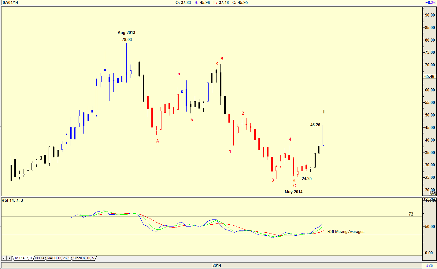
| Figure 1. Weekly chart of EXONE company. |
| Graphic provided by: AdvancedGET. |
| |
| The chart in Figure 1 is a weekly chart of Exone Company Ltd. (XONE) that shows how the share price fell from a high of $79.03 to a low of $24.25 by May 2014. The RSI indicator started suggesting a buy, so I placed the share on my watch list, buying the share when the daily chart confirmed a buy signal using a trigger indicator I prefer using, namely a JM Internal Band. A JM Internal Band is a 15-period simple moving average offset by 2% positive and 2% negative. A move above the upper band suggests a buy. You, as an individual, would have your own preferred indicator. I am also inclined to follow an Elliott Wave count as long as it is not too complicated. The Elliott Wave count shown on the chart suggests that the share price is rising in a WAVE I. Knowing that a WAVE II correction will occur that can be a 72% retracement, I will watch the RSI indicator closely, and should I see the indicator start suggesting a sell, either by crossing the two moving averages of the indicator, or rising above the 72 line bar and then falling below it, I will look to the daily chart to decide when to take profits, if a daily trailing stop has not already taken me out of the position. |

|
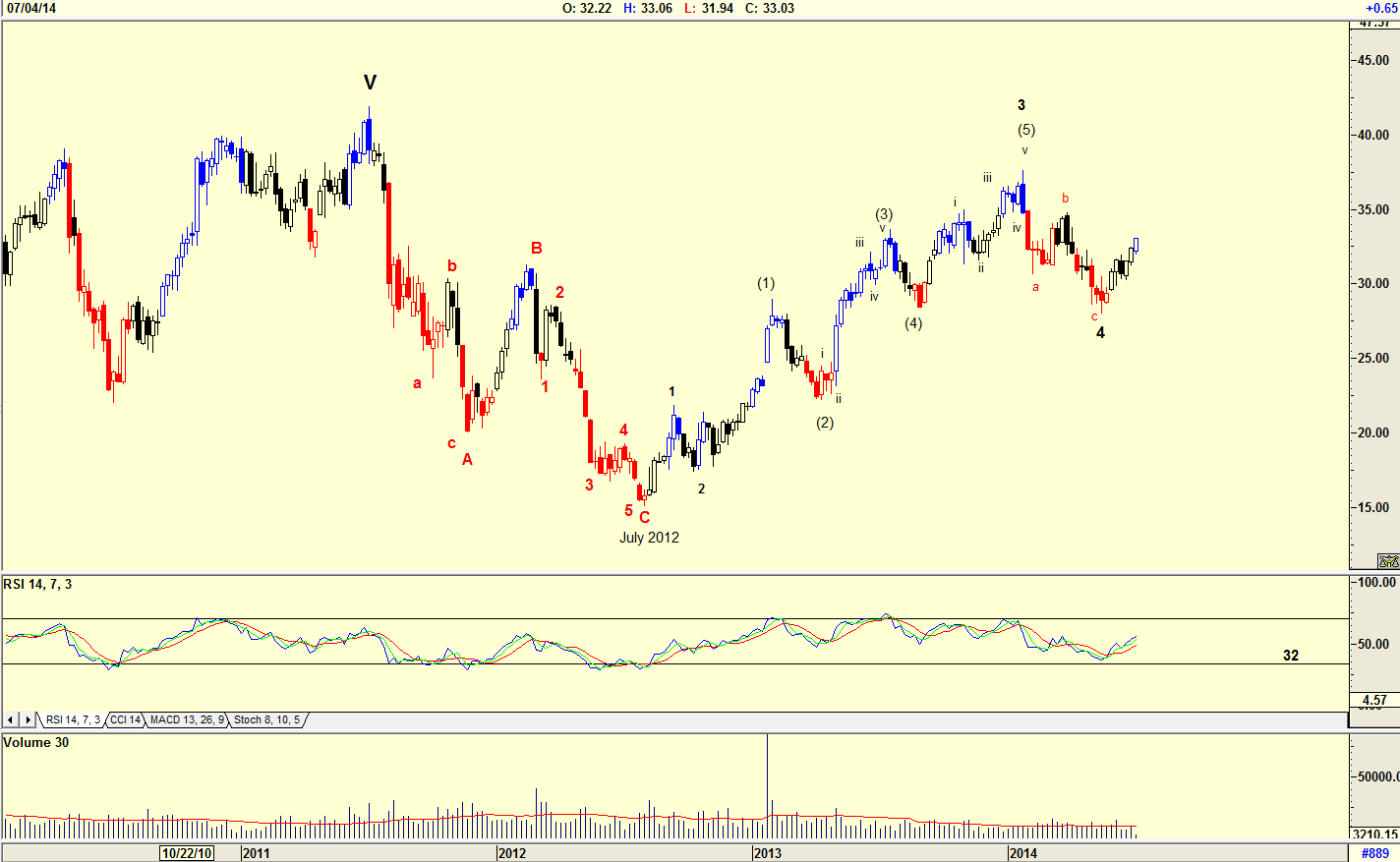
| Figure 2. Weekly chart of OM Group. |
| Graphic provided by: AdvancedGET. |
| |
| The chart in Figure 2 is a weekly chart of the OM Group (OM). The WAVE count is extremely complicated, telling me that if I bought the share based on what I see on the daily chart, I should keep my stops close. The share suggests that it could be rising in a Wave 5, but that the RSI indicator did not fall below the 32 horizontal has put me on my guard. If the daily chart suggested a JM Internal band buy signal, I may buy, but I would keep my stops close. As I said earlier, I prefer a simple Elliott Wave count. |

|
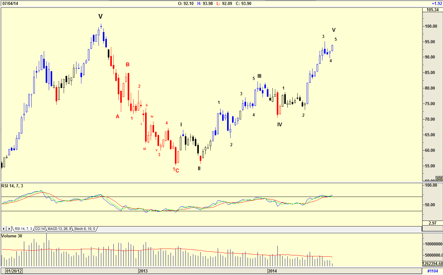
| Figure 3. Weekly chart of Apple. |
| Graphic provided by: AdvancedGET. |
| |
| The chart in Figure 3 is a weekly chart of Apple, Inc. (AAPL). The Elliott Wave count is relatively simple, suggesting that the share price is rising in a WAVE V. The RSI is at overbought levels, suggesting that a sell signal is imminent, although the share could still rise for the next few weeks. This would make me extremely cautious of buying shares in the company depending on the signals received on the daily chart. I would prefer to look for a share where the weekly chart suggests a trend that is "up, up and away..." Using a weekly chart to determine market direction and depending on the daily chart to buy or sell a stock is a must. A weekly chart defines the trend and puts you at ease if the daily buy signal does not materialize as expected. So, when you receive a buy signal in your daily chart analysis, always look at the weekly chart to confirm the signal and then sleep more soundly knowing that if you erred in your buy, your long-term trend is still positive. |
Has been a technical analyst since 1969, and has worked as a futures and options trader with First Financial Futures in Johannesburg, South Africa.
| Address: | 3256 West 24th Ave |
| Vancouver, BC | |
| Phone # for sales: | 6042634214 |
| E-mail address: | petroosp@gmail.com |
Click here for more information about our publications!
Comments

Request Information From Our Sponsors
- StockCharts.com, Inc.
- Candle Patterns
- Candlestick Charting Explained
- Intermarket Technical Analysis
- John Murphy on Chart Analysis
- John Murphy's Chart Pattern Recognition
- John Murphy's Market Message
- MurphyExplainsMarketAnalysis-Intermarket Analysis
- MurphyExplainsMarketAnalysis-Visual Analysis
- StockCharts.com
- Technical Analysis of the Financial Markets
- The Visual Investor
- VectorVest, Inc.
- Executive Premier Workshop
- One-Day Options Course
- OptionsPro
- Retirement Income Workshop
- Sure-Fire Trading Systems (VectorVest, Inc.)
- Trading as a Business Workshop
- VectorVest 7 EOD
- VectorVest 7 RealTime/IntraDay
- VectorVest AutoTester
- VectorVest Educational Services
- VectorVest OnLine
- VectorVest Options Analyzer
- VectorVest ProGraphics v6.0
- VectorVest ProTrader 7
- VectorVest RealTime Derby Tool
- VectorVest Simulator
- VectorVest Variator
- VectorVest Watchdog
