HOT TOPICS LIST
- MACD
- Fibonacci
- RSI
- Gann
- ADXR
- Stochastics
- Volume
- Triangles
- Futures
- Cycles
- Volatility
- ZIGZAG
- MESA
- Retracement
- Aroon
INDICATORS LIST
LIST OF TOPICS
PRINT THIS ARTICLE
by Koos van der Merwe
The Bank of Japan recently announced that it would start purchasing long-term Japanese government bonds.
Position: Sell
Koos van der Merwe
Has been a technical analyst since 1969, and has worked as a futures and options trader with First Financial Futures in Johannesburg, South Africa.
PRINT THIS ARTICLE
MA ENVELOPES
Japan Today
04/09/13 11:18:10 AMby Koos van der Merwe
The Bank of Japan recently announced that it would start purchasing long-term Japanese government bonds.
Position: Sell
| Japan, one of the wealthiest countries in the world, has been running an extremely large budget deficit for years. This year alone, the deficit is expected to be approximately 8%. In the U.S., the deficit is about 6.5%. The Japanese economy suffers from a deflation rate of -0.2%. In the U.S., the annual inflation is approximately 2%. The Japanese have now had 20 solid years of deflation. Since the early 1990s, Japan has never recovered to a level of stable, slightly rising prices. Under its new chairman Haruhiko Kuroda, the Bank of Japan is targeting that precious +2% annual inflation rate. Does this mean that it is time to start investing in Japan? Looking at the charts, it looks as though it may be too late, but you can keep an eye on Japan. |

|
| Figure 1. Monthly chart of Japan Hedged Equity ETF (DXJ). |
| Graphic provided by: AdvancedGET. |
| |
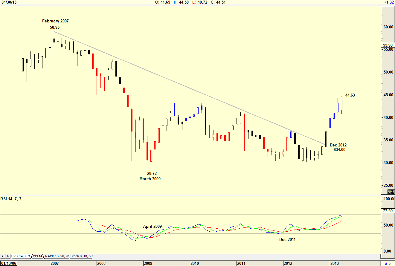
| The chart in Figure 1 is a monthly chart of the Japan Hedged Equity ETF (DXJ), and shows how the price fell from a high of $58.95 in February 2007 to a low of $28.72 by March 2009. The chart shows how in December 2012 the fund broke the downtrend line and rose to its current high of $44.63. Note that the RSI gave a buy in April 2009, and that it repeated that buy signal in December 2011. |

|
| Figure 2. Monthly Chart of Japan Equity Fund (JEQ). |
| Graphic provided by: AdvancedGET. |
| |
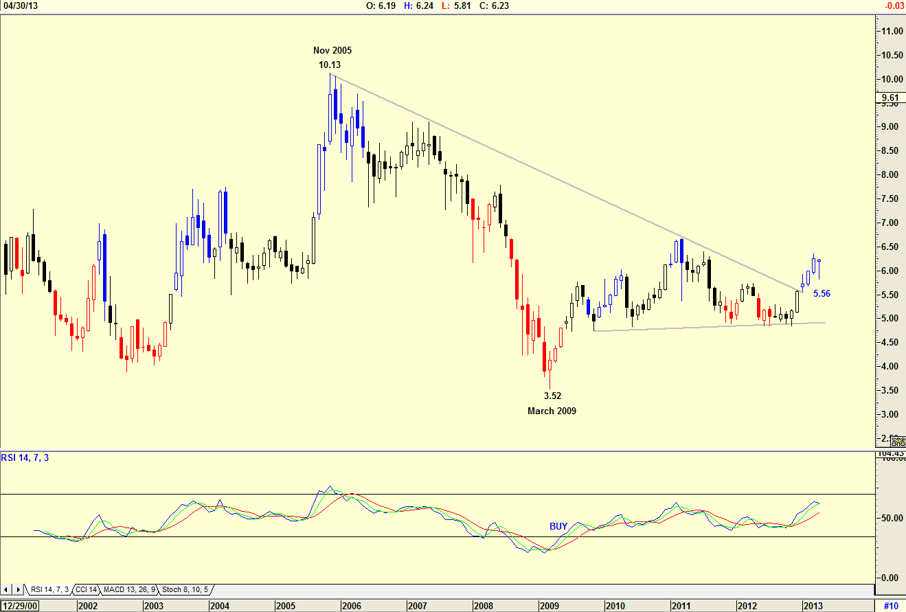
| The chart in Figure 2 is a monthly chart of the Japan Equity Fund (JEQ) and shows how the fund reached a high of $10.13 in November 2005, falling to a low of $3.52 by March 2009. As with the DXJ in Figure 1, the price broke out of its downtrend line in December 2012. The RSI indicator gave a buy signal in May 2009, a month later than DXJ. In both charts, the RSI is still trending upwards. What do the daily charts tell us? Is it time to start investing in Japan, or have we missed that opportunity? |

|
| Figure 3. Daily chart of Japan Hedged Equity ETF (DXJ). |
| Graphic provided by: AdvancedGET. |
| |
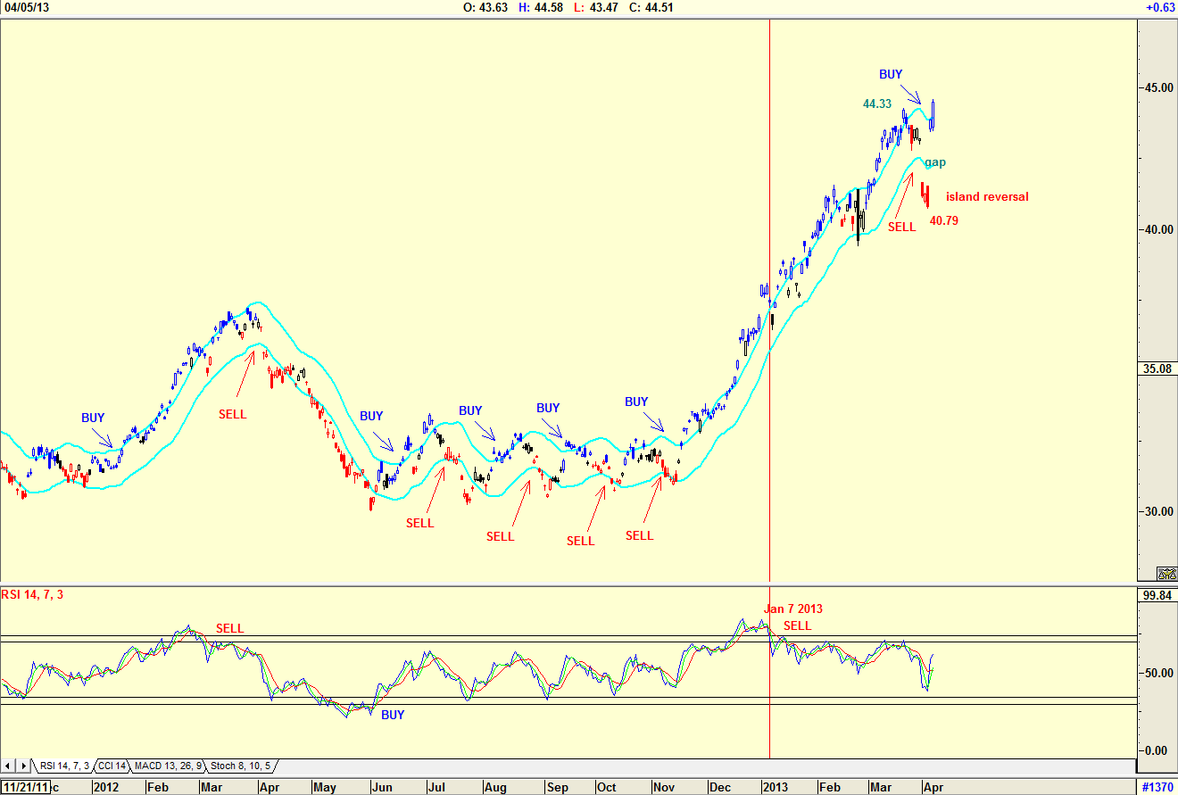
| Figure 3 is a daily chart of the Japan Hedged Equity ETF (DXJ). The chart shows the buy and sell triggers of the JM Internal Band indicator. The JM Internal Band is a 15-period simple moving average offset by 2% positive and 2% negative. The number of buys and sells given would have discouraged you from buying the share. You would have been a great deal happier using the RSI indicator as a trigger, but a sell signal was given on January 7, 2013. Note that this was halfway up the rise to its high of $44.33. Do note the gap as it fell to an island reversal of $40.79. This suggests that you should buy the fund, and hold. |

|
| Figure 4. The Daily chart of the Japan Equity Fund (JEQ). |
| Graphic provided by: AdvancedGET. |
| |
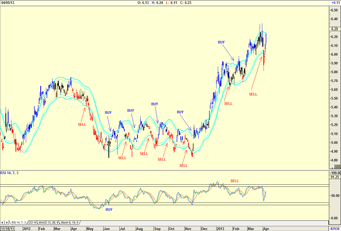
| The daily chart of the Japan Equity Fund (JEQ) in Figure 4 shows the same uncertainty by investors as DXJ in Figure 3. The chart does not show an island reversal BUY as shown in the chart in Figure 3. You would therefore have stayed out buying the equity fund. Would you buy into Japan at the moment? All four of the charts say no. However, with the fundamentals suggesting that you should keep an eye on Japan, these are charts that should be in your watch list, waiting for the opportunity to buy into Japan. Japan's strategy for ending their 20 year deflationary cycle makes sense. |
Has been a technical analyst since 1969, and has worked as a futures and options trader with First Financial Futures in Johannesburg, South Africa.
| Address: | 3256 West 24th Ave |
| Vancouver, BC | |
| Phone # for sales: | 6042634214 |
| E-mail address: | petroosp@gmail.com |
Click here for more information about our publications!
PRINT THIS ARTICLE

Request Information From Our Sponsors
- StockCharts.com, Inc.
- Candle Patterns
- Candlestick Charting Explained
- Intermarket Technical Analysis
- John Murphy on Chart Analysis
- John Murphy's Chart Pattern Recognition
- John Murphy's Market Message
- MurphyExplainsMarketAnalysis-Intermarket Analysis
- MurphyExplainsMarketAnalysis-Visual Analysis
- StockCharts.com
- Technical Analysis of the Financial Markets
- The Visual Investor
- VectorVest, Inc.
- Executive Premier Workshop
- One-Day Options Course
- OptionsPro
- Retirement Income Workshop
- Sure-Fire Trading Systems (VectorVest, Inc.)
- Trading as a Business Workshop
- VectorVest 7 EOD
- VectorVest 7 RealTime/IntraDay
- VectorVest AutoTester
- VectorVest Educational Services
- VectorVest OnLine
- VectorVest Options Analyzer
- VectorVest ProGraphics v6.0
- VectorVest ProTrader 7
- VectorVest RealTime Derby Tool
- VectorVest Simulator
- VectorVest Variator
- VectorVest Watchdog
