HOT TOPICS LIST
- MACD
- Fibonacci
- RSI
- Gann
- ADXR
- Stochastics
- Volume
- Triangles
- Futures
- Cycles
- Volatility
- ZIGZAG
- MESA
- Retracement
- Aroon
INDICATORS LIST
LIST OF TOPICS
PRINT THIS ARTICLE
by Mike Carr, CMT
The Value Line Index offers a useful way to monitor market breadth and confirm the major trends.
Position: Buy
Mike Carr, CMT
Mike Carr, CMT, is a member of the Market Technicians Association, and editor of the MTA's newsletter, Technically Speaking. He is also the author of "Smarter Investing in Any Economy: The Definitive Guide to Relative Strength Investing," and "Conquering the Divide: How to Use Economic Indicators to Catch Stock Market Trends."
PRINT THIS ARTICLE
BOLLINGER BANDS
Value Line Index Points To Broad Market Gains
02/06/12 11:05:49 AMby Mike Carr, CMT
The Value Line Index offers a useful way to monitor market breadth and confirm the major trends.
Position: Buy
| Before traders could electronically buy and sell emini futures contracts, the Value Line Geometric Index was widely traded as a futures contract at the Kansas City Board of Trade (KCBT). This stock market index began trading in 1982. In 1988, the exchange switched to an index based on an arithmetic average. A geometric average is calculated in a way that will always underperform an arithmetic average. Since traders prefer bull markets, the KCBT adapted to that by changing the way the index is calculated. With the arithmetic average, the Value Line index more closely tracks the other broad stock market averages. The Value Line index is an equally weighted index, unlike the cap-weighted calculations applied to the Standard & Poor's 500, which has also evolved to meet traders' concerns. To respond to concerns that cap weighting was skewing performance in a bull market, S&P now offers an equally weighted version of its index. |
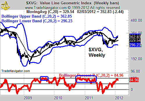
| The geometric average (XVG) can still be used as a valuable tool in market analysis. Some indexes, like the NASDAQ 100, broke out to new highs at the beginning of 2012 and many traders wondered if that signaled a new bull market or a trap. Those fearing a trap are usually concerned about the large weight that a few stocks have in an index. XVG eliminates the impact of any index weighting method and offers a view of what the average stock is doing, since there is no cap or price weighting in the calculation. The index is shown in Figure 1, with Bollinger Bands and the PercentB indicator. PercentB shows that this index has a tendency to "walk the band" as they move higher. "Walking the band" is a phrase coined by John Bollinger, meaning that prices creep up along the upper band or fall lower while staying very close to the lower band. The idea of walking the bands is consistent with the idea that an overbought market can become more overbought and an oversold market can get even more oversold before it reverses. A couple of previous examples of this behavior are highlighted. See Figure 2. |

|
| FIGURE 1: XVG, WEEKLY. The weekly chart of XVG shows that the index is trending higher. |
| Graphic provided by: Trade Navigator. |
| |
| Breadth analysis is usually done with indicators like the advance-decline line. Traders use breadth in an effort to understand what the majority of individual stocks are doing. XVG also offers a view of market breadth but does so with price. We generally trade price (the exception to this being that some traders buy and sell volatility with options and indexes). That in some ways makes XVG a more direct way to analyze breadth and provide the answer to the question of what the general market is doing. |

|
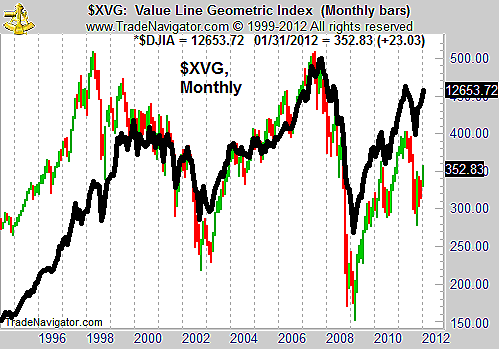
| FIGURE 2: XVG, MONTHLY. The monthly chart of XVG shows it has lagged in comparison with the performance of the DJIA. |
| Graphic provided by: Trade Navigator. |
| |
Mike Carr, CMT, is a member of the Market Technicians Association, and editor of the MTA's newsletter, Technically Speaking. He is also the author of "Smarter Investing in Any Economy: The Definitive Guide to Relative Strength Investing," and "Conquering the Divide: How to Use Economic Indicators to Catch Stock Market Trends."
| Website: | www.moneynews.com/blogs/MichaelCarr/id-73 |
| E-mail address: | marketstrategist@gmail.com |
Click here for more information about our publications!
PRINT THIS ARTICLE

Request Information From Our Sponsors
- StockCharts.com, Inc.
- Candle Patterns
- Candlestick Charting Explained
- Intermarket Technical Analysis
- John Murphy on Chart Analysis
- John Murphy's Chart Pattern Recognition
- John Murphy's Market Message
- MurphyExplainsMarketAnalysis-Intermarket Analysis
- MurphyExplainsMarketAnalysis-Visual Analysis
- StockCharts.com
- Technical Analysis of the Financial Markets
- The Visual Investor
- VectorVest, Inc.
- Executive Premier Workshop
- One-Day Options Course
- OptionsPro
- Retirement Income Workshop
- Sure-Fire Trading Systems (VectorVest, Inc.)
- Trading as a Business Workshop
- VectorVest 7 EOD
- VectorVest 7 RealTime/IntraDay
- VectorVest AutoTester
- VectorVest Educational Services
- VectorVest OnLine
- VectorVest Options Analyzer
- VectorVest ProGraphics v6.0
- VectorVest ProTrader 7
- VectorVest RealTime Derby Tool
- VectorVest Simulator
- VectorVest Variator
- VectorVest Watchdog
