HOT TOPICS LIST
- MACD
- Fibonacci
- RSI
- Gann
- ADXR
- Stochastics
- Volume
- Triangles
- Futures
- Cycles
- Volatility
- ZIGZAG
- MESA
- Retracement
- Aroon
INDICATORS LIST
LIST OF TOPICS
PRINT THIS ARTICLE
by Mike Carr, CMT
Both the Dow Jones Industrial Average and Value Line Geometric Index show that stocks could deliver large gains in the months ahead.
Position: Buy
Mike Carr, CMT
Mike Carr, CMT, is a member of the Market Technicians Association, and editor of the MTA's newsletter, Technically Speaking. He is also the author of "Smarter Investing in Any Economy: The Definitive Guide to Relative Strength Investing," and "Conquering the Divide: How to Use Economic Indicators to Catch Stock Market Trends."
PRINT THIS ARTICLE
WILLIAM'S %R
Stocks At Resistance
01/25/12 09:17:29 AMby Mike Carr, CMT
Both the Dow Jones Industrial Average and Value Line Geometric Index show that stocks could deliver large gains in the months ahead.
Position: Buy
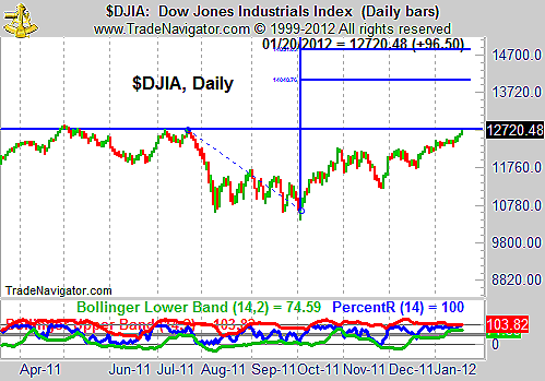
| As usual, stocks have moved higher and many forecasters are predicting a decline. The chart looks more bullish than bearish in many ways. The Dow Jones Industrial Average (DJIA) has traded back to its summer highs. Figure 1 shows the resistance line from those highs, and a breakout above resistance could lead to a quick up move. Sentiment is negative on the stock market and on the economy, providing stocks with a proverbial wall of worry they could climb. In addition to skeptical analysts, the news media also seems pessimistic about the economy. Every piece of good economic news seems to be accompanied by a sobering forecast that the trend is likely to be lower over the rest of the year. Stock market forecasts usually reflect the recent past, and last summer's sharp decline is doubtlessly having an impact on some views. This negative sentiment points to the likelihood of a rapid price move if resistance is broken in the DJIA. |

|
| FIGURE 1: DJIA, DAILY. The daily chart of the DJIA shows momentum contracting, which often happens before a sharp price move. |
| Graphic provided by: Trade Navigator. |
| |
| The chart of the DJIA (Figure 1) includes Williams' %R, a momentum indicator that is similar in many ways to the stochastics indicator. There are two key points to consider when looking at the indicator right now that support a very bullish interpretation. %R tends to point toward an uptrend when it is over 50, as it has been almost continuously since stocks bottomed in November. The indicator is shown with Bollinger Bands, a tool that helps traders to visualize volatility. There is a cyclical pattern to volatility, and low volatility is often followed by high volatility. With the bands having narrowed so much around %R, a period of high volatility should be expected soon. Increased volatility in momentum would be accompanied by a rapid price move. Although the move could come in either direction, the weight of the technical evidence does seem to point toward an upmove. |
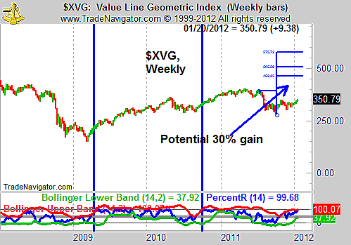
| In 2011, the DJIA diverged from the broader market and was stronger than the average stock. A good index to gauge the average stock is the less widely followed Value Line Geometric Index (XVG, Figure 2). With this index, we see that stocks are still below their summer highs, but a breakout above those highs could lead to a gain of about 30% in the broad market. The weekly chart shows that from the depth of the decline, a move to about 450 in XVG could be expected. |

|
| FIGURE 2: XVG, WEEKLY. The weekly chart of the Value Line Geometric Index also shows that momentum is bullish. |
| Graphic provided by: Trade Navigator. |
| |
| Williams' %R is shown in this chart as well. In addition to the two bullish points that applied to the analysis of the DJIA, we have a third sign of strength from this indicator when applied to XVG. The indicator recently broke above its upper Bollinger Band. The last two times this occurred are highlighted with vertical blue lines in the chart. Significant gains followed after this momentum indicator showed such significant strength. |
| XVG helps to analyze the average stock while the DJIA is focused on large caps. Divergences between the two are important, and when they confirm each other, a strong market move could be expected. Right now, both indexes are bullish and the stock market could be headed higher. |
Mike Carr, CMT, is a member of the Market Technicians Association, and editor of the MTA's newsletter, Technically Speaking. He is also the author of "Smarter Investing in Any Economy: The Definitive Guide to Relative Strength Investing," and "Conquering the Divide: How to Use Economic Indicators to Catch Stock Market Trends."
| Website: | www.moneynews.com/blogs/MichaelCarr/id-73 |
| E-mail address: | marketstrategist@gmail.com |
Click here for more information about our publications!
PRINT THIS ARTICLE

Request Information From Our Sponsors
- StockCharts.com, Inc.
- Candle Patterns
- Candlestick Charting Explained
- Intermarket Technical Analysis
- John Murphy on Chart Analysis
- John Murphy's Chart Pattern Recognition
- John Murphy's Market Message
- MurphyExplainsMarketAnalysis-Intermarket Analysis
- MurphyExplainsMarketAnalysis-Visual Analysis
- StockCharts.com
- Technical Analysis of the Financial Markets
- The Visual Investor
- VectorVest, Inc.
- Executive Premier Workshop
- One-Day Options Course
- OptionsPro
- Retirement Income Workshop
- Sure-Fire Trading Systems (VectorVest, Inc.)
- Trading as a Business Workshop
- VectorVest 7 EOD
- VectorVest 7 RealTime/IntraDay
- VectorVest AutoTester
- VectorVest Educational Services
- VectorVest OnLine
- VectorVest Options Analyzer
- VectorVest ProGraphics v6.0
- VectorVest ProTrader 7
- VectorVest RealTime Derby Tool
- VectorVest Simulator
- VectorVest Variator
- VectorVest Watchdog
