HOT TOPICS LIST
- MACD
- Fibonacci
- RSI
- Gann
- ADXR
- Stochastics
- Volume
- Triangles
- Futures
- Cycles
- Volatility
- ZIGZAG
- MESA
- Retracement
- Aroon
INDICATORS LIST
LIST OF TOPICS
PRINT THIS ARTICLE
by Mike Carr, CMT
Many traders are looking for similarities between the current market and the precrash market of 2008. History says that the crash is probably over.
Position: Buy
Mike Carr, CMT
Mike Carr, CMT, is a member of the Market Technicians Association, and editor of the MTA's newsletter, Technically Speaking. He is also the author of "Smarter Investing in Any Economy: The Definitive Guide to Relative Strength Investing," and "Conquering the Divide: How to Use Economic Indicators to Catch Stock Market Trends."
PRINT THIS ARTICLE
CHART ANALYSIS
Similarities Between Then And Now? This Isn't 2008
12/02/11 09:43:00 AMby Mike Carr, CMT
Many traders are looking for similarities between the current market and the precrash market of 2008. History says that the crash is probably over.
Position: Buy
| Technicians study chart patterns looking for clues about the future based on the events of the past. They rely on patterns defined in the 1930s by Richard Schabacker and popularized in the 1940s by Robert Edwards and John Magee. These are subjective means of analysis, with different technicians seeing different patterns in the charts at any given time. |
| The principle of chart analysis is more important than the specific conclusions reached on any one chart -- the idea that history repeats in the markets and that the future is likely to be similar to the past is fairly well established in price data. Many traders and analysts have been looking for clues that the large declines of 2008 are going to repeat in the markets. In this scenario, the euro is as big a problem now as subprime mortgages were a few years ago. Euro-driven collapses are possible and perhaps similar to the series of events that led to the demise of Lehman Brothers and Bear Stearns. Looking to the past can offer clues to the future, and that idea works with economic data as well. |
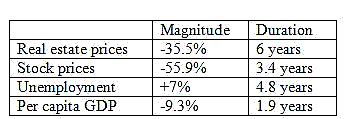
| Data from "This Time Is Different" by economists Carmen Reinhart and Kenneth Rogoff (Princeton University Press, 2009) could help put 2008 and the present into context. They studied what they call "eight centuries of financial folly" and exhaustively catalogued the impact of market bubbles and crashes over the past 800 years. They offer insight into what an average decline looks like and allow us to see where we stand now. Key indicators are shown in Figure 1. |

|
| FIGURE 1: AVERAGE CHANGE IN INDICATORS AFTER A BANKING CRISIS |
| Graphic provided by: Reinhart & Rogoff. |
| |
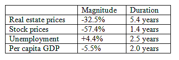
| US data from the most recent crisis is shown in Figure 2. The decline is the US was average as far as real estate and stock prices are concerned and below average when measured by economic indicators. |

|
| FIGURE 2: RESULTS OF THE 2008 CRISIS IN LINE WITH PREVIOUS FINANCIAL FOLLIES |
| Graphic provided by: Reinhart & Rogoff. |
| |
| This time may be different, but Reinhart and Rogoff looked at 800 years of history and concluded that there is no precedent for expecting this time to be any different than the past. The economic recovery is continuing, and the euro presents a serious challenge to that recovery. However, we are unlikely to see new lows develop in the stock market, having suffered two bear markets within 10 years; new all-time highs are more likely to be seen rather than new lows. |
Mike Carr, CMT, is a member of the Market Technicians Association, and editor of the MTA's newsletter, Technically Speaking. He is also the author of "Smarter Investing in Any Economy: The Definitive Guide to Relative Strength Investing," and "Conquering the Divide: How to Use Economic Indicators to Catch Stock Market Trends."
| Website: | www.moneynews.com/blogs/MichaelCarr/id-73 |
| E-mail address: | marketstrategist@gmail.com |
Click here for more information about our publications!
PRINT THIS ARTICLE

Request Information From Our Sponsors
- StockCharts.com, Inc.
- Candle Patterns
- Candlestick Charting Explained
- Intermarket Technical Analysis
- John Murphy on Chart Analysis
- John Murphy's Chart Pattern Recognition
- John Murphy's Market Message
- MurphyExplainsMarketAnalysis-Intermarket Analysis
- MurphyExplainsMarketAnalysis-Visual Analysis
- StockCharts.com
- Technical Analysis of the Financial Markets
- The Visual Investor
- VectorVest, Inc.
- Executive Premier Workshop
- One-Day Options Course
- OptionsPro
- Retirement Income Workshop
- Sure-Fire Trading Systems (VectorVest, Inc.)
- Trading as a Business Workshop
- VectorVest 7 EOD
- VectorVest 7 RealTime/IntraDay
- VectorVest AutoTester
- VectorVest Educational Services
- VectorVest OnLine
- VectorVest Options Analyzer
- VectorVest ProGraphics v6.0
- VectorVest ProTrader 7
- VectorVest RealTime Derby Tool
- VectorVest Simulator
- VectorVest Variator
- VectorVest Watchdog
