

HOT TOPICS LIST
- MACD
- Fibonacci
- RSI
- Gann
- ADXR
- Stochastics
- Volume
- Triangles
- Futures
- Cycles
- Volatility
- ZIGZAG
- MESA
- Retracement
- Aroon
INDICATORS LIST
LIST OF TOPICS
PRINT THIS ARTICLE
by Mike Carr, CMT
Yields on the 10-year Treasury reached a new low and completed a double-bottom pattern on the chart. Projections from the pattern offer both good news and bad news.
Position: Buy
Mike Carr, CMT
Mike Carr, CMT, is a member of the Market Technicians Association, and editor of the MTA's newsletter, Technically Speaking. He is also the author of "Smarter Investing in Any Economy: The Definitive Guide to Relative Strength Investing," and "Conquering the Divide: How to Use Economic Indicators to Catch Stock Market Trends."
PRINT THIS ARTICLE
CHART ANALYSIS
Charting Interest Rates
08/25/11 08:41:32 AMby Mike Carr, CMT
Yields on the 10-year Treasury reached a new low and completed a double-bottom pattern on the chart. Projections from the pattern offer both good news and bad news.
Position: Buy
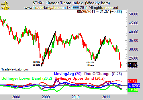
| Interest rates have fallen quickly. The weekly chart of 10-year Treasury yields (Figure 1) shows that they recently reached a new low. In the bottom of the chart, we can see that the lower Bollinger Band has contained the rate of change indicator (ROC), so the rout in yields would not be considered a bond bubble. With the 26-week ROC near 40%, the decline is the sharpest seen since the panic that took place in the autumn of 2008. |
|
| FIGURE 1: TNX, WEEKLY. Interest rates have traded within a broad range from 2% to about 3.5% on the upper end since 2008. |
| Graphic provided by: Trade Navigator. |
| |
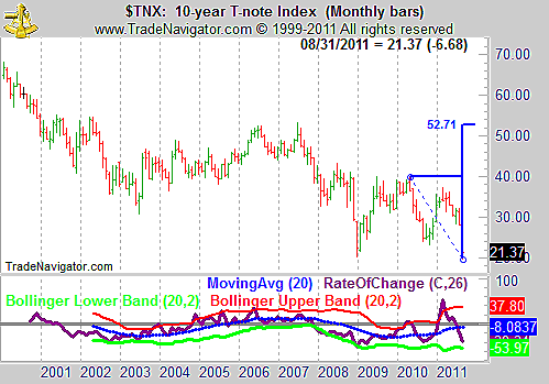
| After bottoming, sharp moves higher have followed the two previous significant lows. Rates doubled in 2009 in less than six months and soared 60% in less than five months after bottoming in 2010. The monthly chart is shown in Figure 2 to project a target based on the double bottom. |
|
| FIGURE 2: TNX, MONTHLY. The monthly chart shows that rates would be expected to reach 5.27%, over time, based on the double-bottom chart pattern. |
| Graphic provided by: Trade Navigator. |
| |
| Higher rates are usually associated with a growing economy. In that sense, the chart projects good news. A rapid rise has the potential to sharply reduce economic growth, and higher rates are also a symptom of higher inflation, bringing the bad news to the chart. |
| Traders could profit from either good news or bad news with exchange traded funds (ETFs) that allow them to bet on rising interest rates by taking a position in bonds. Pro Shares Short 20+ Year Treasury (TBF) and Pro Shares UltraShort 20+ Year Treasury (TBT) would both gain if rates rise. |
Mike Carr, CMT, is a member of the Market Technicians Association, and editor of the MTA's newsletter, Technically Speaking. He is also the author of "Smarter Investing in Any Economy: The Definitive Guide to Relative Strength Investing," and "Conquering the Divide: How to Use Economic Indicators to Catch Stock Market Trends."
| Website: | www.moneynews.com/blogs/MichaelCarr/id-73 |
| E-mail address: | marketstrategist@gmail.com |
Click here for more information about our publications!
PRINT THIS ARTICLE

Request Information From Our Sponsors
- StockCharts.com, Inc.
- Candle Patterns
- Candlestick Charting Explained
- Intermarket Technical Analysis
- John Murphy on Chart Analysis
- John Murphy's Chart Pattern Recognition
- John Murphy's Market Message
- MurphyExplainsMarketAnalysis-Intermarket Analysis
- MurphyExplainsMarketAnalysis-Visual Analysis
- StockCharts.com
- Technical Analysis of the Financial Markets
- The Visual Investor
- VectorVest, Inc.
- Executive Premier Workshop
- One-Day Options Course
- OptionsPro
- Retirement Income Workshop
- Sure-Fire Trading Systems (VectorVest, Inc.)
- Trading as a Business Workshop
- VectorVest 7 EOD
- VectorVest 7 RealTime/IntraDay
- VectorVest AutoTester
- VectorVest Educational Services
- VectorVest OnLine
- VectorVest Options Analyzer
- VectorVest ProGraphics v6.0
- VectorVest ProTrader 7
- VectorVest RealTime Derby Tool
- VectorVest Simulator
- VectorVest Variator
- VectorVest Watchdog