HOT TOPICS LIST
- MACD
- Fibonacci
- RSI
- Gann
- ADXR
- Stochastics
- Volume
- Triangles
- Futures
- Cycles
- Volatility
- ZIGZAG
- MESA
- Retracement
- Aroon
INDICATORS LIST
LIST OF TOPICS
PRINT THIS ARTICLE
by Mike Carr, CMT
The S&P 500 is in a narrow range, much as it was in the summer of 2007. But this time is different.
Position: Buy
Mike Carr, CMT
Mike Carr, CMT, is a member of the Market Technicians Association, and editor of the MTA's newsletter, Technically Speaking. He is also the author of "Smarter Investing in Any Economy: The Definitive Guide to Relative Strength Investing," and "Conquering the Divide: How to Use Economic Indicators to Catch Stock Market Trends."
PRINT THIS ARTICLE
RATE OF CHANGE
Summer Doldrums Hit Stocks
08/02/11 09:04:55 AMby Mike Carr, CMT
The S&P 500 is in a narrow range, much as it was in the summer of 2007. But this time is different.
Position: Buy
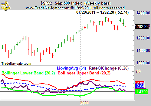
| Stocks have been trading in a relatively narrow range for much of this year. The weekly chart of the Standard & Poor's 500, shown in Figure 1, shows a trendless market. Prices have generally faced resistance near 1350 on the cash index and found support at 1250. |

|
| FIGURE 1: SPX, WEEKLY. The trading range in the S&P 500 has contained prices for nearly seven months. |
| Graphic provided by: Trade Navigator. |
| |
| Momentum has been declining, but it is still positive. In the chart, momentum is shown as the 26-week rate of change (ROC). With this indicator at its lower Bollinger Band, it can even be thought of as oversold. Momentum does seem to generally stay within the bands, as do prices. |
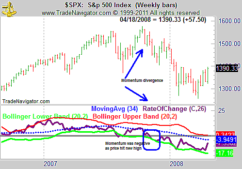
| Figure 2 shows the same index in the summer of 2007, forming the top that preceded the bear market that ended in March 2009. At that time, there was a clear momentum divergence as price set a new high while momentum drove lower. The ROC at that time was negative, and the bear market that followed was deep. In hindsight, the signs of a top were easy to spot, but in real time, charts tended to be more challenging to interpret. |

|
| FIGURE 2: SPX, WEEKLY. Looking back at 2007, the topping pattern appears to be obvious, as is usually the case when reviewing charts. |
| Graphic provided by: Trade Navigator. |
| |
| Declining momentum, as seen in Figure 1, can be a sign of an impending decline or may just signal consolidation. If the ROC turns negative, it would be a bearish omen for the market. For now, the S&P 500 still appears to be headed for gains after breaking through the formidable resistance at 1350. |
Mike Carr, CMT, is a member of the Market Technicians Association, and editor of the MTA's newsletter, Technically Speaking. He is also the author of "Smarter Investing in Any Economy: The Definitive Guide to Relative Strength Investing," and "Conquering the Divide: How to Use Economic Indicators to Catch Stock Market Trends."
| Website: | www.moneynews.com/blogs/MichaelCarr/id-73 |
| E-mail address: | marketstrategist@gmail.com |
Click here for more information about our publications!
Comments
Date:�08/09/11Rank:�1Comment:�Mike:
How do you feel with this call?
Dick Slayton

Request Information From Our Sponsors
- StockCharts.com, Inc.
- Candle Patterns
- Candlestick Charting Explained
- Intermarket Technical Analysis
- John Murphy on Chart Analysis
- John Murphy's Chart Pattern Recognition
- John Murphy's Market Message
- MurphyExplainsMarketAnalysis-Intermarket Analysis
- MurphyExplainsMarketAnalysis-Visual Analysis
- StockCharts.com
- Technical Analysis of the Financial Markets
- The Visual Investor
- VectorVest, Inc.
- Executive Premier Workshop
- One-Day Options Course
- OptionsPro
- Retirement Income Workshop
- Sure-Fire Trading Systems (VectorVest, Inc.)
- Trading as a Business Workshop
- VectorVest 7 EOD
- VectorVest 7 RealTime/IntraDay
- VectorVest AutoTester
- VectorVest Educational Services
- VectorVest OnLine
- VectorVest Options Analyzer
- VectorVest ProGraphics v6.0
- VectorVest ProTrader 7
- VectorVest RealTime Derby Tool
- VectorVest Simulator
- VectorVest Variator
- VectorVest Watchdog
