HOT TOPICS LIST
- MACD
- Fibonacci
- RSI
- Gann
- ADXR
- Stochastics
- Volume
- Triangles
- Futures
- Cycles
- Volatility
- ZIGZAG
- MESA
- Retracement
- Aroon
INDICATORS LIST
LIST OF TOPICS
PRINT THIS ARTICLE
by Donald W. Pendergast, Jr.
Learning to analyze a variety of back-tested equity curve graphs can help give you a better understanding of your trading system.
Position: N/A
Donald W. Pendergast, Jr.
Donald W. Pendergast is a financial markets consultant who offers specialized services to stock brokers and high net worth individuals who seek a better bottom line for their portfolios.
PRINT THIS ARTICLE
TRADING SYSTEMS
Interpreting Trade Statistics And Their Monthly Performances
07/14/11 02:32:31 PMby Donald W. Pendergast, Jr.
Learning to analyze a variety of back-tested equity curve graphs can help give you a better understanding of your trading system.
Position: N/A
| There are tons of useful features for traders of all types in the latest version of TradeStation 9, particularly for those who are serious about system development and deployment. The performance graphs tab within the TradeStation Strategy Performance Report contains no less than eight different performance charts for any given system, each of which gives a unique insight into the inner workings of the system. Here's a comparision of the Equity Curve - Detailed and the Average Profit by Month performance graphs. Let's see if there are meaningful differences in these visual displays of system output and how we might interpret such differences. |

|
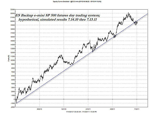
| FIGURE 1: ES. The detailed equity curve chart may not always be the prettiest thing to look at, but it can at least help you come to terms with the realities of trading a system. |
| Graphic provided by: TradeStation. |
| |
| Figure 1 is the detailed equity curve line for this particular emini Standard & Poor's 500 futures daytrading system, covering a full year of back-tested, hypothetical performance across 311 trades. Overall, it looks pretty good, despite a couple of meaningful drawdown periods along the way. This particular graph reveals all of the true nature of any given system, especially because it depicts the maximum intratrade drawdown prior to final trade closeout. This, is, by the way, one of the most vital charts available in the TS performance summary, and will help keep you focused on the harsh realities of trade system performance. |

|
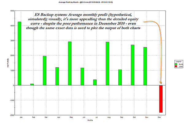
| FIGURE 2: BACKUP SYSTEM. This monthly system performance histogram uses the exact same data and time window as the previous chart, but its visual output would seem to be far more appealing to the average trader. Using both graphs would be far preferable to relying on either one alone. |
| Graphic provided by: TradeStation. |
| |
| Now we migrate to the next graph (Figure 2), which simply depicts the performance of the same exact system over the same exact time series (a full 12 months), but which instead uses monthly histogram bars to display the data. Note how much more visually appealing this graph is, especially because of the string of 11 unbroken green (profitable) monthly histogram bars. The one for December is a real drag, but overall, any trader looking for a decent system would likely still be more than a little interested to learn more about his particular emini system. The big idea here is this: Get all of the information you can before deciding to go ahead and trade, lease, subscribe to or even buy a trading system. Imagine having only looked at the lovely histogram graph for this system, without having witnessed the occasional ugliness of the more informative detailed equity curve graph as well. Take plenty of time and go through as much performance summary data as is humanly possible in order to help set yourself up with a winning, reliable trading system; a little extra time spent upfront could help eliminate some nasty surprises later on down the road. |
Donald W. Pendergast is a financial markets consultant who offers specialized services to stock brokers and high net worth individuals who seek a better bottom line for their portfolios.
| Title: | Writer, market consultant |
| Company: | Linear Trading Systems LLC |
| Jacksonville, FL 32217 | |
| Phone # for sales: | 904-239-9564 |
| E-mail address: | lineartradingsys@gmail.com |
Traders' Resource Links | |
| Linear Trading Systems LLC has not added any product or service information to TRADERS' RESOURCE. | |
Click here for more information about our publications!
Comments

Request Information From Our Sponsors
- StockCharts.com, Inc.
- Candle Patterns
- Candlestick Charting Explained
- Intermarket Technical Analysis
- John Murphy on Chart Analysis
- John Murphy's Chart Pattern Recognition
- John Murphy's Market Message
- MurphyExplainsMarketAnalysis-Intermarket Analysis
- MurphyExplainsMarketAnalysis-Visual Analysis
- StockCharts.com
- Technical Analysis of the Financial Markets
- The Visual Investor
- VectorVest, Inc.
- Executive Premier Workshop
- One-Day Options Course
- OptionsPro
- Retirement Income Workshop
- Sure-Fire Trading Systems (VectorVest, Inc.)
- Trading as a Business Workshop
- VectorVest 7 EOD
- VectorVest 7 RealTime/IntraDay
- VectorVest AutoTester
- VectorVest Educational Services
- VectorVest OnLine
- VectorVest Options Analyzer
- VectorVest ProGraphics v6.0
- VectorVest ProTrader 7
- VectorVest RealTime Derby Tool
- VectorVest Simulator
- VectorVest Variator
- VectorVest Watchdog
