HOT TOPICS LIST
- MACD
- Fibonacci
- RSI
- Gann
- ADXR
- Stochastics
- Volume
- Triangles
- Futures
- Cycles
- Volatility
- ZIGZAG
- MESA
- Retracement
- Aroon
INDICATORS LIST
LIST OF TOPICS
PRINT THIS ARTICLE
by Ron Walker
Remember the robot from the 1960s classic TV show, "Lost in Space"? The robot always gave warnings, using phases like "Warning!" and "Danger!" Market breadth is the B-9 robot in technical analysis. It warns us when danger is present, even when we are unaware of the impending threat.
Position: N/A
Ron Walker
Ron Walker is an active trader and technical analyst. He operates an educational website dedicated to the study of Technical Analysis. The website offers free market analysis with daily video presentations and written commentaries. Ron is a video pioneer, being one of the first to utilize the internet producing Technical Analysis videos. His website is thechartpatterntrader.com
PRINT THIS ARTICLE
Danger! Market Breadth Is Deteriorating!
06/14/11 12:01:00 PMby Ron Walker
Remember the robot from the 1960s classic TV show, "Lost in Space"? The robot always gave warnings, using phases like "Warning!" and "Danger!" Market breadth is the B-9 robot in technical analysis. It warns us when danger is present, even when we are unaware of the impending threat.
Position: N/A
| Market breadth usually compares the number of stocks that are falling with the number of stocks that are rising on the New York Stock Exchange (NYSE). The amount of advancing issues versus those declining. There are several different market breadth indicators that use various calculations to determine market breadth, but the one we'll examine is the NYSE bullish percent index (BPI). In his classic book, "The Visual Investor," analyst John Murphy explains that the BPI actually measures the percent of stocks on the NYSE that are in a point & figure (P&F) uptrend. |

|
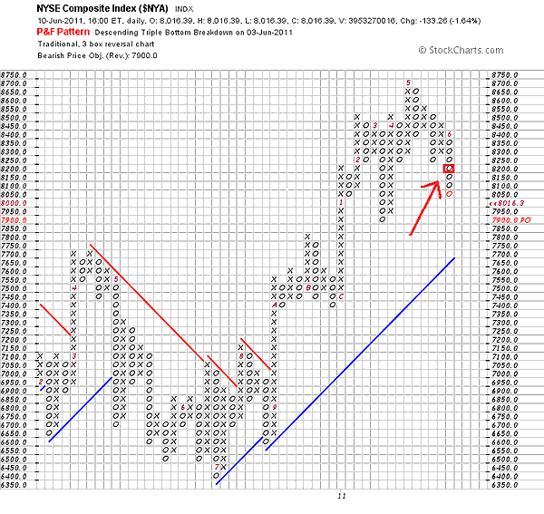
| FIGURE 1: $NYA P&F, DAILY. The P&F chart shows the last column of Os moving below the previous column of Os, triggering a new sell signal on June 3, 2011. The red arrow points to a small red square, which highlights where the sell signal was triggered. |
| Graphic provided by: StockCharts.com. |
| |
| What is a P&F signal, you may ask? Well, there are several signals, but here we will have a simple review of how the basic P&F signals work. P&F charts use X and O columns to define rising and falling prices. When prices are rising, a column of Xs appear and when prices are falling, a column of Os form. A new P&F buy signal is triggered when an X appears, which exceeds the previous X column. In contrast, a sell signal is activated when a column of Os moves lower than the previous column of Os. Let's look at an example of what these columns look like on the NYSE P&F daily chart (Figure 1) in order to see how these signals are generated. Figure 1 shows that the last column of Os moved below the previous column of Os, triggering a new sell signal on June 3, 2011, the date in which the event occurred. The red arrow that points to a small red square in Figure 1, highlights where the signal was triggered. |
| Actually, the BPI doesn't evaluate the NYSE Composite Index when determining market breadth, as in this example. But instead, it looks at the total number of issues on the NYSE Index in order to determine how many stocks have buy signals. So the BPI is diagnosing the health of the stocks that make of the index rather than the index itself. The BPI is calculated by taking the total number of issues in an index that are generating buy signals on point & figure charts and then dividing it by the total number of stocks in the NYSE index. This gives us the percentage of stocks in a P&F uptrend. The BPI fluctuates between zero percent and 100%. Murphy's rules of interpretation for the BPI are simple, the market is deemed overbought with a BPI reading above 70%, and oversold when it falls below 30%. |

|
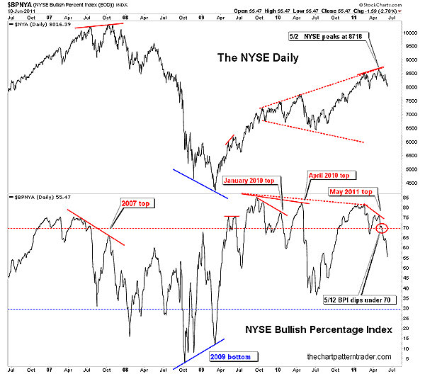
| FIGURE 2: $BPNYA & $NYA, DAILY. Negative divergence formed while the BPI was above 70%, warning traders of a dangerously overextended market. On May 12, the negative divergence played out as the BPI dipped below 70% (circled in red on the dotted red line), marking a new sell signal. |
| Graphic provided by: StockCharts.com. |
| |
| The NYSE BPI daily chart is plotted as a line in the lower window of Figure 2, with the NYSE daily chart posted above it in the upper window. The overbought level at 70% is marked with a dotted red line, and the oversold level at 30% has a blue dotted line. On May 2, 2011, the NYSE surged to a new high at 8718, but the BPI diverged from the NYSE, forming a lower high. This negative divergence formed while the readings on the BPI were above 70%, clearly warning traders of a dangerously overextended market. A few days later on May 12, the BPI dipped below 70% (circled in red on the dotted red line) as a further indictment that market was topping. A new bearish signal was triggered once the BPI sank below 70%. Note in Figure 2 that the tops and bottoms were accompanied by a divergence. The bearish divergence in 2007 marked the market top. A bullish divergence formed at the 2009 bottom. A bearish divergence at the January and April 2010 peaks marked turning points for the market. And finally, the bearish divergence mentioned above, which appeared just as the NYSE peaked in early May. |
| Market breadth is a yardstick that measures the overall strength of the market. A clear warning sign is being given with the most recent bearish signal on the BPI; that market breadth is deteriorating and that danger lies ahead. The BPI has accurately called the tops in January and April 2010, the summer peak in 2009, and the market top in 2007. There is a high probability that this signal may also be marking another important top for the market. It is interesting to note that a massive broadening formation has formed on the NYSE daily (upper window, Figure 2), which is a bearish pattern, which often coincides with major tops. |
Ron Walker is an active trader and technical analyst. He operates an educational website dedicated to the study of Technical Analysis. The website offers free market analysis with daily video presentations and written commentaries. Ron is a video pioneer, being one of the first to utilize the internet producing Technical Analysis videos. His website is thechartpatterntrader.com
| Website: | thechartpatterntrader.com |
| E-mail address: | thechartpatterntrader@gmail.com |
Click here for more information about our publications!
PRINT THIS ARTICLE

Request Information From Our Sponsors
- StockCharts.com, Inc.
- Candle Patterns
- Candlestick Charting Explained
- Intermarket Technical Analysis
- John Murphy on Chart Analysis
- John Murphy's Chart Pattern Recognition
- John Murphy's Market Message
- MurphyExplainsMarketAnalysis-Intermarket Analysis
- MurphyExplainsMarketAnalysis-Visual Analysis
- StockCharts.com
- Technical Analysis of the Financial Markets
- The Visual Investor
- VectorVest, Inc.
- Executive Premier Workshop
- One-Day Options Course
- OptionsPro
- Retirement Income Workshop
- Sure-Fire Trading Systems (VectorVest, Inc.)
- Trading as a Business Workshop
- VectorVest 7 EOD
- VectorVest 7 RealTime/IntraDay
- VectorVest AutoTester
- VectorVest Educational Services
- VectorVest OnLine
- VectorVest Options Analyzer
- VectorVest ProGraphics v6.0
- VectorVest ProTrader 7
- VectorVest RealTime Derby Tool
- VectorVest Simulator
- VectorVest Variator
- VectorVest Watchdog
