HOT TOPICS LIST
- MACD
- Fibonacci
- RSI
- Gann
- ADXR
- Stochastics
- Volume
- Triangles
- Futures
- Cycles
- Volatility
- ZIGZAG
- MESA
- Retracement
- Aroon
INDICATORS LIST
LIST OF TOPICS
PRINT THIS ARTICLE
by Mike Carr, CMT
Rate of change is bearish for crude oil on monthly and daily charts.
Position: Sell
Mike Carr, CMT
Mike Carr, CMT, is a member of the Market Technicians Association, and editor of the MTA's newsletter, Technically Speaking. He is also the author of "Smarter Investing in Any Economy: The Definitive Guide to Relative Strength Investing," and "Conquering the Divide: How to Use Economic Indicators to Catch Stock Market Trends."
PRINT THIS ARTICLE
RATE CHANGE - PRICE
Crude Oil Looks Bearish
05/18/11 08:12:15 AMby Mike Carr, CMT
Rate of change is bearish for crude oil on monthly and daily charts.
Position: Sell
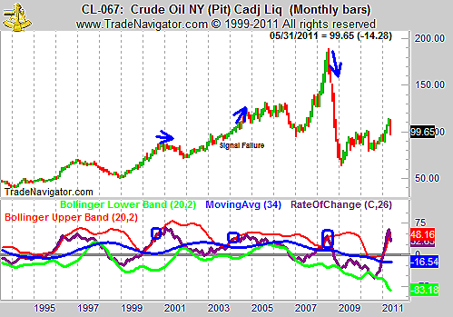
| Long-term trends are visible on monthly charts. Figure 1 shows the long-term view of oil and includes the rate of change (ROC) indicator with Bollinger bands. Overbought markets tend to see ROC extend above the upper band, and oversold markets reach the lower band. Market reversals can be expected when the ROC moves back between the bands. Sell signals are highlighted on the chart, and like any other indicator, they don't always work. |

|
| FIGURE 1: CRUDE OIL, MONTHLY. ROC is showing a sell signal based on the ROC on the monthly chart. |
| Graphic provided by: Trade Navigator. |
| |
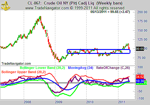
| The weekly chart of oil is shown in Figure 2. Here we see that oil has fallen back toward a key trading range level that has contained most of the price action for the past couple years. The level between 85 and 95 has offered significant support and resistance and we may see prices consolidate here yet again. |

|
| FIGURE 2: CRUDE OIL, WEEKLY. ROC is at the lower band and prices are at a prior resistance level, which may become support now. |
| Graphic provided by: Trade Navigator. |
| |
| The daily chart (Figure 3) also shows the price increase of the past few weeks has most likely ended. ROC has plummeted along with prices, and actually led the way lower. |

|
| FIGURE 3: CRUDE OIL, MONTHLY. The momentum divergence is obvious. |
| Graphic provided by: Trade Navigator. |
| |
| We may not see a crash in oil as many hope, since it would lead to lower gas prices. But we are likely to see a consolidation, and perhaps a slight drift lower in prices. |
Mike Carr, CMT, is a member of the Market Technicians Association, and editor of the MTA's newsletter, Technically Speaking. He is also the author of "Smarter Investing in Any Economy: The Definitive Guide to Relative Strength Investing," and "Conquering the Divide: How to Use Economic Indicators to Catch Stock Market Trends."
| Website: | www.moneynews.com/blogs/MichaelCarr/id-73 |
| E-mail address: | marketstrategist@gmail.com |
Click here for more information about our publications!
Comments

Request Information From Our Sponsors
- StockCharts.com, Inc.
- Candle Patterns
- Candlestick Charting Explained
- Intermarket Technical Analysis
- John Murphy on Chart Analysis
- John Murphy's Chart Pattern Recognition
- John Murphy's Market Message
- MurphyExplainsMarketAnalysis-Intermarket Analysis
- MurphyExplainsMarketAnalysis-Visual Analysis
- StockCharts.com
- Technical Analysis of the Financial Markets
- The Visual Investor
- VectorVest, Inc.
- Executive Premier Workshop
- One-Day Options Course
- OptionsPro
- Retirement Income Workshop
- Sure-Fire Trading Systems (VectorVest, Inc.)
- Trading as a Business Workshop
- VectorVest 7 EOD
- VectorVest 7 RealTime/IntraDay
- VectorVest AutoTester
- VectorVest Educational Services
- VectorVest OnLine
- VectorVest Options Analyzer
- VectorVest ProGraphics v6.0
- VectorVest ProTrader 7
- VectorVest RealTime Derby Tool
- VectorVest Simulator
- VectorVest Variator
- VectorVest Watchdog
