HOT TOPICS LIST
- MACD
- Fibonacci
- RSI
- Gann
- ADXR
- Stochastics
- Volume
- Triangles
- Futures
- Cycles
- Volatility
- ZIGZAG
- MESA
- Retracement
- Aroon
INDICATORS LIST
LIST OF TOPICS
PRINT THIS ARTICLE
by Alan R. Northam
Statistical analysis of the energy market sector shows that over the near term, this market should continue to move higher. However, a market correction or even a long-term downtrend reversal looms on the horizon.
Position: N/A
Alan R. Northam
Alan Northam lives in the Dallas, Texas area and as an electronic engineer gave him an analytical mind from which he has developed a thorough knowledge of stock market technical analysis. His abilities to analyze the future direction of the stock market has allowed him to successfully trade of his own portfolio over the last 30 years. Mr. Northam is now retired and trading the stock market full time. You can reach him at inquiry@tradersclassroom.com or by visiting his website at http://www.tradersclassroom.com. You can also follow him on Twitter @TradersClassrm.
PRINT THIS ARTICLE
STATISTICS
Energy Sector To Continue Higher Near Term
05/09/11 08:45:50 AMby Alan R. Northam
Statistical analysis of the energy market sector shows that over the near term, this market should continue to move higher. However, a market correction or even a long-term downtrend reversal looms on the horizon.
Position: N/A
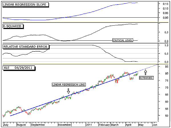
| Figure 1 shows the long-term trend of the energy market sector as measured by the Select Sector SPDR ETF (XLE). The bottom panel shows the daily trading bars along with the 200-day linear regression line. The dotted blue line represents the extension of the 200-day linear regression trendline. The linear regression line represents the model of XLE. By model, I mean that this line represents the direction and slope of the price of XLE and can be represented mathematically as y = 49.736 + 0.1595 x where y equals price and x equals time. If price moved exactly according to this model, then tomorrow's price would be calculated to be y = 49.736 + 0.1595 x 201, which equals 81.80. This is plotted on the chart along the extended linear regression line (dotted blue line). However, by looking at the chart we can see that price does not follow the linear regression line exactly but moves around it. If the R-squared indicator were exactly 1.0, then all the closing prices would lay exactly on the linear regression line and tomorrow's price calculation would be exactly the price at which the market closes tomorrow. |

|
| FIGURE 1: XLE, DAILY. This chart shows the daily price chart in the bottom panel along with the 200-day linear regression trendline, the linear regression slope indicator in the top panel, the R-squared indicator in the second panel, and the relative standard error index in the third. |
| Graphic provided by: MetaStock. |
| |
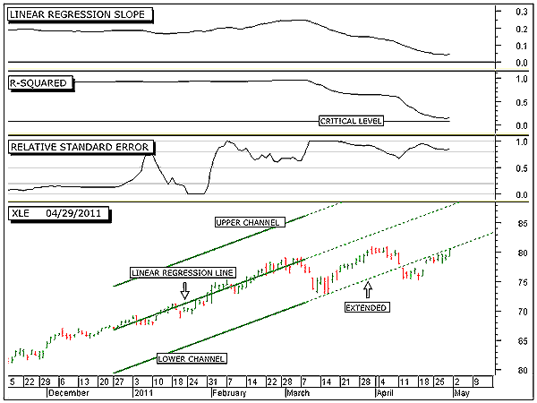
| The linear regression slope indicator in the top panel crossed above its zero line in mid-November 2010. This crossing marks the beginning of the current long-term upward rally for XLE. Note that this indicator has continued to move upward until just recently. The upward movement of this indicator represents the period of price acceleration, a period of time when each day's price swing is greater than the previous day's price swing. Note, however, that beginning in April this indicator has started to move sideways, signaling the end of the period of price acceleration. This sideways movement in the slope indicator is a warning that the upward rally is starting to tire. Should the linear regression slope indicator turn downward, it will signal price deceleration, which normally occurs near the end of a rally. Thus, a turndown in this indicator would signal the beginning of the ending stage of the current long-term upward rally. Note that the current level of the linear regression slope indicator is currently at 0.1595 and part of the equation for the model of XLE. Thus, this part of the equation represents the slope of the linear regression line. The R-squared indicator is shown in the second window from the top. This indicator is currently reading 0.95 on a zero to 1 scale, indicating a very strong uptrend in progress. With a reading of 0.95, this indicator is signaling that 95% of the current upward rally is contributed to price following the linear regression line. The other 5% is due to random variations around the linear regression line. It is this small amount of random variation that keeps price from moving exactly along the plotted linear regression line. The higher the R-squared value, the closer price follows the linear regression line and the lower the value the further price swings around this line. With a high reading of 0.95 or 95%, it can be expected that price will continue to follow closely along the extended upsloping linear regression line. However, at some point in the future, the price model for XLE will break down and the long-term upward rally will come to an end. The third window from the top shows the relative standard error index (RSEI). This index is currently below 0.2, indicating low volatility. This indicator is very sensitive to volatility and is the indicator used to initially detect the possible breakdown of the linear regression model for XLE and the end of the long-term upward rally. Such a low level of volatility normally occurs when price is trending in a strong upward rally and is closely following the linear regression line. Once this index moves above 0.2, it will signal that volatility is starting to increase, which then signals that the top of the long-term upward rally is drawing to a close. The long-term statistical analysis shows that XLE should continue to follow the extended upward linear regression line. Of course, we all know that nothing continues in an upward direction forever and we must be on guard for the inevitable when the linear regression model for XLE starts to break down. The first signal that we normally get that this is about to happen is when the RSEI index starts to move above 0.2. To detect when the long-term model of XLE will start to break down, we look at a shorter time frame. Figure 2 shows XLE over the intermediate term. The bottom panel shows the daily price bars along with the 50-day linear regression line (model) and its +/-2 sigma channel lines. Note that in early March, price moved down to the lower extended channel line before it bounced upward and started to rally back up to the linear regression line. Note also that at the end of March, price failed to reach the linear regression line before it turned back down; this is called a price failure. Note further that once this price failure occurred, price moved back down and broke down below the lower channel line; this is known as a price breakdown. Tip: Price failure usually leads to a price breakdown. The breach of this lower channel line signals the end of the current uptrend and the beginning of a new trend. Sometimes, this new trend is a more shallow upsloping rally, sometimes price moves sideways in what is more commonly referred to as a price range, and sometimes the trend will reverse direction and start to rally in the opposite direction. Here it looks like a more shallow upward rally has begun. If this is true, then we should start to see price fail to reach the 200-day linear regression line as shown in Figure 1, and the relative standard error index in Figure 1 should also start to rise. |

|
| FIGURE 2: XLE, DAILY. This chart shows the daily price chart in the bottom panel along with the 50-day linear regression trendline and its upper and lower channel lines, the linear regression slope indicator in the top panel, the R-squared indicator in the second panel, and the relative standard error index in the third. |
| Graphic provided by: MetaStock. |
| |
| In conclusion, the long-term statistical analysis shows that XLE will most likely continue to move in an upward direction. However, to get a more sensitive analysis concerning the health of this long-term upward rally, we turn to a shorter time period. The intermediate-term statistical analysis shows that XLE is close to a reversal in trend. This reversal in trend could be nothing more than a market correction to relieve the market of its excessive gains or it could be the beginning of a long-term downward selloff. To determine if the upcoming reversal in trend is an intermediate-term correction or the beginning of a long-term selloff, we must keep our eye on the 200-day linear regression slope indicator and the 200-day R-squared indicator. If the 200-day linear regression slope indicator moves below its zero line and the 200 day R-squared indicator moves below its critical level and then moves back above it, then this will signal that a long-term downward selloff has begun. As long as these conditions do not occur, then any downward swing in price is simply corrective. |
Alan Northam lives in the Dallas, Texas area and as an electronic engineer gave him an analytical mind from which he has developed a thorough knowledge of stock market technical analysis. His abilities to analyze the future direction of the stock market has allowed him to successfully trade of his own portfolio over the last 30 years. Mr. Northam is now retired and trading the stock market full time. You can reach him at inquiry@tradersclassroom.com or by visiting his website at http://www.tradersclassroom.com. You can also follow him on Twitter @TradersClassrm.
| Garland, Tx | |
| Website: | www.tradersclassroom.com |
| E-mail address: | inquiry@tradersclassroom.com |
Click here for more information about our publications!
PRINT THIS ARTICLE

Request Information From Our Sponsors
- StockCharts.com, Inc.
- Candle Patterns
- Candlestick Charting Explained
- Intermarket Technical Analysis
- John Murphy on Chart Analysis
- John Murphy's Chart Pattern Recognition
- John Murphy's Market Message
- MurphyExplainsMarketAnalysis-Intermarket Analysis
- MurphyExplainsMarketAnalysis-Visual Analysis
- StockCharts.com
- Technical Analysis of the Financial Markets
- The Visual Investor
- VectorVest, Inc.
- Executive Premier Workshop
- One-Day Options Course
- OptionsPro
- Retirement Income Workshop
- Sure-Fire Trading Systems (VectorVest, Inc.)
- Trading as a Business Workshop
- VectorVest 7 EOD
- VectorVest 7 RealTime/IntraDay
- VectorVest AutoTester
- VectorVest Educational Services
- VectorVest OnLine
- VectorVest Options Analyzer
- VectorVest ProGraphics v6.0
- VectorVest ProTrader 7
- VectorVest RealTime Derby Tool
- VectorVest Simulator
- VectorVest Variator
- VectorVest Watchdog
