HOT TOPICS LIST
- MACD
- Fibonacci
- RSI
- Gann
- ADXR
- Stochastics
- Volume
- Triangles
- Futures
- Cycles
- Volatility
- ZIGZAG
- MESA
- Retracement
- Aroon
INDICATORS LIST
LIST OF TOPICS
PRINT THIS ARTICLE
by Mike Carr, CMT
Traders need volatility to make money, and lumber has been offering large price moves in short time frames.
Position: Buy
Mike Carr, CMT
Mike Carr, CMT, is a member of the Market Technicians Association, and editor of the MTA's newsletter, Technically Speaking. He is also the author of "Smarter Investing in Any Economy: The Definitive Guide to Relative Strength Investing," and "Conquering the Divide: How to Use Economic Indicators to Catch Stock Market Trends."
PRINT THIS ARTICLE
BOLLINGER BANDS
Lumber As A Trader's Dream
05/02/11 08:30:52 AMby Mike Carr, CMT
Traders need volatility to make money, and lumber has been offering large price moves in short time frames.
Position: Buy
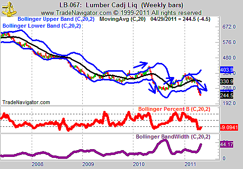
| Many believe that changes in volatility are easier to predict than price changes. A weekly chart of lumber, shown in Figure 1, seems to illustrate this point. Prices have moved sharply higher and lower, and the Bollinger BandWidth (the purple line in the lower frame of the chart) has shown much steadier action. The PercentB indicator can help traders time their entries. |

|
| FIGURE 1: LB, WEEKLY. Lumber has moved consistently between its upper and lower Bollinger bands. |
| Graphic provided by: Trade Navigator. |
| |
| An initial break of the upper band was followed by a brief reversal on each occasion in 2010, and the subsequent break offered a timely buy signal. Oversold levels, signaled by a break of the lower band, marked the end of the decline. |
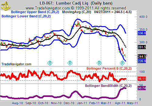
| The daily chart, in Figure 2, refines that approach and highlights short-term trading opportunities. Breaks of the Bollinger band on this daily chart tend to mark reversal points. Increased volatility, signaled by the BandWidth increasing, tend to be followed by consolidations. |

|
| FIGURE 2: LB, DAILY. The daily chart reflects an extreme level of volatility. |
| Graphic provided by: Trade Navigator. |
| |
| Lumber's recent decline has been sharp, but is likely to be near an end. Higher prices may not follow immediately, but the next trend is more likely to be up than down in this economically sensitive commodity. |
Mike Carr, CMT, is a member of the Market Technicians Association, and editor of the MTA's newsletter, Technically Speaking. He is also the author of "Smarter Investing in Any Economy: The Definitive Guide to Relative Strength Investing," and "Conquering the Divide: How to Use Economic Indicators to Catch Stock Market Trends."
| Website: | www.moneynews.com/blogs/MichaelCarr/id-73 |
| E-mail address: | marketstrategist@gmail.com |
Click here for more information about our publications!
PRINT THIS ARTICLE

Request Information From Our Sponsors
- StockCharts.com, Inc.
- Candle Patterns
- Candlestick Charting Explained
- Intermarket Technical Analysis
- John Murphy on Chart Analysis
- John Murphy's Chart Pattern Recognition
- John Murphy's Market Message
- MurphyExplainsMarketAnalysis-Intermarket Analysis
- MurphyExplainsMarketAnalysis-Visual Analysis
- StockCharts.com
- Technical Analysis of the Financial Markets
- The Visual Investor
- VectorVest, Inc.
- Executive Premier Workshop
- One-Day Options Course
- OptionsPro
- Retirement Income Workshop
- Sure-Fire Trading Systems (VectorVest, Inc.)
- Trading as a Business Workshop
- VectorVest 7 EOD
- VectorVest 7 RealTime/IntraDay
- VectorVest AutoTester
- VectorVest Educational Services
- VectorVest OnLine
- VectorVest Options Analyzer
- VectorVest ProGraphics v6.0
- VectorVest ProTrader 7
- VectorVest RealTime Derby Tool
- VectorVest Simulator
- VectorVest Variator
- VectorVest Watchdog
