HOT TOPICS LIST
- MACD
- Fibonacci
- RSI
- Gann
- ADXR
- Stochastics
- Volume
- Triangles
- Futures
- Cycles
- Volatility
- ZIGZAG
- MESA
- Retracement
- Aroon
INDICATORS LIST
LIST OF TOPICS
PRINT THIS ARTICLE
by Alan R. Northam
Statistical analysis is used to show that Exxon has completed its upward rally and is now moving in a sideways trading range. A breakout above or a breakdown below the current horizontal trading range is now necessary to determine the future direction of Exxon.
Position: N/A
Alan R. Northam
Alan Northam lives in the Dallas, Texas area and as an electronic engineer gave him an analytical mind from which he has developed a thorough knowledge of stock market technical analysis. His abilities to analyze the future direction of the stock market has allowed him to successfully trade of his own portfolio over the last 30 years. Mr. Northam is now retired and trading the stock market full time. You can reach him at inquiry@tradersclassroom.com or by visiting his website at http://www.tradersclassroom.com. You can also follow him on Twitter @TradersClassrm.
PRINT THIS ARTICLE
Exxon Mobil Topping?
04/26/11 11:52:02 AMby Alan R. Northam
Statistical analysis is used to show that Exxon has completed its upward rally and is now moving in a sideways trading range. A breakout above or a breakdown below the current horizontal trading range is now necessary to determine the future direction of Exxon.
Position: N/A
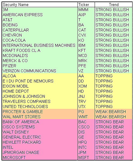
| Figure 1 shows the trend status of the 30 Dow Jones Industrial Average (DJIA) stocks. The trend status is based upon signals generated by the 50-day linear regression analysis. The 13 stocks highlighted in light green all remain in strong uptrends. The seven stocks highlighted in light yellow are suspected to be in their respective topping stages. The two stocks highlighted in tan are currently in weak downtrends, and the eight stocks highlighted in rose are all in strong downtrends. |

|
| FIGURE 1: DJIA 30 STOCKS. This table shows the current trends of each of the 30 stocks composing the DJIA highlighted in different colors. |
| Graphic provided by: Microsoft Excel. |
| |
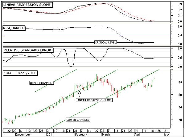
| The bottom panel of Figure 2 shows the daily bar chart of Exxon Mobil (XOM). This panel also shows the extended 50-day linear regression trendline along with its upper and lower two sigma channel lines. In a statistical sense, these two channel lines contain 95% of all the closing prices over this period. Any price movement outside the boundaries of this channel is considered a significant change in trader psychology. From mid-December 2010 until late February 2011, the price of XOM followed the linear regression trend line quite closely. This is the period of strength in the uptrend. This is also shown by the rising linear regression slope indicator in the top panel. From mid-February to mid-March, the closing price of XOM moved away from the linear regression trendline and moved downward to the lower channel line. Since increased volatility normally occurs just before a trend reversal, this period of increased volatility most likely marks the beginning of the end of the upward rally. This is also shown by the rapid upward climb of the relative standard error index (RSEI) shown in the third panel from the top in Figure 2. From mid-March to early April, price moved along the lower channel line, as that this line acted as a strong line of support for XOM. Unfortunately, XOM was not able to rally back to the linear regression line (middle line), indicating that the upward rally had become weak. This weakness can also be seen by the R-squared indicator moving downward and below its critical level during this time period. Then in early April, price started to move downward and away from the lower channel line, signaling a change in trader psychology and the end of the upward rally. |

|
| FIGURE 2: XOM, DAILY. This chart shows the daily price chart in the bottom panel along with the 50-day linear regression trendline and its upper and lower channel lines, the linear regression slope indicator in the top panel, the R-squared indicator in the second panel, and the relative standard error index in the third. This figure shows the breakdown of the upward rally of Exxon. |
| Graphic provided by: MetaStock. |
| |
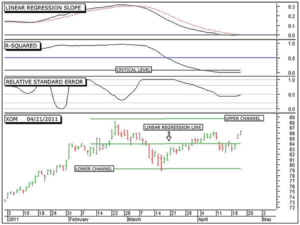
| Figure 3 shows the linear regression trendline along with its upper and lower three sigma channel lines over the most recent 50-day period. Three sigma channel lines were chosen instead of two sigma channel lines, as price movement is normally more volatile during periods of sideways movement. This chart highlights that from early February, the price of XOM has moved net sideways. A breakout above the upper channel line or a breakdown below the lower channel line is now necessary to determine the future direction of XOM. However, it can be seen that it only took 15 days for XOM to move from its late February peak to the lower channel line in mid March. It has now taken 26 days to move back upward to its current level and has yet to reach the upper channel line. This indicates that a significant struggle is taking place to move in the upward direction. If this upward struggle consumes all the buying power before price can break out above the upper channel line, then price will most likely fall. Failure to make a new higher high will most likely change the psychology of traders from buyers to sellers, and XOM could see lower lows ahead instead of higher highs. |

|
| FIGURE 3: XOM, DAILY. This chart shows the daily price chart in the bottom panel along with the 50-day linear regression trendline and its upper and lower channel lines, the linear regression slope indicator in the top panel, the R-squared indicator in the second panel, and the relative standard error index in the third. This figure shows that Exxon is currently in a trading range. |
| Graphic provided by: MetaStock. |
| |
| In conclusion, only 13 out of the total of 30 stocks that make up the DJIA remain in strong uptrends and eight are in strong downtrends. This leaves nine stocks that are either correcting, topping, or in their early stage of reversing, of which Exxon is one. Exxon made its most recent high two months ago. Since that time, price has broken down below the upsloping linear regression trading channel and has been moving in a sideways direction. It is now necessary for price to either break out above the upper channel line, in which case Exxon will rejoin the ranks of those stocks within the DJIA that are still in upward trends, or should Exxon break down below the lower channel line, then it will join those stocks that are currently in downtrends. |
Alan Northam lives in the Dallas, Texas area and as an electronic engineer gave him an analytical mind from which he has developed a thorough knowledge of stock market technical analysis. His abilities to analyze the future direction of the stock market has allowed him to successfully trade of his own portfolio over the last 30 years. Mr. Northam is now retired and trading the stock market full time. You can reach him at inquiry@tradersclassroom.com or by visiting his website at http://www.tradersclassroom.com. You can also follow him on Twitter @TradersClassrm.
| Garland, Tx | |
| Website: | www.tradersclassroom.com |
| E-mail address: | inquiry@tradersclassroom.com |
Click here for more information about our publications!
PRINT THIS ARTICLE

Request Information From Our Sponsors
- StockCharts.com, Inc.
- Candle Patterns
- Candlestick Charting Explained
- Intermarket Technical Analysis
- John Murphy on Chart Analysis
- John Murphy's Chart Pattern Recognition
- John Murphy's Market Message
- MurphyExplainsMarketAnalysis-Intermarket Analysis
- MurphyExplainsMarketAnalysis-Visual Analysis
- StockCharts.com
- Technical Analysis of the Financial Markets
- The Visual Investor
- VectorVest, Inc.
- Executive Premier Workshop
- One-Day Options Course
- OptionsPro
- Retirement Income Workshop
- Sure-Fire Trading Systems (VectorVest, Inc.)
- Trading as a Business Workshop
- VectorVest 7 EOD
- VectorVest 7 RealTime/IntraDay
- VectorVest AutoTester
- VectorVest Educational Services
- VectorVest OnLine
- VectorVest Options Analyzer
- VectorVest ProGraphics v6.0
- VectorVest ProTrader 7
- VectorVest RealTime Derby Tool
- VectorVest Simulator
- VectorVest Variator
- VectorVest Watchdog
