HOT TOPICS LIST
- MACD
- Fibonacci
- RSI
- Gann
- ADXR
- Stochastics
- Volume
- Triangles
- Futures
- Cycles
- Volatility
- ZIGZAG
- MESA
- Retracement
- Aroon
INDICATORS LIST
LIST OF TOPICS
PRINT THIS ARTICLE
by Sharon Yamanaka
Krispy Kreme Doughnuts, Inc. (KKD) has been one of the few bright spots in the past year's nightmarishly bear market. But as the stock market bottoms out and other companies begin seeing profits again, how long will KKD continue its strong upward trend?
Position: Hold
Sharon Yamanaka
PRINT THIS ARTICLE
TECHNICAL ANALYSIS
Krispy Kreme Part II- A Closer Look at an Inflated Stock
02/15/02 10:33:18 AMby Sharon Yamanaka
Krispy Kreme Doughnuts, Inc. (KKD) has been one of the few bright spots in the past year's nightmarishly bear market. But as the stock market bottoms out and other companies begin seeing profits again, how long will KKD continue its strong upward trend?
Position: Hold
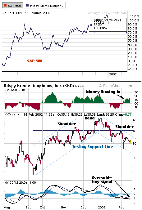
| Taking a closer look at Krispy Kreme's chart for the past six months, you can see a number of contradictory technical signals developing. On the negative side, a head and shoulders pattern developed, starting at the beginning of November and ending on February 4, 2001. KKD is also in a downward trend as show in in Figure 1, third chart from the top. Both are considered strong indicators and normally if they occured I would sell or short the stock. But in this case, there are a number of reasons to hold on to the stock to see if it will eke out a few more profitable months, or perhaps even continue on its bullish ways. |
| Using Figure 1 as my guide, the first chart shows a relative performance chart using the S&P 500 as the baseline. Krispy Kreme has been exremely bullish in the past six months, rising 80% over the S&P, and it should continue to have strong retail sales of their doughnuts. The company plans to open multiple stores in the coming year, leaving room for the stock to rise. |

|
| Figure 1: Top chart: KKD's relative performance chart using the S&P 500 as a baseline; Chart 2: Chaikin Money Flow; Chart 3: 6-month daily chart; Chart 4: MACD. |
| Graphic provided by: StockCharts.com. |
| |
| The second chart from the top is the Chaikin Money Flow (CMF). This is showing money flowing into the stock. That, to me, was a very strong indicator of the stock's strength. The CMF corresponds to the rise and fall of the KKD's price well enough that if the indicator started showing money flowing out, I would consider selling. But for now, it's indicating a possible rise in the stock. |
| Going on to the third section, this shows the daily chart containing the head and shoulders pattern and the trend channels. There is also a support line at 35 which the head and shoulders pattern failed to penetrate. That seems to negate that pattern, but KKD is still travelling down the trend channel. In part one I pointed out the a "three white soldiers" candlestick pattern that formed on February 4-6. On Febrary 13-14 another strong reversal pattern, the engulfing pattern, formed. Both of these reversal patterns formed at the 35 support line. The support line seems to be holding and reaction is very strong and positive in the opposite direction when it is reached. |
| Finally, using another popular indicator, the MACD, KKD is in an oversold area and the two MACD lines seem to be ready to cross and give a buy signal-- another reason to hang on to the stock. Given this set of chart analysis, KKD seems ready to move up, but given its inflated status with a P/E currently at 94, a lot of extra thought--and worry--need to be put into any negative indicators. If this stock goes down, it could be in for a very big fall. |
| Title: | Staff writer |
| Company: | Technical Analysis, Inc. |
| Website: | www.traders.com |
| E-mail address: | syamanaka@traders.com |
Traders' Resource Links | |
| Charting the Stock Market: The Wyckoff Method -- Books | |
| Working-Money.com -- Online Trading Services | |
| Traders.com Advantage -- Online Trading Services | |
| Technical Analysis of Stocks & Commodities -- Publications and Newsletters | |
| Working Money, at Working-Money.com -- Publications and Newsletters | |
| Traders.com Advantage -- Publications and Newsletters | |
| Professional Traders Starter Kit -- Software | |
Click here for more information about our publications!
Comments
Date:�02/15/02Rank:�Comment:�at least send an email to me thanking me to bring this to your attentio.

Request Information From Our Sponsors
- VectorVest, Inc.
- Executive Premier Workshop
- One-Day Options Course
- OptionsPro
- Retirement Income Workshop
- Sure-Fire Trading Systems (VectorVest, Inc.)
- Trading as a Business Workshop
- VectorVest 7 EOD
- VectorVest 7 RealTime/IntraDay
- VectorVest AutoTester
- VectorVest Educational Services
- VectorVest OnLine
- VectorVest Options Analyzer
- VectorVest ProGraphics v6.0
- VectorVest ProTrader 7
- VectorVest RealTime Derby Tool
- VectorVest Simulator
- VectorVest Variator
- VectorVest Watchdog
- StockCharts.com, Inc.
- Candle Patterns
- Candlestick Charting Explained
- Intermarket Technical Analysis
- John Murphy on Chart Analysis
- John Murphy's Chart Pattern Recognition
- John Murphy's Market Message
- MurphyExplainsMarketAnalysis-Intermarket Analysis
- MurphyExplainsMarketAnalysis-Visual Analysis
- StockCharts.com
- Technical Analysis of the Financial Markets
- The Visual Investor
