HOT TOPICS LIST
- MACD
- Fibonacci
- RSI
- Gann
- ADXR
- Stochastics
- Volume
- Triangles
- Futures
- Cycles
- Volatility
- ZIGZAG
- MESA
- Retracement
- Aroon
INDICATORS LIST
LIST OF TOPICS
PRINT THIS ARTICLE
by Alan R. Northam
Statistical analysis is used here to show that the financial sector is close to reversing its weak downward trend to a new uptrend. However, this analysis also shows that this reversal may be diverted.
Position: N/A
Alan R. Northam
Alan Northam lives in the Dallas, Texas area and as an electronic engineer gave him an analytical mind from which he has developed a thorough knowledge of stock market technical analysis. His abilities to analyze the future direction of the stock market has allowed him to successfully trade of his own portfolio over the last 30 years. Mr. Northam is now retired and trading the stock market full time. You can reach him at inquiry@tradersclassroom.com or by visiting his website at http://www.tradersclassroom.com. You can also follow him on Twitter @TradersClassrm.
PRINT THIS ARTICLE
LIN. REGTREND
Financial Sector Reversal In Trouble
01/19/11 02:40:08 PMby Alan R. Northam
Statistical analysis is used here to show that the financial sector is close to reversing its weak downward trend to a new uptrend. However, this analysis also shows that this reversal may be diverted.
Position: N/A
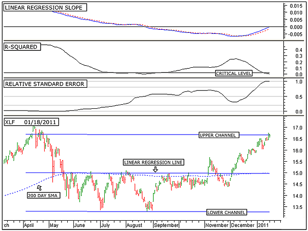
| Figure 1 shows the long-term analysis of the Financial Select Sector SPDR ETF (XLF). On the price chart, in the bottom window of Figure 1, is shown the 200-day linear regression line along with its two standard deviation upper and lower channel lines. Statistically, these two channel lines contain 95% of all trading activity. Thus, the upper channel line represents a strong line of resistance and the lower channel line as a strong line of support. The middle line is the linear regression trendline and represents the median price or trend. A move in price above the linear regression line represents overzealous buyers, while a move below represents overzealous sellers. The first thing to note in Figure 1 is that the linear regression line and the linear regression channel lines are pointing in a shallow downward direction. This is an indication that XLF has been in a weak downtrend over the last 200 trading days. The second thing to take note of is that price has moved up to the upper channel line, indicating extremely overzealous buying since the beginning of December 2010. |

|
| FIGURE 1: XLF, DAILY. This chart shows the daily price chart of the Financial Select Sector SPDR ETF in the bottom window along with the 200-day linear regression line and the upper and lower linear regression channel lines, the linear regression slope indicator in the top window, the R-squared indicator in the second window, and the relative standard error indicator in the third. |
| Graphic provided by: MetaStock. |
| |
| The relative standard error indicator is a measure of how close to or how far away price has wandered from the linear regression line, and it is also a measure of price volatility. When price is equal to the linear regression line, the standard error is zero. When price moves away from the linear regression line, the standard error increases, indicating an increase in volatility. The problem with using the normal standard error indicator is in quantifying the strength of volatility. Thus, I have developed the relative standard error indicator. The relative standard error indicator moves between zero and one, with zero representing no volatility in price and one representing high volatility. It is important to know when volatility has become significantly high, as high volatility normally occurs near or at the end of a trend and is an early warning of a possible change in trend. Currently, the relative standard error indicator is at an extreme level, indicating extreme volatility in price. This is an indication that the long-term downward rally could be in its final stage. Normally, the process that unfolds during a change in trend is that volatility first spikes upward, as in the current case of XLF. Second, a weakening of the current trend occurs. To see if the current long-term trend of XLF is weakening, we turn our attention to the R-squared indicator. The R-squared indicator is a measure of the strength of the trend. When this indicator is above its critical level, a strong trend is in place. Statistically, when R-squared is above its critical level, it indicates that there is a 95% probability that a significantly strong trend is in place. The critical level is different for differing time periods. For long time periods, the critical level is low and moves upward as the time period shortens. The calculation of this critical level involves a complex statistical calculation. I have programmed this complex statistical calculation into the R-squared indicator such that when the time period is selected, the critical level automatically adjusts. When the R-squared indicator falls below its critical level, statistically, there is no longer the presence of a significant trend. Note that the R-squared indicator has recently moved below its critical level, indicating the lack of a significant trend. In other words, a weak downtrend is in place. Thus, the first two dominoes have fallen for a reversal in the long trend from down to up. The first domino is that volatility has moved to a high level, and the second domino is that the current trend has become weak. The next step in identifying a reversal is to identify when the linear regression line turns upward. To monitor this, we turn to the linear regression slope indicator in the top window of Figure 1. The linear regression slope indicator does two things: It not only determines when a trend has reversed directions, it can also measure price momentum. When the linear regression slope indicator is below zero, as is the current case, it indicates that the linear regression line, drawn over the price chart in the bottom window of Figure 1, is pointing downward and as a result indicates that the trend is downward. When the indicator is above zero it indicates an uptrend. As can be seen by this indicator, it is currently below its zero line but is moving upward. When the linear regression slope indicator is below its zero line and moving upward, it is an indication of price deceleration. Price deceleration starts once the linear regression slope indicator reverses direction from pointing downward to pointing up. To help in this determination, a nine-day simple moving average of this indicator is plotted (see red dotted line). Price deceleration normally occurs just before a change in trend. By monitoring this indicator, it can be determined when a change in trend is expected to occur. Note that the indicator is now just slightly below its zero line and continues to point upward with no sign of rolling over. This is an indication that the long-term trend of XLF is about to change from down to up. Figure 1 shows that XLF is in a weak downtrend. This figure also shows that since December 2010, buyers have been overzealous and has bought this market up to the upper linear regression channel line. Statistically, the upper and lower channel lines contain 95% of the price action. Thus, this upper channel line acts as a strong line of resistance. The question now is, "Will buyers continue to buy this market higher, or will the sellers jump in and start selling this market lower?" To help answer this question, we look toward the shorter-term time frame. However, if we look at too short a time frame, we will only identify short-term pullbacks in the current trend. To help in this determination, we turn to the intermediate-term time frame. |

|
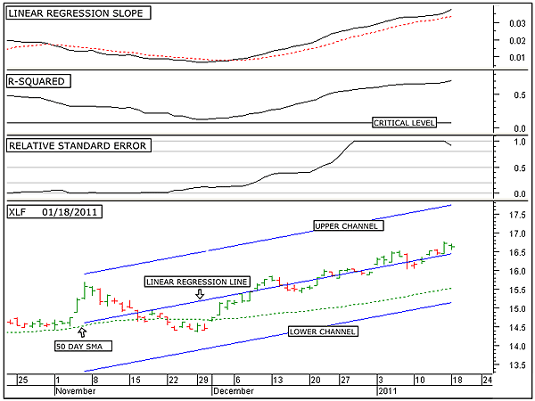
| FIGURE 2: XLF, DAILY. This chart shows the daily price chart of the Financial Select Sector SPDR ETF in the bottom window along with the 50-day linear regression line and the upper and lower linear regression channel lines, the linear regression slope indicator in the top window, the R-squared indicator in the second window, and the relative standard error indicator in the third. |
| Graphic provided by: MetaStock. |
| |
| Figure 2 shows the intermediate-term analysis of XLF. The price chart in the bottom window of Figure 2 shows the 50-day linear regression line, along with its two standard deviation upper and lower channel lines. Note that the linear regression trendline is sloping upward, indicating an intermediate-term uptrend. The relative standard error indicator indicator indicates high volatility. The R-squared indicator is currently above its critical level, indicating that a strong uptrend is in force with a 95% probability that the current trend will continue in the future. The linear regression slope indicator indicates that price continues to accelerate, signaling that the uptrend remains healthy and strong. The intermediate-term analysis shows that volatility has risen to a high level, completing the first step to an intermediate-term trend reversal. However, the intermediate-term trend remains strong and price continues to accelerate, indicating that the uptrend shows no sign of a reversal. However, with the current level of volatility being high, we should expect a reversal in the intermediate-term trend in the weeks ahead. |
| In conclusion, the Financial Select Sector SPDR ETF (XLF) currently remains in a weak long-term downtrend. This long-term downtrend is, however, vulnerable to an uptrend reversal due to its high level of volatility. Over the intermediate term, this market is also in a strong uptrend. The strength of this intermediate-term trend could very well propel this market sufficiently higher to reverse the long-term trend from down to up. However, since volatility is also high over the intermediate term, the intermediate-term trend could experience a reversal from up to down in the weeks ahead. If this occurs, then the potential for a long-term reversal in trend from down to up for XLF will have been diverted. |
Alan Northam lives in the Dallas, Texas area and as an electronic engineer gave him an analytical mind from which he has developed a thorough knowledge of stock market technical analysis. His abilities to analyze the future direction of the stock market has allowed him to successfully trade of his own portfolio over the last 30 years. Mr. Northam is now retired and trading the stock market full time. You can reach him at inquiry@tradersclassroom.com or by visiting his website at http://www.tradersclassroom.com. You can also follow him on Twitter @TradersClassrm.
| Garland, Tx | |
| Website: | www.tradersclassroom.com |
| E-mail address: | inquiry@tradersclassroom.com |
Click here for more information about our publications!
PRINT THIS ARTICLE

Request Information From Our Sponsors
- VectorVest, Inc.
- Executive Premier Workshop
- One-Day Options Course
- OptionsPro
- Retirement Income Workshop
- Sure-Fire Trading Systems (VectorVest, Inc.)
- Trading as a Business Workshop
- VectorVest 7 EOD
- VectorVest 7 RealTime/IntraDay
- VectorVest AutoTester
- VectorVest Educational Services
- VectorVest OnLine
- VectorVest Options Analyzer
- VectorVest ProGraphics v6.0
- VectorVest ProTrader 7
- VectorVest RealTime Derby Tool
- VectorVest Simulator
- VectorVest Variator
- VectorVest Watchdog
- StockCharts.com, Inc.
- Candle Patterns
- Candlestick Charting Explained
- Intermarket Technical Analysis
- John Murphy on Chart Analysis
- John Murphy's Chart Pattern Recognition
- John Murphy's Market Message
- MurphyExplainsMarketAnalysis-Intermarket Analysis
- MurphyExplainsMarketAnalysis-Visual Analysis
- StockCharts.com
- Technical Analysis of the Financial Markets
- The Visual Investor
