HOT TOPICS LIST
- MACD
- Fibonacci
- RSI
- Gann
- ADXR
- Stochastics
- Volume
- Triangles
- Futures
- Cycles
- Volatility
- ZIGZAG
- MESA
- Retracement
- Aroon
INDICATORS LIST
LIST OF TOPICS
PRINT THIS ARTICLE
by Mike Carr, CMT
Lumber, which is widely followed as an economic indicator, reached its all-time lows that fulfilled major price pattern objectives in 2010.
Position: N/A
Mike Carr, CMT
Mike Carr, CMT, is a member of the Market Technicians Association, and editor of the MTA's newsletter, Technically Speaking. He is also the author of "Smarter Investing in Any Economy: The Definitive Guide to Relative Strength Investing," and "Conquering the Divide: How to Use Economic Indicators to Catch Stock Market Trends."
PRINT THIS ARTICLE
RATE CHANGE - PRICE
Lumber's Historic Bear Market
01/12/11 08:36:52 AMby Mike Carr, CMT
Lumber, which is widely followed as an economic indicator, reached its all-time lows that fulfilled major price pattern objectives in 2010.
Position: N/A
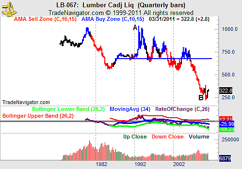
| Home construction requires lumber, and as new-home starts reached historic lows last year and remain there still, lumber prices followed. Looking at the long-term chart (Figure 1), it appears that lumber actually led throughout the decline. That figure shows a quarterly chart, where prices fell by almost 80% between points A and B, a period of about 17 years. The resistance line also can be thought of as the resistance line of a triangle pattern, and the price objective from that pattern would project to about 320, very close to the current price. |

|
| FIGURE 1: LUMBER, QUARTERLY. A quarterly time frame is used to present the long-term perspective with greater detail than an annual chart offered. |
| Graphic provided by: Trade Navigator. |
| |
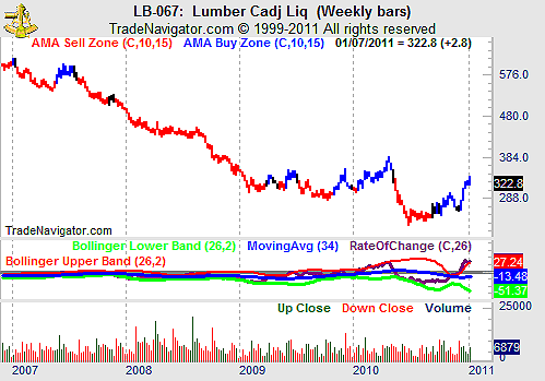
| Figure 2, the weekly chart, shows that prices presented extreme opportunities for traders in 2010. A 40% price decline was followed by a 45% gain. The rate of change is also shown in the chart, and the widening Bollinger bands on that indicator show the high volatility, and traders like volatility, since it offers the greatest opportunities for gains. |

|
| FIGURE 2: LUMBER, WEEKLY. The weekly chart shows the market experienced unusual volatility in 2010. |
| Graphic provided by: Trade Navigator. |
| |
| At this point, prices have reached an area where a long-term trading range developed. After so much volatility, basing would be expected in a chart. Short-term traders may find opportunities, with signals generated by the rate of change indicator offering an opportunity to enter and exit positions. Long-term investors may have hope that steady prices will improve the chances of a recovery in home starts, and the housing market. |
Mike Carr, CMT, is a member of the Market Technicians Association, and editor of the MTA's newsletter, Technically Speaking. He is also the author of "Smarter Investing in Any Economy: The Definitive Guide to Relative Strength Investing," and "Conquering the Divide: How to Use Economic Indicators to Catch Stock Market Trends."
| Website: | www.moneynews.com/blogs/MichaelCarr/id-73 |
| E-mail address: | marketstrategist@gmail.com |
Click here for more information about our publications!
Comments

Request Information From Our Sponsors
- StockCharts.com, Inc.
- Candle Patterns
- Candlestick Charting Explained
- Intermarket Technical Analysis
- John Murphy on Chart Analysis
- John Murphy's Chart Pattern Recognition
- John Murphy's Market Message
- MurphyExplainsMarketAnalysis-Intermarket Analysis
- MurphyExplainsMarketAnalysis-Visual Analysis
- StockCharts.com
- Technical Analysis of the Financial Markets
- The Visual Investor
- VectorVest, Inc.
- Executive Premier Workshop
- One-Day Options Course
- OptionsPro
- Retirement Income Workshop
- Sure-Fire Trading Systems (VectorVest, Inc.)
- Trading as a Business Workshop
- VectorVest 7 EOD
- VectorVest 7 RealTime/IntraDay
- VectorVest AutoTester
- VectorVest Educational Services
- VectorVest OnLine
- VectorVest Options Analyzer
- VectorVest ProGraphics v6.0
- VectorVest ProTrader 7
- VectorVest RealTime Derby Tool
- VectorVest Simulator
- VectorVest Variator
- VectorVest Watchdog
