

HOT TOPICS LIST
- MACD
- Fibonacci
- RSI
- Gann
- ADXR
- Stochastics
- Volume
- Triangles
- Futures
- Cycles
- Volatility
- ZIGZAG
- MESA
- Retracement
- Aroon
INDICATORS LIST
LIST OF TOPICS
PRINT THIS ARTICLE
by Alan R. Northam
One of the many uses of statistical analysis in the discipline of statistics is making forecasts using known data. Here I use statistical analysis to forecast the expected price range of the Santa Claus rally.
Position: N/A
Alan R. Northam
Alan Northam lives in the Dallas, Texas area and as an electronic engineer gave him an analytical mind from which he has developed a thorough knowledge of stock market technical analysis. His abilities to analyze the future direction of the stock market has allowed him to successfully trade of his own portfolio over the last 30 years. Mr. Northam is now retired and trading the stock market full time. You can reach him at inquiry@tradersclassroom.com or by visiting his website at http://www.tradersclassroom.com. You can also follow him on Twitter @TradersClassrm.
PRINT THIS ARTICLE
LIN. REGTREND
Predicting The Santa Claus Rally
01/03/11 11:21:30 AMby Alan R. Northam
One of the many uses of statistical analysis in the discipline of statistics is making forecasts using known data. Here I use statistical analysis to forecast the expected price range of the Santa Claus rally.
Position: N/A
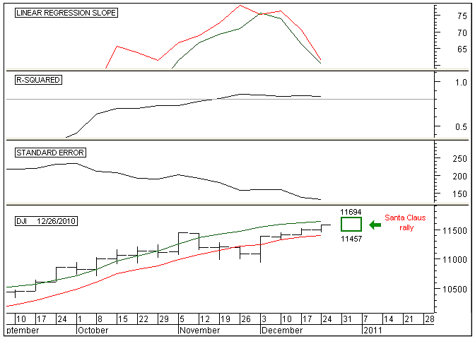
| The Santa Claus rally occurs during the last five trading sessions of the year and the first two trading sessions of the new year. On average, the market gains approximately 1.4% during this time period. Typically in years where the Santa Claus rally fails to move upward, the following year turns out to be a bear market or presents an opportunity later in the new year to buy stocks at a much lower price. There are many different methods that can be used to make market forecasts, but here I use statistical analysis to predict the expected price range for this year's Santa Claus rally. To start with, I am going to use the Dow Jones Industrial Average (DJIA) to predict the price range for this year's Santa Claus rally. In Figure 1, I have set the time period to weekly. I did this because in making the most accurate prediction using statistical analysis I only want to move out into the future by one time period. Since the Santa Claus rally lasts for just over one week, I therefore want to make a prediction of its price range one time period or one week into the future. See Figure 1. |
|
| FIGURE 1: DJIA, WEEKLY. This chart shows two 16-week linear regression lines on the price chart in the bottom panel along with the expected range of the Santa Claus rally, the linear regression slope indicator in the top panel, the R-squared indicator in the second panel, and the standard error indicator in the third. |
| Graphic provided by: MetaStock. |
| |
| I start by looking for a time period in which the standard error indicator is low. Low standard errors means more accurate prediction, whereas high standard errors translates into larger errors in predictions. By plotting the standard error indicator and changing its time period, I look for a time period with a low standard error. I started with 10 periods (the more periods the more accurate the forecast) and worked my way upward to around 30 periods. During this search, I found that 16 periods gives the best-looking downward slope. In searching for the best looking downward slope, I look for a downsloping standard error line with minimum ripple. This tells me that the standard error is continuing to get smaller with small deviations from its downtrend. This translates into price hugging tightly to its linear regression line with minimal deviations from it. Note: It is the linear regression line I am going to project one period or one week into the future. Therefore, I want price to continue to hug tightly to the linear regression line and not deviate away from it. The next thing I want to check is the strength of the trend. To do this I plot an R-squared indicator just above the standard error indicator and set its time period to 16. High R-squared values means that the closing price is hugging very close to the linear regression line, which is what I want to occur in order to make accurate predictions. Since we are going to predict the price of the linear regression line one week into the future, to make our prediction as accurate as possible so that price will actually land close to the predicted linear regression line, we need the value of R-squared to be as high as possible. On Figure 1, I have plotted the R-squared indicator with a time period of 16 weeks. Note that the value of the R-squared indicator at the right edge of the chart is 0.84. This means that 84% of the time over the last 16 weeks, price hugged closely to the linear regression line, while the other 16% of the time price deviated further away from this line. Overall, 0.84 or 84% represents a strong trend and we should expect price to continue to hug closely to the linear regression line. However, there is a 16% chance that our prediction may not be extremely accurate. Note: Risk is always involved no matter what we do. |
| To make the actual prediction I now plot two linear regression slope lines in the top pane of Figure 1. The green line represents the linear regression slope using the high price of the DJIA each week over the past 16 weeks. The value of the slope at the right edge of the chart is 60. This means that each week over the last 16, the linear regression line moved upward by 60 points each week. The red line represents the linear regression slope using the low price of each week over the past 16 weeks. The value of the slope at the right edge of the chart is 61. Note: I am using the high and low linear regression slopes because I want to find the forecasted high and low price range over the next one week. Next, I plot two linear regression lines on the price chart. The green line represents the linear regression line of the high prices over the last 16 weeks. The value of the green linear regression line at the right edge of the chart is 11634. To plot where the high price is expected to fall one week into the future, we simply add 60 to 11634 to it to arrive at a high price of 11694 one week into the future. The red line represents the linear regression line of the low prices over the last 16 weeks. The value of the red linear regression line at the right edge of the chart is 11396. To plot where the low price is expected to fall one week into the future, we add 61 to 11396 to arrive at a low price of 11457 one week into the future. This high and low price range over the next one week is then plotted on the chart. |
| In conclusion, using statistical analysis we can predict the high and low price range one week into the future. This analysis shows that the high price of the DJIA over the next week is predicted to be 11675 and the low price 11442. I have drawn a box on the price chart to show this predicted price range for the 2010 Santa Claus rally. Please note that this is a prediction for the expected price range during the Santa Claus rally, whereas the actual price range will most likely be somewhat different. Predictions are not absolutes but provide a guideline as to what we should expect the market to do over the next one week. Failure of the Santa Claus rally to make a higher high and a higher low going into the new year generally has bearish consequences for the new year. |
Alan Northam lives in the Dallas, Texas area and as an electronic engineer gave him an analytical mind from which he has developed a thorough knowledge of stock market technical analysis. His abilities to analyze the future direction of the stock market has allowed him to successfully trade of his own portfolio over the last 30 years. Mr. Northam is now retired and trading the stock market full time. You can reach him at inquiry@tradersclassroom.com or by visiting his website at http://www.tradersclassroom.com. You can also follow him on Twitter @TradersClassrm.
| Garland, Tx | |
| Website: | www.tradersclassroom.com |
| E-mail address: | inquiry@tradersclassroom.com |
Click here for more information about our publications!
Comments
Date:�01/04/11Rank:�5Comment:�

Request Information From Our Sponsors
- StockCharts.com, Inc.
- Candle Patterns
- Candlestick Charting Explained
- Intermarket Technical Analysis
- John Murphy on Chart Analysis
- John Murphy's Chart Pattern Recognition
- John Murphy's Market Message
- MurphyExplainsMarketAnalysis-Intermarket Analysis
- MurphyExplainsMarketAnalysis-Visual Analysis
- StockCharts.com
- Technical Analysis of the Financial Markets
- The Visual Investor
- VectorVest, Inc.
- Executive Premier Workshop
- One-Day Options Course
- OptionsPro
- Retirement Income Workshop
- Sure-Fire Trading Systems (VectorVest, Inc.)
- Trading as a Business Workshop
- VectorVest 7 EOD
- VectorVest 7 RealTime/IntraDay
- VectorVest AutoTester
- VectorVest Educational Services
- VectorVest OnLine
- VectorVest Options Analyzer
- VectorVest ProGraphics v6.0
- VectorVest ProTrader 7
- VectorVest RealTime Derby Tool
- VectorVest Simulator
- VectorVest Variator
- VectorVest Watchdog