HOT TOPICS LIST
- MACD
- Fibonacci
- RSI
- Gann
- ADXR
- Stochastics
- Volume
- Triangles
- Futures
- Cycles
- Volatility
- ZIGZAG
- MESA
- Retracement
- Aroon
INDICATORS LIST
LIST OF TOPICS
PRINT THIS ARTICLE
by Billy Williams
If price action is the market's conversation, then price bar patterns are the alphabet...
Position: Hold
Billy Williams
Billy Williams has been trading the markets for 27 years, specializing in momentum trading with stocks and options.
PRINT THIS ARTICLE
CANDLESTICK CHARTING
Pullback Entries Using Price Bar Patterns
09/28/10 09:01:46 AMby Billy Williams
If price action is the market's conversation, then price bar patterns are the alphabet...
Position: Hold
| Effective openings for trade entries leave clues; specifically, the individual price bars leave clues as a stock's price action unfolds. The study of price action shows you that if the market is speaking to you, then the price bars are the alphabet that makes up that conversation. Whether the market is experiencing expansion in the form of a trend or a period of contraction is experiencing trading back and forth in a trading range, having a basic understanding of price bar patterns can help you time your entries with greater precision while also deepening your understanding on how the market is unfolding. |

|
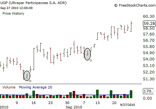
| FIGURE 1: UGP. UGP experiences a steady uptrend, and using inside bars, you find easy, low-risk entry points into that trend. |
| Graphic provided by: www.freestockcharts.com. |
| |
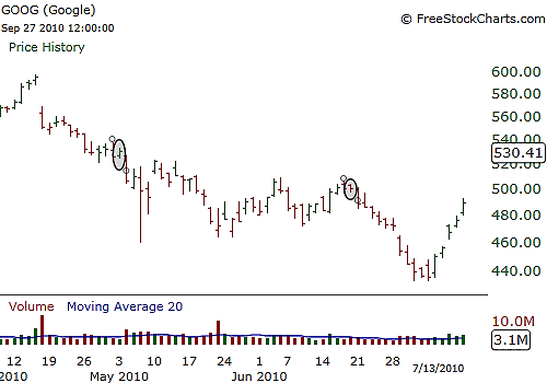
| Inside bars are price bars that trade within the daily trading range of the previous price bar (Figures 1 and 2). They are considered a "pause" where price has been moving in a given direction but buyers or sellers have not taken control of the price action. This results in a tight trading range that often becomes a critical trading point where price will take off in the opposite direction. For example, a stock has been trading upward but then begins to pull back in price, then forms an inside bar. An effective entry is to buy the stock as it travels above the high of the inside bar and enter in the direction of the dominant trend. |

|
| FIGURE 2: GOOG. GOOG underwent a bearish trend in the period from April to July 2010, but using inside bars, you could have profitably shorted the stock during this time. |
| Graphic provided by: www.freestockcharts.com. |
| |
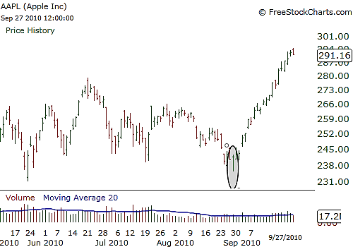
| Using candlestick charting, the doji is a price bar pattern that shows a reversal in price action (Figure 3). A doji is formed when price opens either at the upper or lower end of the price bar's trading range, then trades in a given direction, while later in the day, reversing back down to its opening price and closing at or near that opening price. This pattern forms a tail, where the trading range shows a straight line up or down depending on the day's direction, with the opening and closing tabs close to each other at day's end. The doji is an effective price bar pattern when trying to spot a price reversal in a stock's price action. When price trades in a given direction and then you notice a doji forming, it often signals that a countertrend is in the making. If price is stuck in a trading range, trades down toward support, and forms a bullish doji where the tail is at the bottom of the range while the opening and closing tabs are in the upper range of the doji, it indicates that there are buyers at the support level. An effective entry using the doji in that instance is to enter as price trades back up over the top of the doji's price high and ride the new trend back up to resistance if in a trading range. |

|
| FIGURE 3: AAPL. AAPL has experienced a trading range in the last few months, but this doji showed buyers taking control again while offering an effective entry point. |
| Graphic provided by: www.freestockcharts.com. |
| |
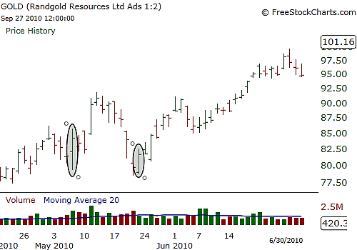
| The engulfing bar pattern is opposite the inside bar in that it trades above the high and the low of the previous price bar's pattern, "engulfing" that price bar, hence the name (Figure 4). This price bar pattern is another type of reversal signal when a stock is trending in a given direction, but then a large engulfing bar develops. This reveals an influx of buyers or sellers at a given price level that could mean that a stock could have had a favorable earnings release, business contract, or new product launch that could make it more appealing or less appealing, depending on the direction of the price bar. |

|
| FIGURE 4: GOLD. GOLD's price action meandered back and forth but at this particular price point, engulfing bars formed, showing buyers lurking at this level and eventually pushing the stock higher. |
| Graphic provided by: www.freestockcharts.com. |
| |
| A good entry for using the engulfing bar is to enter right above or below its price range within the context of the price direction you are favoring. These three price bar patterns are common in the market and if you spend some time studying stock charts, you will find that they occur quite often and with remarkable accuracy at critical price levels. |
Billy Williams has been trading the markets for 27 years, specializing in momentum trading with stocks and options.
| Company: | StockOptionSystem.com |
| E-mail address: | stockoptionsystem.com@gmail.com |
Traders' Resource Links | |
| StockOptionSystem.com has not added any product or service information to TRADERS' RESOURCE. | |
Click here for more information about our publications!
Comments

Request Information From Our Sponsors
- VectorVest, Inc.
- Executive Premier Workshop
- One-Day Options Course
- OptionsPro
- Retirement Income Workshop
- Sure-Fire Trading Systems (VectorVest, Inc.)
- Trading as a Business Workshop
- VectorVest 7 EOD
- VectorVest 7 RealTime/IntraDay
- VectorVest AutoTester
- VectorVest Educational Services
- VectorVest OnLine
- VectorVest Options Analyzer
- VectorVest ProGraphics v6.0
- VectorVest ProTrader 7
- VectorVest RealTime Derby Tool
- VectorVest Simulator
- VectorVest Variator
- VectorVest Watchdog
- StockCharts.com, Inc.
- Candle Patterns
- Candlestick Charting Explained
- Intermarket Technical Analysis
- John Murphy on Chart Analysis
- John Murphy's Chart Pattern Recognition
- John Murphy's Market Message
- MurphyExplainsMarketAnalysis-Intermarket Analysis
- MurphyExplainsMarketAnalysis-Visual Analysis
- StockCharts.com
- Technical Analysis of the Financial Markets
- The Visual Investor
