HOT TOPICS LIST
- MACD
- Fibonacci
- RSI
- Gann
- ADXR
- Stochastics
- Volume
- Triangles
- Futures
- Cycles
- Volatility
- ZIGZAG
- MESA
- Retracement
- Aroon
INDICATORS LIST
LIST OF TOPICS
PRINT THIS ARTICLE
by Alan R. Northam
Intel is near the end of its current downward leg, but longer term, it may have further to go on the downside.
Position: N/A
Alan R. Northam
Alan Northam lives in the Dallas, Texas area and as an electronic engineer gave him an analytical mind from which he has developed a thorough knowledge of stock market technical analysis. His abilities to analyze the future direction of the stock market has allowed him to successfully trade of his own portfolio over the last 30 years. Mr. Northam is now retired and trading the stock market full time. You can reach him at inquiry@tradersclassroom.com or by visiting his website at http://www.tradersclassroom.com. You can also follow him on Twitter @TradersClassrm.
PRINT THIS ARTICLE
TECHNICAL ANALYSIS
Intel Near End Of Trend?
09/09/10 12:42:51 PMby Alan R. Northam
Intel is near the end of its current downward leg, but longer term, it may have further to go on the downside.
Position: N/A
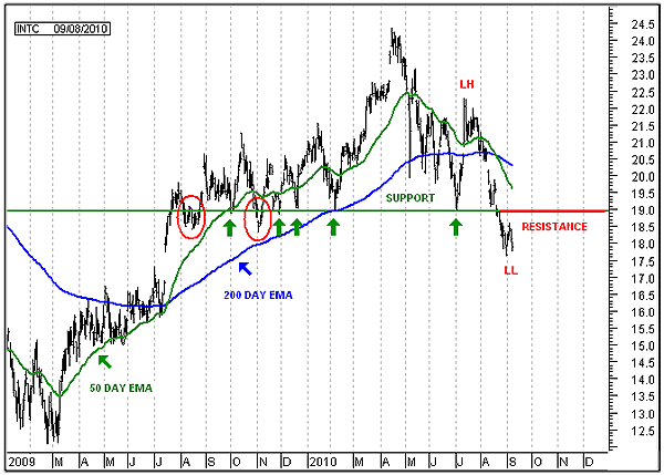
| From March 2009 through April 2010, Intel doubled in price as it rallied from $12.30 to $24.36 a share (see Figure 1). During this rally, Intel traded sideways from July 2009 to February 2010, developing a support shelf at $18.95 a share. Note that Intel touched this support shelf four times before trading upward to $24 per share (see first four green arrows). In addition, Intel broke down below the support shelf during its early development but shortly moved back above it (see two red ovals). This trading action from July 2009 until February 2010 shows a strong reluctance for price to move below $18.95, signaling a strong line of support from the support shelf. |

|
| FIGURE 1: INTC, DAILY. This chart shows the daily bar chart with the 50-day and 200-day exponential moving averages along with the support shelf at $18.95. |
| Graphic provided by: MetaStock. |
| |
| Five months later, in July 2010, the market remembered that strong line of support when Intel once again bounced off the support shelf and started to trade higher (see last green arrow). However, Intel did not make a new higher high during the ensuing rally but turned back down in mid-July at $22.28, forming a new lower high. This failure of price to make a new higher high indicated that weakness had developed in the uptrend. Intel then continued to trade lower and once again crossed below the support shelf at $18.95. The question now becomes, "Will Intel move back above the support shelf like it did in August and November 2009 and continue to trade higher?" I don't think so, and here's why. The two breakdowns below the support shelf in 2009 (see red ovals) occurred while price was above its 200-day exponential moving average (EMA) and the 50-day EMA was above the 200-day EMA, indicating that price was in a long-term uptrend. Now just the opposite has occurred. Price is below the 200-day EMA and the 50-day EMA is below the 200-day EMA, indicating that price is now in a long-term downtrend. As a result, I would expect that price could move up to $18.95 and either bounce off it or trade slightly above it, but then I would also expect price to turn back down and continue to sell off. Thus, I would expect $18.95 now to become a strong line of resistance instead of a strong line of support. So what's next for Intel? We must look beneath the surface of the price chart and look at price momentum and its volume. |
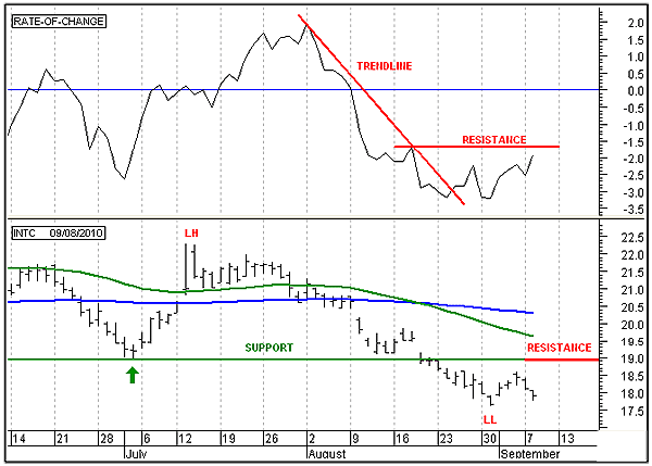
| In Figure 2, we see price in the bottom panel of the chart and the rate of change (ROC) indicator in the top panel. The ROC is a measure of the momentum of price. The ROC has broken out above its downsloping trendline. This is an indication that the downward acceleration in price has come to an end. The ROC is now moving upward to test overhead resistance from the last significant pivot point in the previous downtrend. A breakout above this line of resistance will signal that price is ready to start moving higher. In order for price to move significantly higher, volume must increase, and therefore, it is time to take a look at volume to see what we can learn about the future direction of INTC. |

|
| FIGURE 2: INTC, DAILY. This chart shows the daily price bars in the lower panel and the rate of change indicator in the upper panel. |
| Graphic provided by: MetaStock. |
| |
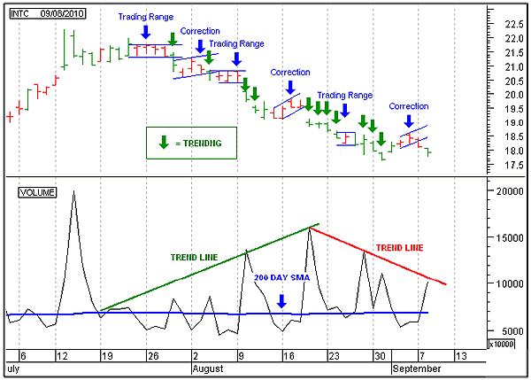
| Figure 3 shows a chart with price in the top panel and volume in the bottom. I have turned the price bars green when volume is above average and red when below average. I have also bound the trading ranges and upward corrections with blue parallel channel lines and added blue labels to the chart. In addition, I have shown the trending price bars in green and added green arrows. In the volume panel I have shown a green upsloping trendline to show when volume is increasing and a red downsloping trendline when volume is decreasing. I also added a 200-day simple moving average of volume in blue to represent the average of volume. In the upper panel the main direction of the trend is heading down. In the volume panel you can see that the green trendline of volume is increasing as price is trending down. Increasing volume indicates the direction of the trend, which is downward. Now notice the individual price bars in the upper panel. All the price bars that are moving in the downward direction are green. This indicates that volume is above average when the price bars are moving lower. Again, above-average volume in the direction of the price bars indicates the direction of the main trend, which is downward. Now note the individual price bars that make up the trading ranges and the corrections; note these price bars are red. The price bars are red when volume is below average. Volume is normally below average during trading ranges and market corrections. Thus, these red bars inform us that they are part of a trading range or a market correction. The last price bar on the chart is lower than the previous two and it has turned green, indicating that volume is once again above average (note above-average volume in the volume panel). This is a signal that price is once again headed lower. Now observe the red downsloping trendline in the bottom panel of Figure 3. This downsloping trendline is informing us that volume is now starting to decrease. Decreasing volume in the direction of the main price trend is an indication that the main trend is near its end. |

|
| FIGURE 3: INTC, DAILY. This chart shows the daily price bars in the upper panel and the volume line chart in the lower panel. |
| Graphic provided by: MetaStock. |
| |
| In conclusion, the main direction of Intel is heading down. However, the current downward leg from the July highs appears to be nearing an end with maybe one more move down before ending. Once the downtrend ends, Intel will enter into an upward market correction that will most likely test the overhead resistance shelf seen in Figure 1. As a result, Intel should be put on a watchlist until any test of the resistance shelf is complete or until volume breaks out above its downsloping trendline, signaling that Intel has resumed its downtrend. |
Alan Northam lives in the Dallas, Texas area and as an electronic engineer gave him an analytical mind from which he has developed a thorough knowledge of stock market technical analysis. His abilities to analyze the future direction of the stock market has allowed him to successfully trade of his own portfolio over the last 30 years. Mr. Northam is now retired and trading the stock market full time. You can reach him at inquiry@tradersclassroom.com or by visiting his website at http://www.tradersclassroom.com. You can also follow him on Twitter @TradersClassrm.
| Garland, Tx | |
| Website: | www.tradersclassroom.com |
| E-mail address: | inquiry@tradersclassroom.com |
Click here for more information about our publications!
PRINT THIS ARTICLE

Request Information From Our Sponsors
- StockCharts.com, Inc.
- Candle Patterns
- Candlestick Charting Explained
- Intermarket Technical Analysis
- John Murphy on Chart Analysis
- John Murphy's Chart Pattern Recognition
- John Murphy's Market Message
- MurphyExplainsMarketAnalysis-Intermarket Analysis
- MurphyExplainsMarketAnalysis-Visual Analysis
- StockCharts.com
- Technical Analysis of the Financial Markets
- The Visual Investor
- VectorVest, Inc.
- Executive Premier Workshop
- One-Day Options Course
- OptionsPro
- Retirement Income Workshop
- Sure-Fire Trading Systems (VectorVest, Inc.)
- Trading as a Business Workshop
- VectorVest 7 EOD
- VectorVest 7 RealTime/IntraDay
- VectorVest AutoTester
- VectorVest Educational Services
- VectorVest OnLine
- VectorVest Options Analyzer
- VectorVest ProGraphics v6.0
- VectorVest ProTrader 7
- VectorVest RealTime Derby Tool
- VectorVest Simulator
- VectorVest Variator
- VectorVest Watchdog
