HOT TOPICS LIST
- MACD
- Fibonacci
- RSI
- Gann
- ADXR
- Stochastics
- Volume
- Triangles
- Futures
- Cycles
- Volatility
- ZIGZAG
- MESA
- Retracement
- Aroon
INDICATORS LIST
LIST OF TOPICS
PRINT THIS ARTICLE
by Ron Walker
The classic head & shoulders pattern has a very high success rate, triggering the expected result 74% of the time. What's it say about the market ahead?
Position: N/A
Ron Walker
Ron Walker is an active trader and technical analyst. He operates an educational website dedicated to the study of Technical Analysis. The website offers free market analysis with daily video presentations and written commentaries. Ron is a video pioneer, being one of the first to utilize the internet producing Technical Analysis videos. His website is thechartpatterntrader.com
PRINT THIS ARTICLE
HEAD & SHOULDERS
Short Setups For The S&P 500's Head & Shoulders Top
05/03/10 09:41:19 AMby Ron Walker
The classic head & shoulders pattern has a very high success rate, triggering the expected result 74% of the time. What's it say about the market ahead?
Position: N/A
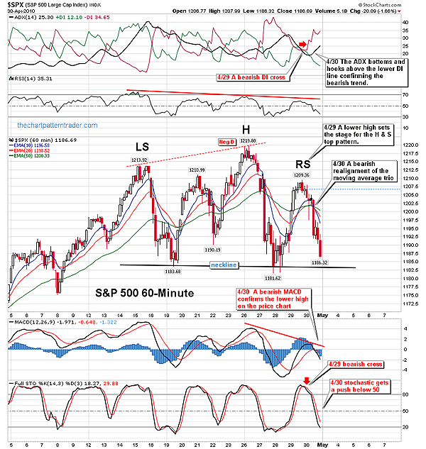
| Price patterns represent human behavior and they are psychological road maps of future price direction. Right now, the Standard & Poor's 500 is churning through a head & shoulders reversal pattern in the 60-minute time frame (Figure 1), sending a message of warning to price pattern traders who trade financial instruments that mirror the S&P 500. Topping patterns form when people refuse to pay more for a stock once it reaches extended levels. As the stock overheats, holders of that stock get nervous and sell; meanwhile, short sellers eager to place their bets against the prevailing trend pile on. As prices fall back to support, the johnny-come-latelies show up, feeling this is their big buying opportunity. Their emotional behavior temporarily props prices back up. The emotional actions of both bulls and bears create patterns on charts as prices bounce back and forth like a furious tennis match as the bulls and bears fight for control. |

|
| FIGURE 1: $SPX, 60-MINUTE. A head & shoulders top forms on the 60-minute chart being confirmed by technical indicators and a bearish alignment of the moving average trio. |
| Graphic provided by: StockCharts.com. |
| |
| The appearance of a head & shoulders pattern on a chart usually signals that a security or index is undergoing distribution (Figure 1). The pattern begins to form once price climaxes after a strong rally with high volume. The rally is followed by a minor recession to complete the left shoulder. After that, euphoria carries prices to another new high on relatively strong volume. But a reaction causes price to fall back again somewhere near the previous minor low that completed the left shoulder. A third rally occurs, but price can't muster the strength to reach the height of the head. Finally, prices decline in a third recession down, sending it back to the prior area of support forming a neckline, setting up a lower high and right shoulder. A third decline sets in, sending prices back to the neckline of support. If a slew of buyers don't come riding to the rescue at support, supply overcomes demand and the stock dives. Once the price breaks through the neckline, the pattern is completed. We can focus our microscopic lens on the 60-minute chart of the S&P 500 for a closeup of a nicely developed head & shoulders top (Figure 1). When April came to a close, prices had an intraday move back down toward the previous support level near 1183, putting in a lower high, and the last leg down necessary in order to complete the right shoulder of the pattern. The stage is now set for prices to come to a screeching halt and make a U-turn. |

|
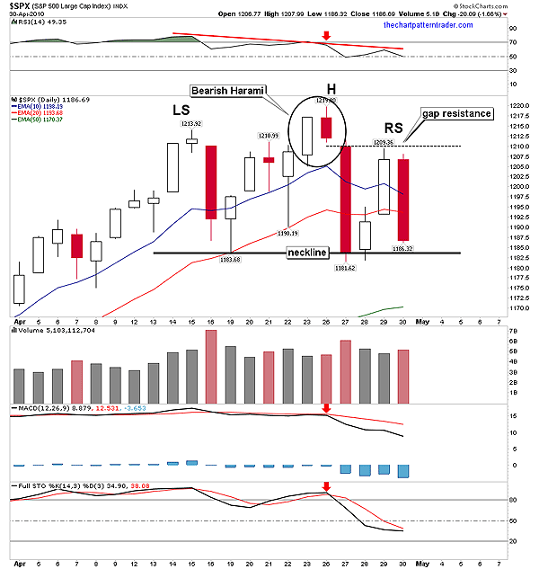
| FIGURE 2: $SPX, DAILY. A bearish harami forms when a bearish red bar's real body remains inside the trading range of the previous long white bar. The following bar gapped lower and confirmed the pattern. The next rally couldn't clear gap resistance. |
| Graphic provided by: StockCharts.com. |
| |
| There are a couple of effective tactics to help time the precise entry of this pattern. The first opportunity came when a bearish divergence set up on the hourly chart (Figure 1) after prices came to a peak to form the top of the head. Figure 2 shows that a bearish harami pattern set up on the daily chart at that time, which was confirmed the very next session as price gapped down, forming an elongated bearish candle. A trader can go short once the lowest point of the first candle in the harami pattern has been violated, with a stop just above the most recent high. Combining the negative divergence on the hourly chart with the bearish candle pattern on the daily chart offers traders a timely short entry point. Even though the S&P 500 rallied the following two sessions after that, there wasn't enough strength to clear the gap resistance made that confirmed the bearish harami pattern (Figure 2). The two-day rally allowed for the right shoulder to set up on the hourly chart, which brings us to our second possible entry point. |

|
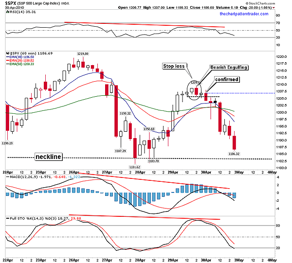
| FIGURE 3: $SPX, 60-MINUTE. A bearish engulfing pattern appears when a small white candle is followed by red candle that completely engulfs it. The black-dotted line marks the low of the engulfing candle. Two bars later, the pattern was confirmed by another candle that printed a low below the dotted line. |
| Graphic provided by: StockCharts.com. |
| |
| The second opportunity to sell short presented itself on the hourly chart when a reversal occurred shortly after the right shoulder peaked. Figure 3 showcases the bearish engulfing candlestick that printed on the 60-minute chart. The black-dotted line marks the pivot point that is used as a trigger point to implement the trade. Should an intraday candle be completed with prices below the dotted line (the low of the engulfing candle), the trade will be triggered. In this case, the pattern was confirmed shortly after the open of the following session, the day after the pattern appeared, when a red bar sliced below the low of the engulfing candle. The third opportunity came a few bars later when a bearish alignment of the moving average trio, the 10-, 20-, and 50-period exponential moving averages (EMAs), occurred on the hourly chart (Figure 3). A bearish alignment occurs when the moving averages roll over together, featuring the 10-period EMA below the 20-period EMA, with the 50-period EMA above them both. A short sale can be taken the moment the moving averages snap into a bearish alignment. Both price and technical indicators should be used to predict price movement. Indicators must always support all price patterns. Note that the moving average convergence/divergence (MACD) (12,26, 9), the relative strength index (RSI) (14), and the stochastic (14,3,3) not only validated the bearish price pattern, but they also gave timely sell signals of their own (Figure 3). Each one of those indicators put in a lower high on the hourly chart when the right shoulder formed, being in agreement with price, thereby corroborating what price was telling us. If you glance back at Figure 2, you will see that those same indicators confirmed the bearish harami pattern in the daily time frame. |
| Less aggressive traders can wait for the S&P 500 to penetrate the neckline of the price pattern. The actual trigger for the head & shoulders pattern comes when prices crash through the neckline. If prices collapse through the neckline, the pattern will be complete and the bears will take control. But in this case, there is a possibility that the pattern may be classified as a complex pattern with two left shoulders. Should prices bounce at the neckline, it could set up another right shoulder. The validation of the head & shoulders topping pattern will signal lower prices to come in the days ahead, sending a message to many long positions to get while the getting's good. |
Ron Walker is an active trader and technical analyst. He operates an educational website dedicated to the study of Technical Analysis. The website offers free market analysis with daily video presentations and written commentaries. Ron is a video pioneer, being one of the first to utilize the internet producing Technical Analysis videos. His website is thechartpatterntrader.com
| Website: | thechartpatterntrader.com |
| E-mail address: | thechartpatterntrader@gmail.com |
Click here for more information about our publications!
Comments
Date:�05/04/10Rank:�5Comment:�
Date:�05/04/10Rank:�5Comment:�

Request Information From Our Sponsors
- StockCharts.com, Inc.
- Candle Patterns
- Candlestick Charting Explained
- Intermarket Technical Analysis
- John Murphy on Chart Analysis
- John Murphy's Chart Pattern Recognition
- John Murphy's Market Message
- MurphyExplainsMarketAnalysis-Intermarket Analysis
- MurphyExplainsMarketAnalysis-Visual Analysis
- StockCharts.com
- Technical Analysis of the Financial Markets
- The Visual Investor
- VectorVest, Inc.
- Executive Premier Workshop
- One-Day Options Course
- OptionsPro
- Retirement Income Workshop
- Sure-Fire Trading Systems (VectorVest, Inc.)
- Trading as a Business Workshop
- VectorVest 7 EOD
- VectorVest 7 RealTime/IntraDay
- VectorVest AutoTester
- VectorVest Educational Services
- VectorVest OnLine
- VectorVest Options Analyzer
- VectorVest ProGraphics v6.0
- VectorVest ProTrader 7
- VectorVest RealTime Derby Tool
- VectorVest Simulator
- VectorVest Variator
- VectorVest Watchdog
