HOT TOPICS LIST
- MACD
- Fibonacci
- RSI
- Gann
- ADXR
- Stochastics
- Volume
- Triangles
- Futures
- Cycles
- Volatility
- ZIGZAG
- MESA
- Retracement
- Aroon
INDICATORS LIST
LIST OF TOPICS
PRINT THIS ARTICLE
by Ron Walker
A bullish P-p-P pattern on the MACD histogram hints that volatility is on the rise. But market sentiment remains very bullish at these levels as the indexes make fresh highs, drawing the bulls into a false sense of security.
Position: N/A
Ron Walker
Ron Walker is an active trader and technical analyst. He operates an educational website dedicated to the study of Technical Analysis. The website offers free market analysis with daily video presentations and written commentaries. Ron is a video pioneer, being one of the first to utilize the internet producing Technical Analysis videos. His website is thechartpatterntrader.com
PRINT THIS ARTICLE
VOLATILITY
The VIX Hints Of Irrational Exuberance
03/26/10 12:04:50 PMby Ron Walker
A bullish P-p-P pattern on the MACD histogram hints that volatility is on the rise. But market sentiment remains very bullish at these levels as the indexes make fresh highs, drawing the bulls into a false sense of security.
Position: N/A
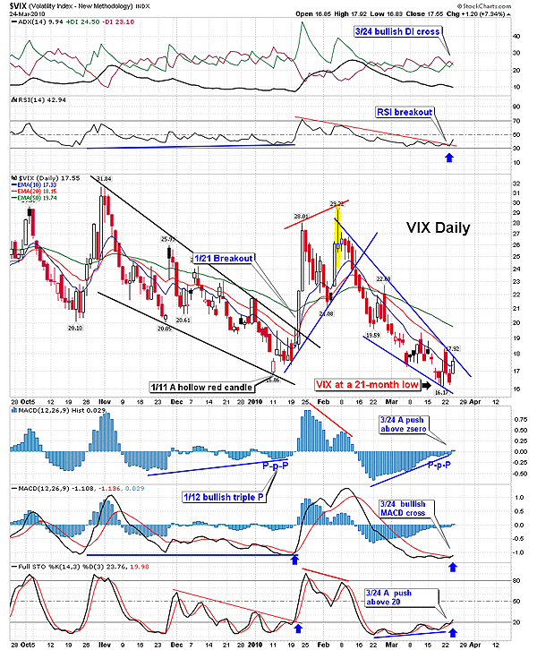
| The Chicago Board Options Exchange Volatility Index (VIX) is the symbol for the measure of implied volatility of the Standard & Poor's 500 index options. It is commonly known as the fear gauge. The VIX is a contrarian indicator that moves in the opposite direction of the S&P 500. As the VIX rises, it reveals that the amount of volatility on the S&P 500 is increasing. In Figure 1, the daily chart of the VIX shows that it bottomed in early January 2009, breaking out of a bullish falling wedge. The VIX surged until early February, corresponding with a correction of the S&P 500. As the VIX peaked, a bearish shooting star candle marked the top (highlighted in yellow in Figure 1). The topping candle pattern appeared simultaneously with bearish divergence appeared on the moving average convergence/divergence (MACD) histogram (12,26,9), followed by a bearish cross on the moving average convergence/divergence (MACD) and stochastic (14,3,3). That set the stage for the sharp decline in February and March. The VIX sank back to the January low for a test, forming yet another bullish falling wedge pattern, hitting a 21-month low. |

|
| FIGURE 1: $VIX, DAILY. The VIX is poised to break out of the bullish falling wedge pattern after a test of the January low, with multiple bullish signals in place. |
| Graphic provided by: StockCharts.com. |
| |
| Technical indicators on the VIX daily chart suggest that volatility is on the rise. On March 19, 2010, a bullish P-p-P pattern appeared on the histogram, just as a bullish divergence was completing (Figure 1). The histogram bottomed out in mid-February and began to rise higher as the VIX moved lower, creating a divergence. In mid-March, the histogram began to move lower again, forming the divergence. Once the histogram completed a higher low, the vertical bars began to move back up toward the center line. After the vertical bars traced a higher low and began to tick upward, it marked a change in momentum. The P-p-P pattern is a code for a bullish pattern that comes when the histogram is below zero and begins to move up toward its centerline. This pattern reveals that the VIX is oversold. When the histogram is below zero and the slope changes, the slope resembles P-p-P. |

|
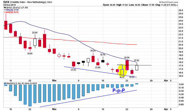
| FIGURE 2: $VIX, DAILY. A bullish PpP pattern developed on the VIX in mid-March. The yellow oval marks the session that the bullish signal occurred. The VIX needs to close above 17.57, which was the highest high during that session (dotted black line) in order to confirm the pattern and the shift in momentum. |
| Graphic provided by: StockCharts.com. |
| |
| The bullish P-p-P pattern will be confirmed once prices close above the highest high made during the session when the pattern first appeared (see the yellow oval in Figure 2). The pattern was completed on March 19 with an intraday high of 17.57. The VIX needs to close above that level to validate the change in momentum. As the histogram moved above the zero line, it closed just shy of that level at 17.55. A breakout of the falling wedge pattern should produce a confirmation to this bullish histogram pattern. Figure 1 reveals that the P-p-P pattern catapulted the histogram above the center line into positive territory, causing the MACD to get a bullish cross on March 24. Meanwhile, the stochastic (14,3,3) also completed a divergence and has begun to hook back up out of oversold levels. |
| The average directional movement index (ADX) (14) offers even more clues that draws us to the conclusion that the index is forecasting a change in momentum. First, the ADX line has turned down below both direction lines (+/-DI), tipping off traders that a directional change is coming. The best signals on the ADX come after the ADX line has spent several weeks below both directional lines. In addition, on March 24, the +DI line crossed back above the -DI line as a bullish precursor to the breakout of the falling wedge pattern. |
| The relative strength index (RSI)(14) broke its downtrend hinting of an impending breakout of the falling wedge pattern. The bullish scenario on the VIX may facilitate a change in the balance of power between the bulls and bears. The VIX suggests that we are on the threshold of another correction. The VIX alludes that the current bullish sediment is being propelled by false optimism as the bears lie in wait to usurp their power back. |
Ron Walker is an active trader and technical analyst. He operates an educational website dedicated to the study of Technical Analysis. The website offers free market analysis with daily video presentations and written commentaries. Ron is a video pioneer, being one of the first to utilize the internet producing Technical Analysis videos. His website is thechartpatterntrader.com
| Website: | thechartpatterntrader.com |
| E-mail address: | thechartpatterntrader@gmail.com |
Click here for more information about our publications!
Comments
Date:�03/26/10Rank:�5Comment:�
Date:�03/28/10Rank:�5Comment:�

Request Information From Our Sponsors
- StockCharts.com, Inc.
- Candle Patterns
- Candlestick Charting Explained
- Intermarket Technical Analysis
- John Murphy on Chart Analysis
- John Murphy's Chart Pattern Recognition
- John Murphy's Market Message
- MurphyExplainsMarketAnalysis-Intermarket Analysis
- MurphyExplainsMarketAnalysis-Visual Analysis
- StockCharts.com
- Technical Analysis of the Financial Markets
- The Visual Investor
- VectorVest, Inc.
- Executive Premier Workshop
- One-Day Options Course
- OptionsPro
- Retirement Income Workshop
- Sure-Fire Trading Systems (VectorVest, Inc.)
- Trading as a Business Workshop
- VectorVest 7 EOD
- VectorVest 7 RealTime/IntraDay
- VectorVest AutoTester
- VectorVest Educational Services
- VectorVest OnLine
- VectorVest Options Analyzer
- VectorVest ProGraphics v6.0
- VectorVest ProTrader 7
- VectorVest RealTime Derby Tool
- VectorVest Simulator
- VectorVest Variator
- VectorVest Watchdog
