HOT TOPICS LIST
- MACD
- Fibonacci
- RSI
- Gann
- ADXR
- Stochastics
- Volume
- Triangles
- Futures
- Cycles
- Volatility
- ZIGZAG
- MESA
- Retracement
- Aroon
INDICATORS LIST
LIST OF TOPICS
PRINT THIS ARTICLE
by Mike Carr, CMT
As usual, we want to look at things with different tools. The dollar will be the subject of our analysis today as we look at the volatility of its volatility.
Position: N/A
Mike Carr, CMT
Mike Carr, CMT, is a member of the Market Technicians Association, and editor of the MTA's newsletter, Technically Speaking. He is also the author of "Smarter Investing in Any Economy: The Definitive Guide to Relative Strength Investing," and "Conquering the Divide: How to Use Economic Indicators to Catch Stock Market Trends."
PRINT THIS ARTICLE
VOLATILITY
The Dollar And The Risk
12/09/09 08:44:33 AMby Mike Carr, CMT
As usual, we want to look at things with different tools. The dollar will be the subject of our analysis today as we look at the volatility of its volatility.
Position: N/A
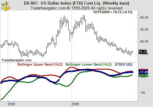
| Risk is considered to be equivalent to volatility in the investment world. And volatility can be quantified by using standard deviations. This is a function that is readily available in most charting software. In Figure 1, we have a weekly chart of the US Dollar Index along with the standard deviations of the close over the past year. We also added Bollinger bands to the standard deviations to place them in context. |

|
| FIGURE 1: US DOLLAR INDEX, WEEKLY. The dollar index is shown with a measure of its volatility and relative volatility. |
| Graphic provided by: Trade Navigator. |
| |
| The blue line in the bottom half of the chart shows the standard deviation of the closing price over the past 52 weeks, a measure of volatility. The red and green lines are Bollinger bands of the standard deviation, which measure the volatility of the volatility. From standard financial theories, we know that when the standard deviation is at the upper band (the red line), risk is highest. Low-risk opportunities are found when the blue line is closer to the green line. |
| At the end of 2008, we see that risk jumped dramatically, and the dollar moved up sharply. This confirms visually that the best returns are associated with the highest risks. |
| A similar situation is present in the charts now — risk has increased and is now relatively high when compared to the recent past. Traders should be aware of this and look for breakouts in either direction. |
Mike Carr, CMT, is a member of the Market Technicians Association, and editor of the MTA's newsletter, Technically Speaking. He is also the author of "Smarter Investing in Any Economy: The Definitive Guide to Relative Strength Investing," and "Conquering the Divide: How to Use Economic Indicators to Catch Stock Market Trends."
| Website: | www.moneynews.com/blogs/MichaelCarr/id-73 |
| E-mail address: | marketstrategist@gmail.com |
Click here for more information about our publications!
Comments
Date:�12/09/09Rank:�5Comment:�

Request Information From Our Sponsors
- StockCharts.com, Inc.
- Candle Patterns
- Candlestick Charting Explained
- Intermarket Technical Analysis
- John Murphy on Chart Analysis
- John Murphy's Chart Pattern Recognition
- John Murphy's Market Message
- MurphyExplainsMarketAnalysis-Intermarket Analysis
- MurphyExplainsMarketAnalysis-Visual Analysis
- StockCharts.com
- Technical Analysis of the Financial Markets
- The Visual Investor
- VectorVest, Inc.
- Executive Premier Workshop
- One-Day Options Course
- OptionsPro
- Retirement Income Workshop
- Sure-Fire Trading Systems (VectorVest, Inc.)
- Trading as a Business Workshop
- VectorVest 7 EOD
- VectorVest 7 RealTime/IntraDay
- VectorVest AutoTester
- VectorVest Educational Services
- VectorVest OnLine
- VectorVest Options Analyzer
- VectorVest ProGraphics v6.0
- VectorVest ProTrader 7
- VectorVest RealTime Derby Tool
- VectorVest Simulator
- VectorVest Variator
- VectorVest Watchdog
