HOT TOPICS LIST
- MACD
- Fibonacci
- RSI
- Gann
- ADXR
- Stochastics
- Volume
- Triangles
- Futures
- Cycles
- Volatility
- ZIGZAG
- MESA
- Retracement
- Aroon
INDICATORS LIST
LIST OF TOPICS
PRINT THIS ARTICLE
by Koos van der Merwe
In 1982, at a conference in Johannesburg, South Africa, I met a man named Roger Paget. He taught me two cycle strategies I still use today.
Position: N/A
Koos van der Merwe
Has been a technical analyst since 1969, and has worked as a futures and options trader with First Financial Futures in Johannesburg, South Africa.
PRINT THIS ARTICLE
CYCLES
Paget Cycles Revisited
09/29/09 08:38:02 AMby Koos van der Merwe
In 1982, at a conference in Johannesburg, South Africa, I met a man named Roger Paget. He taught me two cycle strategies I still use today.
Position: N/A
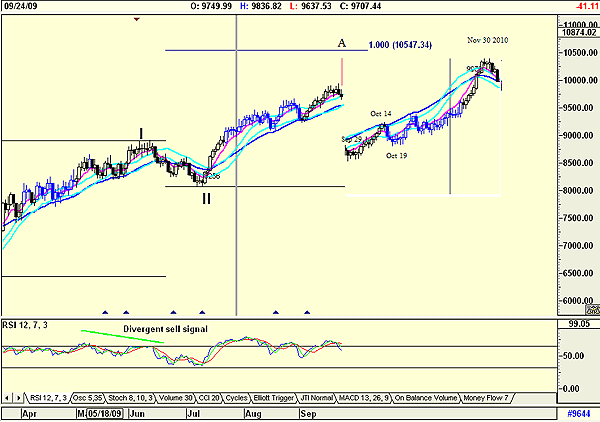
| I spent many years using Roger Paget's strategies, especially when I traded the futures market. They gave me an approximate idea of what to expect for the future. They weren't always that accurate, but there was usually a pretty good idea. Today, using sophisticated oscillators on a computer not available in Paget's time, we can better his cycle forecasting strategies. However, I still lean toward them as a confirmation of what my other charts are telling me. To draw these charts, I use Advanced GET, copy the last 40 days using SNAGIT, invert the chart, and paste it on a SNAGIT copy of the entire chart. You can see this in Figure 1. I have left certain lines on so that you can identify the pasted chart. |

|
| FIGURE 1: DJIA, DAILY. The DJIA shown as an insert the last 40 days inverted. |
| Graphic provided by: AdvancedGET. |
| |
| Referring to Figure 1, the gray vertical line on the chart is at the 40-day limit as suggested by Paget's theory. You can see the inverted section on the chart suggesting possible lows. The pink vertical line shows the position where the inverted section has been pasted. The chart suggests a major low on November 30, 2009. (Minor lows and highs; low September 29, high October 14, low September 29, high October 19. I have left out a minor high and low.) Will these highs and lows actually occur? Perhaps not on the exact dates, but it does give an indication of turning points and where the market can go to. Do note, the strategy predicts dates only, not prices, which is why I have offset the inverted chart. The second technique Paget taught me is shown in Figure 2. |

|
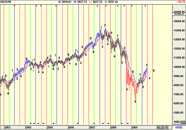
| FIGURE 2: DJIA, MONTHLY. A weekly chart of the DJIA showing cycle repetitiveness. |
| Graphic provided by: AdvancedGET. |
| |
| The chart is a weekly chart of the Dow Jones Industrial Average (DJIA). The vertical lines are drawn at the end of March, June, September, and December of each year. Note how the colors of the vertical lines are repeated -- for example, March is green, June is blue, September is magenta, and December is red. Paget always allowed six counts for the DJIA on a weekly chart as shown, allowing a duplicate count to correct any inconsistencies at the end of count 6 and start of count 1. I have shown this on the chart with smaller numbers when it has occurred. Note too how repetitive the highs and lows are in the chart. The chart is suggesting that point 3 is nearing completion, and the future trend until sometime in November/December is down. This does tie in with the suggestion of Figure 1, which suggested a low in October and a high end November as the high in the trend. Will this always occur? If you look at the chart, you will see that in some years, the highs or lows suggested were small -- intraweek and hardly measurable. Nevertheless, they should be noted on the chart. These are two techniques I have used and still use with success in determining dates to watch for in my analysis. In future articles, I will write about daily and monthly Paget cycles, and the use of Gann fans as turning points. |
Has been a technical analyst since 1969, and has worked as a futures and options trader with First Financial Futures in Johannesburg, South Africa.
| Address: | 3256 West 24th Ave |
| Vancouver, BC | |
| Phone # for sales: | 6042634214 |
| E-mail address: | petroosp@gmail.com |
Click here for more information about our publications!
Comments
Date:�10/06/09Rank:�5Comment:�
Date:�10/17/09Rank:�5Comment:�

Request Information From Our Sponsors
- StockCharts.com, Inc.
- Candle Patterns
- Candlestick Charting Explained
- Intermarket Technical Analysis
- John Murphy on Chart Analysis
- John Murphy's Chart Pattern Recognition
- John Murphy's Market Message
- MurphyExplainsMarketAnalysis-Intermarket Analysis
- MurphyExplainsMarketAnalysis-Visual Analysis
- StockCharts.com
- Technical Analysis of the Financial Markets
- The Visual Investor
- VectorVest, Inc.
- Executive Premier Workshop
- One-Day Options Course
- OptionsPro
- Retirement Income Workshop
- Sure-Fire Trading Systems (VectorVest, Inc.)
- Trading as a Business Workshop
- VectorVest 7 EOD
- VectorVest 7 RealTime/IntraDay
- VectorVest AutoTester
- VectorVest Educational Services
- VectorVest OnLine
- VectorVest Options Analyzer
- VectorVest ProGraphics v6.0
- VectorVest ProTrader 7
- VectorVest RealTime Derby Tool
- VectorVest Simulator
- VectorVest Variator
- VectorVest Watchdog
