

HOT TOPICS LIST
- MACD
- Fibonacci
- RSI
- Gann
- ADXR
- Stochastics
- Volume
- Triangles
- Futures
- Cycles
- Volatility
- ZIGZAG
- MESA
- Retracement
- Aroon
INDICATORS LIST
LIST OF TOPICS
PRINT THIS ARTICLE
by Ron Walker
The MACD histogram gives good signals. The slope of the MACD histogram is used to determine if a trend is safe. Divergences between the MACD histogram and prices can identify shifts in momentum. Center line crossovers can also pinpoint changes in trend. The histogram on the daily and weekly charts of crude oil recently sent a cryptic message to sell. Reading the MACD histogram is probably a bit simpler and more accurate than trying to read tea leaves to determine the future of crude oil.
Position: N/A
Ron Walker
Ron Walker is an active trader and technical analyst. He operates an educational website dedicated to the study of Technical Analysis. The website offers free market analysis with daily video presentations and written commentaries. Ron is a video pioneer, being one of the first to utilize the internet producing Technical Analysis videos. His website is thechartpatterntrader.com
PRINT THIS ARTICLE
TECHNICAL ANALYSIS
Crude Oil And The MACD Histogram
09/28/09 12:08:43 PMby Ron Walker
The MACD histogram gives good signals. The slope of the MACD histogram is used to determine if a trend is safe. Divergences between the MACD histogram and prices can identify shifts in momentum. Center line crossovers can also pinpoint changes in trend. The histogram on the daily and weekly charts of crude oil recently sent a cryptic message to sell. Reading the MACD histogram is probably a bit simpler and more accurate than trying to read tea leaves to determine the future of crude oil.
Position: N/A
| The moving average convergence/divergence histogram (MACDH) measures the difference between the MACD line and its signal line. In his book Trading For A Living, Alexander Elder defines the relationship of the slope of the MACD histogram by the two most recent neighboring bars. Elder stated that "if the last bar is higher (like the height of letters m-M), the slope of MACDH is up. If the last bar is lower (like the depth of letters P-p), then the slope of the MACDH is down." Elder's work was also expanded upon in an outstanding article published in Working-Money.com titled "Trading The MACD Histogram Parts I and II," published in December 2006. In it, Elder's "m-M" and "P-p" terminology using divergences is expanded on; when negative divergence appears on the histogram after an uptrend, and a pattern forms on the MACDH that resembles m-M-m, the article points out that it produces a change in slope. And vice versa, when a pattern that resembles P-p-P forms after a downtrend, a change in slope occurs to the upside. The article concludes that as the histogram peaks, changing its slope from up to down, that it is the second "m" that triggers the short signal. This action should be taken only when a negative divergence appears. The MACDH ticks up and down quite frequently in the daily time frame and could generate false signals resulting in overtrading, so it might be more beneficial to pay attention to the slope of the histogram or act on a divergence when a m-M-m pattern appears when looking for a short entry. Divergences aren't as frequent, but much more reliable signals. Why is the bearish m-M-m pattern such a powerful short signal after a bearish divergence appears? Because when the histogram stops rising and ticks down it is moving in the opposite direction of the trend. The trend is only safe when the slope of the histogram and prices are moving in the same direction. The article ascribes the capital and lower-case letters as a shorthand for momentum, which "can be used to spot short-term shifts in momentum." |
|
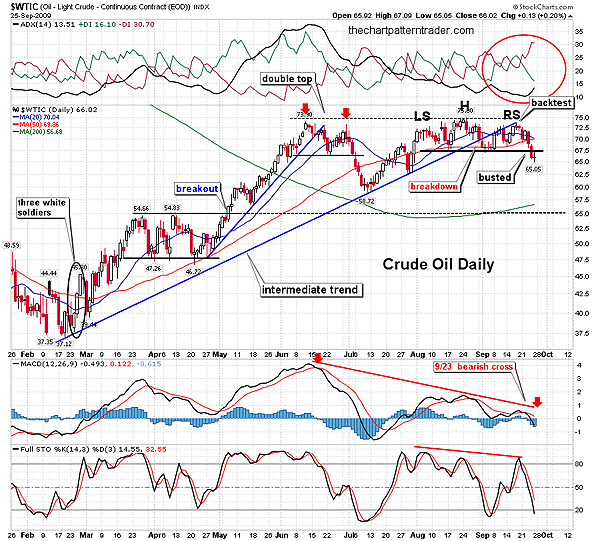
| FIGURE 1: $WTIC, DAILY. The breaking of the intermediate trend took prices back to the August lows. A bounce off support provided a successful backtest of that trendline and completed the head & shoulders pattern. Both the ADX and the MACD turned bearish shortly after the bearish m-M-m played out. |
| Graphic provided by: StockCharts.com. |
| |
| Through August and September 2009, crude oil's continuous contract ($WTIC) traded in a range between $67 to $75. In Figure 1, crude oil broke below its intermediate trendline on September 1, 2009, shortly after prices peaked at $75. That fractured the trend that began in February 2009. Prices then trickled down to test the August lows near $67, where WTIC rested on support. After the pullback, WTIC made another run for the prior high. A quick jolt higher encouraged the bulls as prices bounced off August support and the 50-day simple moving average (SMA). But after the bounce, prices had trouble clearing the broken intermediate trendline and WTIC couldn't make a higher high. Therefore, both the diagonal trendline and the horizontal level of resistance maintained their authority, proving to be an insurmountable obstacle to overcome. |
|
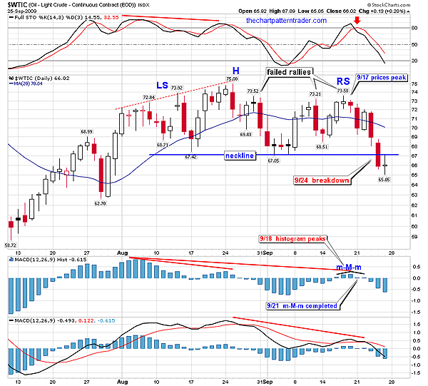
| FIGURE 2: $WTIC, DAILY. WTIC peaked on September 17, producing a lower high. |
| Graphic provided by: StockCharts.com. |
| |
| Further, prices had trouble clearing the mid-70s range all summer. After prices had peaked in late August (Figure 2), there were three separate attempts over the following weeks to challenge that high as the bulls and bears played tug-of-war, centered around the 20-day SMA. Finally, the bears yanked prices below the 20-day SMA, dragging the bulls through the mud. This victory for the bears accomplished three things; first, it allowed prices to successfully backtest the broken intermediate trendline. Second, it produced a lower high. Third, it completed the right shoulder in a head & shoulders topping pattern in September. This would eventually lead to lower lows. I want to draw your attention to a closeup of WTIC and the MACD histogram in Figure 2. WTIC peaked on September 17, producing a lower high. The next day, the histogram peaked. During the following session, on September 21, the histogram ticked down, completing a bearish m-M-m pattern. It wasn't until two days later that the actual MACD (12, 26, 9) indicator itself crossed below the signal line. The histogram offered an earlier warning that momentum was shifting, accurately predicting the reversal. Note how the two histogram peaks that preceded the m-M-m pattern were much higher in stature than the peak made in m-M-m pattern, showing that momentum to the upside was beginning to wane. |
| By September 24, prices broke support and put in a lower low, breaking the neckline of the head & shoulders top. It is interesting to note that the same day the m-M-m completed on the histogram, the stochastic (14, 3, 3) crossed below its signal line. Both indicators determine short-term momentum, and in this case moved in sync with one another, whereas the MACD helps to determine longer-term movements and is better suited for trend finding. Incidentally, the MACD's bearish crossover also suggests that longer-term trend is likely down. Back in Figure 1, another trend-based indicator is in agreement with the MACD and the histogram. The average directional movement indicator (ADX) (14) has turned bearish. The ADX line bottomed out and has begun rising, strengthening the surging negative direction indicator (-DI). This is a bearish indication that a new downtrend is beginning. |
|
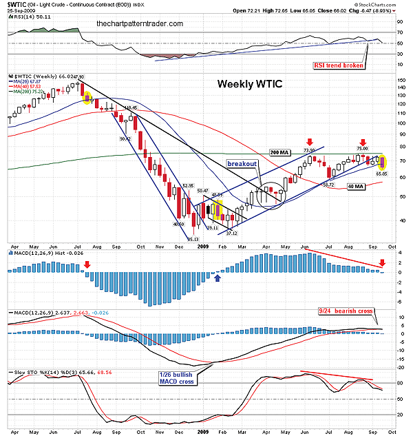
| FIGURE 3: $WTIC, WEEKLY. Center line moves on the MACD histogram have provided excellent entry and exit points. The price bars highlighted in yellow correspond with shifts in the center line. WTIC could have a double top in play or prices consolidate setting up a very large continuation pattern. The 40-week SMA will likely be tested. |
| Graphic provided by: StockCharts.com. |
| |
| In Figure 3, the weekly chart of WTIC reinforces the chances of further deterioration in price. The histogram's last bar printed a move just below its centerline, causing the MACD to cross below its signal line, flashing a sell signal. The prior two signals that were given when the histogram crossed above and below its center line proved to be very profitable. In mid-July 2008, a sell signal was flashed as the histogram broke below its centerline. Those that heeded to it were spared from a $98 catastrophe as prices dropped over the next five months. Then after bottoming in December 2008, the histogram ticked higher toward its centerline. During the last week of January 2009, the histogram was lifted above its centerline and the bulls started to party with confetti and balloons. That signal shifted momentum to the upside, taking prices from $40 to the peak in August at $75, causing prices to almost double in that time. Both prior histogram signals seen on the weekly chart produced winning trades by a pretty hefty margin. As far a price patterns in the weekly time frame, WTIC could be setting up a double-top pattern, with a confirmation line near $59. Note that WTIC reversed, putting in a distinct peak each time it touched the 200-week SMA. However, prices could begin struggling through a continuation pattern over the next several months in the form of a triangle or rectangle. With the penetration of the 20-week SMA, the next stop is likely the 40-week SMA near $57. There is good support just below that level at $55, as seen on the daily chart in Figure 1 (the dotted black line). In conclusion, by using the MACDH to spot divergences on daily charts to find short and long entry points and the slope usually determines market direction. Using the MACDH information on the charts in conjunction with centerline shifts on the weekly chart to help determine the tide of the market can only increase the odds of a successful trade. But keep in mind that divergences aren't limited to the daily charts. Divergences that form in the weekly time frame are actually more powerful. |
Ron Walker is an active trader and technical analyst. He operates an educational website dedicated to the study of Technical Analysis. The website offers free market analysis with daily video presentations and written commentaries. Ron is a video pioneer, being one of the first to utilize the internet producing Technical Analysis videos. His website is thechartpatterntrader.com
| Website: | thechartpatterntrader.com |
| E-mail address: | thechartpatterntrader@gmail.com |
Click here for more information about our publications!
Comments

Request Information From Our Sponsors
- StockCharts.com, Inc.
- Candle Patterns
- Candlestick Charting Explained
- Intermarket Technical Analysis
- John Murphy on Chart Analysis
- John Murphy's Chart Pattern Recognition
- John Murphy's Market Message
- MurphyExplainsMarketAnalysis-Intermarket Analysis
- MurphyExplainsMarketAnalysis-Visual Analysis
- StockCharts.com
- Technical Analysis of the Financial Markets
- The Visual Investor
- VectorVest, Inc.
- Executive Premier Workshop
- One-Day Options Course
- OptionsPro
- Retirement Income Workshop
- Sure-Fire Trading Systems (VectorVest, Inc.)
- Trading as a Business Workshop
- VectorVest 7 EOD
- VectorVest 7 RealTime/IntraDay
- VectorVest AutoTester
- VectorVest Educational Services
- VectorVest OnLine
- VectorVest Options Analyzer
- VectorVest ProGraphics v6.0
- VectorVest ProTrader 7
- VectorVest RealTime Derby Tool
- VectorVest Simulator
- VectorVest Variator
- VectorVest Watchdog