HOT TOPICS LIST
- MACD
- Fibonacci
- RSI
- Gann
- ADXR
- Stochastics
- Volume
- Triangles
- Futures
- Cycles
- Volatility
- ZIGZAG
- MESA
- Retracement
- Aroon
INDICATORS LIST
LIST OF TOPICS
PRINT THIS ARTICLE
by Mike Carr, CMT
The Value Line Index is understudied but one of the broadest measures of the stock market. Right now, it seems to be breaking out of a rectangle.
Position: N/A
Mike Carr, CMT
Mike Carr, CMT, is a member of the Market Technicians Association, and editor of the MTA's newsletter, Technically Speaking. He is also the author of "Smarter Investing in Any Economy: The Definitive Guide to Relative Strength Investing," and "Conquering the Divide: How to Use Economic Indicators to Catch Stock Market Trends."
PRINT THIS ARTICLE
STRATEGIES
A Rectangle In The Broad Market
07/24/09 02:27:18 PMby Mike Carr, CMT
The Value Line Index is understudied but one of the broadest measures of the stock market. Right now, it seems to be breaking out of a rectangle.
Position: N/A
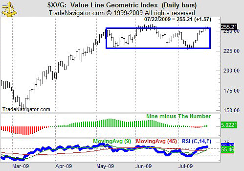
| Rectangles are useful price patterns that can signify a reversal or a continuation. After the market's rapid rise from the March lows, a consolidation pattern was the best-case scenario for the market bulls. Looking at Figure 1, we can see that a rectangle has contained the price action for almost two months in the Value Line Geometric Index ($XVG). |

|
| FIGURE 1: $XVG: DAILY. Prices are at the upper boundary of the rectangle and the RSI points to an upside breakout. |
| Graphic provided by: Trade Navigator. |
| |
| While not as commonly used as other indexes as the Standard & Poor's 500 or Dow Jones Industrial Average (DJIA), $XVG is monitored by many traders. It is intended to offer a rough approximation of how the average stock in the Value Line universe is performing and offers exposure across market capitalizations. It is usually thought of as more representative of a typical investor's portfolio. |
| The middle frame in Figure 1 shows the relative strength index (RSI) after applying a moving average convergence/divergence (MACD)-style calculation. This is a technique pioneered by Andrew Cardwell, who has done a great deal of innovative work with the RSI. We see that it is currently indicating upward momentum in the indicator, a good sign that higher prices are ahead. |
| We can also see the RSI in the bottom part of the chart is bullish. Cardwell advocates putting moving averages on the RSI. In this case, we see that the nine-day moving average is just crossing above the 45-day moving average, another sign that the market should move higher. |
| Overall, this is supportive of higher prices for the broad market. |
Mike Carr, CMT, is a member of the Market Technicians Association, and editor of the MTA's newsletter, Technically Speaking. He is also the author of "Smarter Investing in Any Economy: The Definitive Guide to Relative Strength Investing," and "Conquering the Divide: How to Use Economic Indicators to Catch Stock Market Trends."
| Website: | www.moneynews.com/blogs/MichaelCarr/id-73 |
| E-mail address: | marketstrategist@gmail.com |
Click here for more information about our publications!
Comments
Date:�07/28/09Rank:�4Comment:�
Date:�07/28/09Rank:�5Comment:�

Request Information From Our Sponsors
- StockCharts.com, Inc.
- Candle Patterns
- Candlestick Charting Explained
- Intermarket Technical Analysis
- John Murphy on Chart Analysis
- John Murphy's Chart Pattern Recognition
- John Murphy's Market Message
- MurphyExplainsMarketAnalysis-Intermarket Analysis
- MurphyExplainsMarketAnalysis-Visual Analysis
- StockCharts.com
- Technical Analysis of the Financial Markets
- The Visual Investor
- VectorVest, Inc.
- Executive Premier Workshop
- One-Day Options Course
- OptionsPro
- Retirement Income Workshop
- Sure-Fire Trading Systems (VectorVest, Inc.)
- Trading as a Business Workshop
- VectorVest 7 EOD
- VectorVest 7 RealTime/IntraDay
- VectorVest AutoTester
- VectorVest Educational Services
- VectorVest OnLine
- VectorVest Options Analyzer
- VectorVest ProGraphics v6.0
- VectorVest ProTrader 7
- VectorVest RealTime Derby Tool
- VectorVest Simulator
- VectorVest Variator
- VectorVest Watchdog
