HOT TOPICS LIST
- MACD
- Fibonacci
- RSI
- Gann
- ADXR
- Stochastics
- Volume
- Triangles
- Futures
- Cycles
- Volatility
- ZIGZAG
- MESA
- Retracement
- Aroon
INDICATORS LIST
LIST OF TOPICS
PRINT THIS ARTICLE
by Mike Carr, CMT
Using the Value Line index allows us to see how the broad market is doing, and right now, that is potentially bullish.
Position: N/A
Mike Carr, CMT
Mike Carr, CMT, is a member of the Market Technicians Association, and editor of the MTA's newsletter, Technically Speaking. He is also the author of "Smarter Investing in Any Economy: The Definitive Guide to Relative Strength Investing," and "Conquering the Divide: How to Use Economic Indicators to Catch Stock Market Trends."
PRINT THIS ARTICLE
CHART ANALYSIS
Broad Market Bullish
06/09/09 10:04:32 AMby Mike Carr, CMT
Using the Value Line index allows us to see how the broad market is doing, and right now, that is potentially bullish.
Position: N/A
| Less followed than other stock indexes, the Value Line Geometric Average (VLG) shows the performance of a basket of stocks where an equal dollar amount is invested in each stock. The change in each stock is averaged geometrically every day to provide a rough idea of how the median stock in the Value Line universe performed. |
| The median stock represents the halfway point. There are more than 1,600 stocks in VLG. About 800 will do better than the average every day and about half will do worse. Other indexes like the Standard & Poor's 500 can be dominated by the performance of only a few stocks. VLG avoids this problem. |
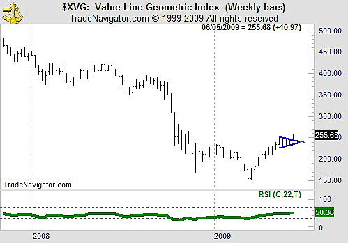
| Recent price action is shown in Figure 1. The index rose sharply off its March bottom, like all indexes and most stocks. In May, a pennant pattern formed, which was completed with an upside breakout with recent price action. |

|
| FIGURE 1: $XVG, WEEKLY. The weekly chart of the Value Line Geometric Index clearly shows that price has broken out of a pennant. |
| Graphic provided by: Trade Navigator. |
| |
| Pennants are usually considered to be continuation patterns. The upside measured target is at 334, an incredible gain of more than 30%. Chart readers may also spot a loose double bottom, which has an almost identical price target. |
| This shows the broad market may have more gains ahead as stocks that didn't participate as much in the initial advance may show leadership in coming months. |
Mike Carr, CMT, is a member of the Market Technicians Association, and editor of the MTA's newsletter, Technically Speaking. He is also the author of "Smarter Investing in Any Economy: The Definitive Guide to Relative Strength Investing," and "Conquering the Divide: How to Use Economic Indicators to Catch Stock Market Trends."
| Website: | www.moneynews.com/blogs/MichaelCarr/id-73 |
| E-mail address: | marketstrategist@gmail.com |
Click here for more information about our publications!
PRINT THIS ARTICLE

Request Information From Our Sponsors
- StockCharts.com, Inc.
- Candle Patterns
- Candlestick Charting Explained
- Intermarket Technical Analysis
- John Murphy on Chart Analysis
- John Murphy's Chart Pattern Recognition
- John Murphy's Market Message
- MurphyExplainsMarketAnalysis-Intermarket Analysis
- MurphyExplainsMarketAnalysis-Visual Analysis
- StockCharts.com
- Technical Analysis of the Financial Markets
- The Visual Investor
- VectorVest, Inc.
- Executive Premier Workshop
- One-Day Options Course
- OptionsPro
- Retirement Income Workshop
- Sure-Fire Trading Systems (VectorVest, Inc.)
- Trading as a Business Workshop
- VectorVest 7 EOD
- VectorVest 7 RealTime/IntraDay
- VectorVest AutoTester
- VectorVest Educational Services
- VectorVest OnLine
- VectorVest Options Analyzer
- VectorVest ProGraphics v6.0
- VectorVest ProTrader 7
- VectorVest RealTime Derby Tool
- VectorVest Simulator
- VectorVest Variator
- VectorVest Watchdog
