HOT TOPICS LIST
- MACD
- Fibonacci
- RSI
- Gann
- ADXR
- Stochastics
- Volume
- Triangles
- Futures
- Cycles
- Volatility
- ZIGZAG
- MESA
- Retracement
- Aroon
INDICATORS LIST
LIST OF TOPICS
PRINT THIS ARTICLE
by Alan R. Northam
The S&P 500 has now broken its series of lower peaks and lower troughs, signaling the end of the bear market downtrend that began in October 2007. However, it is still unknown as to whether a new bull market upward trend is in progress.
Position: N/A
Alan R. Northam
Alan Northam lives in the Dallas, Texas area and as an electronic engineer gave him an analytical mind from which he has developed a thorough knowledge of stock market technical analysis. His abilities to analyze the future direction of the stock market has allowed him to successfully trade of his own portfolio over the last 30 years. Mr. Northam is now retired and trading the stock market full time. You can reach him at inquiry@tradersclassroom.com or by visiting his website at http://www.tradersclassroom.com. You can also follow him on Twitter @TradersClassrm.
PRINT THIS ARTICLE
TECHNICAL ANALYSIS
S&P 500 Breaks Series Of Peaks And Troughs
06/08/09 12:36:55 PMby Alan R. Northam
The S&P 500 has now broken its series of lower peaks and lower troughs, signaling the end of the bear market downtrend that began in October 2007. However, it is still unknown as to whether a new bull market upward trend is in progress.
Position: N/A
| One of the most basic but yet most reliable methods of technical analysis is known as peak and trough analysis. The principles of peak and trough analysis was first described by Charles Henry Dow in the early 1900s and later became a basic tenet of Dow theory. All other forms of technical analysis are basically derivatives of peak and trough analysis. Dow theory states that a bull market is defined as a series of peaks and troughs where each succeeding peak is higher than the one before it and each trough is higher than the one preceding it. A peak is a price peak and a trough is a price minimum. A bear market is just the opposite. A bear market is defined as a series of peaks and troughs, where each peak is lower than the one before it and each trough is lower than the previous trough. Dow theory also states that a bull market trend or a bear market trend ends when the series of peaks and troughs is broken. However, the breaking of the series of peaks and troughs does not necessarily indicate a reversal of trend, only that the old trend has ended and a new trend has begun. This new trend could be a trading range, a new downward trend, or a new upward trend. |
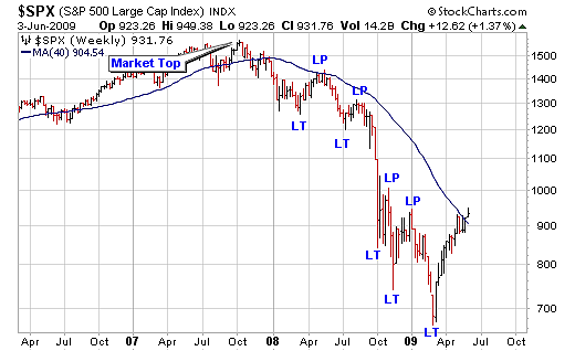
| Figure 1 is that of the weekly bar chart of the Standard & Poor's 500 over the last two years. This chart shows the October 2007 bull market top followed by the bear market over the last 18 months. Note the labeling of a series of LTs (lower trough) and LPs (lower peaks) on the chart. Note that during the complete bear market from October 2007 to March 2009, each trough was lower than the preceding trough and each peak lower than the one before. This series of peaks and troughs satisfies the definition of a downward trend or bear market. However, note that in early June the previous lower peak is being challenged. Should a higher peak develop, it will break the series of lower peaks and terminate the downward trend. |

|
| FIGURE 1: $SPX, WEEKLY. This figure shows a series of lower peaks and lower troughs. |
| Graphic provided by: StockCharts.com. |
| |
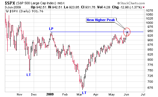
| In Figure 2, I have shown the daily bar chart of the S&P 500 over the last eight months to show more detail. I have drawn a horizontal line off the early January 2009 price peak. This line shows that in early June 2009 the S&P 500 made a higher high price, which breaks the downward trend that started in October 2007. However, to satisfy the Dow theory definition of a new upward trend, this market still needs to form a higher trough followed by a new higher peak, neither of which as yet occurred. Therefore, it is uncertain whether a new upward trend is in play, a horizontal trading range is developing, or a more shallow downward trend will develop. |

|
| FIGURE 2: $SPX, DAILY. This market has made a new higher high price, thereby breaking the series of lower peaks and troughs, terminating the downtrend that started in October 2007. |
| Graphic provided by: StockCharts.com. |
| |
| In conclusion, the S&P 500 has now broken its series of lower peaks and lower troughs, thereby terminating the downward trend that started in October 2007. However, we do not know if a new bull market trend is currently under way or if this market is entering into a large sideways trading range, or even if a new downward trend will eventually evolve. We must wait and see what the future peaks and troughs tell us about the future direction of the S&P 500. |
Alan Northam lives in the Dallas, Texas area and as an electronic engineer gave him an analytical mind from which he has developed a thorough knowledge of stock market technical analysis. His abilities to analyze the future direction of the stock market has allowed him to successfully trade of his own portfolio over the last 30 years. Mr. Northam is now retired and trading the stock market full time. You can reach him at inquiry@tradersclassroom.com or by visiting his website at http://www.tradersclassroom.com. You can also follow him on Twitter @TradersClassrm.
| Garland, Tx | |
| Website: | www.tradersclassroom.com |
| E-mail address: | inquiry@tradersclassroom.com |
Click here for more information about our publications!
Comments
Date:�06/09/09Rank:�4Comment:�

Request Information From Our Sponsors
- StockCharts.com, Inc.
- Candle Patterns
- Candlestick Charting Explained
- Intermarket Technical Analysis
- John Murphy on Chart Analysis
- John Murphy's Chart Pattern Recognition
- John Murphy's Market Message
- MurphyExplainsMarketAnalysis-Intermarket Analysis
- MurphyExplainsMarketAnalysis-Visual Analysis
- StockCharts.com
- Technical Analysis of the Financial Markets
- The Visual Investor
- VectorVest, Inc.
- Executive Premier Workshop
- One-Day Options Course
- OptionsPro
- Retirement Income Workshop
- Sure-Fire Trading Systems (VectorVest, Inc.)
- Trading as a Business Workshop
- VectorVest 7 EOD
- VectorVest 7 RealTime/IntraDay
- VectorVest AutoTester
- VectorVest Educational Services
- VectorVest OnLine
- VectorVest Options Analyzer
- VectorVest ProGraphics v6.0
- VectorVest ProTrader 7
- VectorVest RealTime Derby Tool
- VectorVest Simulator
- VectorVest Variator
- VectorVest Watchdog
