HOT TOPICS LIST
- MACD
- Fibonacci
- RSI
- Gann
- ADXR
- Stochastics
- Volume
- Triangles
- Futures
- Cycles
- Volatility
- ZIGZAG
- MESA
- Retracement
- Aroon
INDICATORS LIST
LIST OF TOPICS
PRINT THIS ARTICLE
by Paolo Pezzutti
Prices are very close to the apex of the formation, and we can expect a breakout soon.
Position: N/A
Paolo Pezzutti
Author of the book "Trading the US Markets - A Comprehensive Guide to US Markets for International Traders and Investors" - Harriman House (July 2008)
PRINT THIS ARTICLE
TRIANGLES
Yahoo! Developing A Bullish Triangle
03/23/09 12:53:38 PMby Paolo Pezzutti
Prices are very close to the apex of the formation, and we can expect a breakout soon.
Position: N/A
| We know that markets spend long periods of time developing congestions and trading ranges. Triangles are a form of congestion. At the beginning you can see high volatility, but as they develop, volume dries up and volatility reduces. There are different types of triangles: ascending triangles are considered bullish patterns, while descending triangles are bearish. Symmetrical triangles tend to continue the trend preceding the triangle formation. |

|
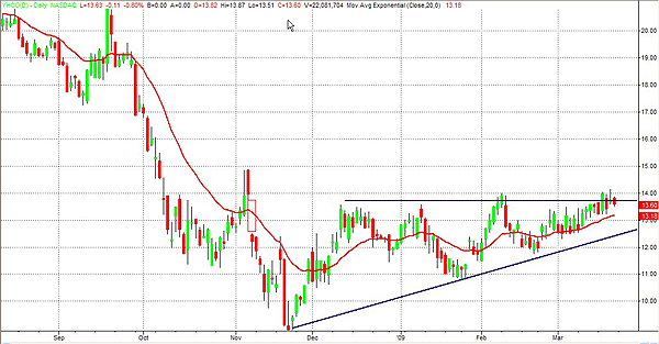
| FIGURE 1: YHOO, DAILY. Since last December, Yahoo has developed an ascending triangle, which is greatly considered a bullish formation. Prices are near the apex, and we can expect a breakout soon. |
| Graphic provided by: TradeStation. |
| |
| In the daily chart in Figure 1, you can see that Yahoo! (YHOO), since last December, has developed a bullish triangle. In fact, prices rose toward the resistance level between $13.5 and $14, with buying pressure building up as prices tested the upper boundary. They have hit resistance three times already and we can expect a breakout soon because prices are now very near the apex. Based on the pattern characteristics after the breakout, prices start a new trend. False moves may occur where the formation ends, and they are usually accompanied by low volatility. Although we should expect a breakout to the upside, there are a number of different scenarios. |
| The breakout to the upside could occur with prices moving toward the objective of $18. You could have a pullback after the breakout and then a continuation of the uptrend. In addition, a failure of the breakout could happen with a fall back through the apex in the opposite direction. Let's not forget that a breakout to the downside could also occur with converse situations. It happens with a lower frequency, but it is a possibility that cannot be ruled out. In this case, volatility can be very high. |

|
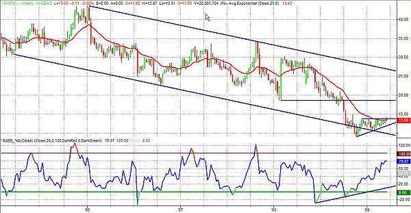
| FIGURE 2: YHOO, WEEKLY. Since the beginning of 2006, the stock has been moving within a downward channel. Prices are now close to the lower trendline and the %b indicator is developing a positive divergence. |
| Graphic provided by: TradeStation. |
| |
| In Figure 2 you can see the weekly chart. Since the beginning of 2006, YHOO has been moving within a wide downward channel. Prices are now testing the lower trendline. In the chart I used the %b indicator, which is derived from the Bollinger bands. It measures where the last price is in relation to the bands. The indicator has printed a positive divergence and is moving to the upside. You can see the resistance at $18.60. This level represents the objective of the triangle, but also the low of the wide-ranging up bar printed on February 1, 2008. |

|
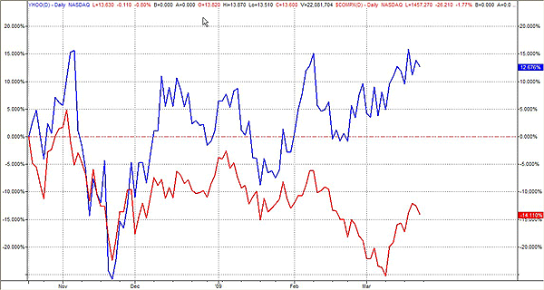
| FIGURE 3: YHOO, DAILY. The stock has outperformed the NASDAQ in the past five months. It could be interpreted as a signal that accumulation is ongoing. |
| Graphic provided by: TradeStation. |
| |
| In light of these different scenarios, you can prepare your plan according to the assessment of market conditions. You can trade the breakout or you may anticipate the breakout direction, entering your position in a low-volatility environment. You can also wait for a pullback after the breakout, if it ever occurs. You can finally capitalize on false moves. In Figure 3, you can see that YHOO has outperformed the NASDAQ in the past five months. In this light, the triangle could be seen as a sign of accumulation on this stock. |
Author of the book "Trading the US Markets - A Comprehensive Guide to US Markets for International Traders and Investors" - Harriman House (July 2008)
| Address: | VIA ROBERTO AGO 26 POSTAL CODE 00166 |
| Rome, ITALY | |
| Phone # for sales: | +393357540708 |
| E-mail address: | pezzutti.paolo@tiscali.it |
Click here for more information about our publications!
Comments
Date:�03/23/09Rank:�5Comment:�
Date:�03/23/09Rank:�5Comment:�

Request Information From Our Sponsors
- StockCharts.com, Inc.
- Candle Patterns
- Candlestick Charting Explained
- Intermarket Technical Analysis
- John Murphy on Chart Analysis
- John Murphy's Chart Pattern Recognition
- John Murphy's Market Message
- MurphyExplainsMarketAnalysis-Intermarket Analysis
- MurphyExplainsMarketAnalysis-Visual Analysis
- StockCharts.com
- Technical Analysis of the Financial Markets
- The Visual Investor
- VectorVest, Inc.
- Executive Premier Workshop
- One-Day Options Course
- OptionsPro
- Retirement Income Workshop
- Sure-Fire Trading Systems (VectorVest, Inc.)
- Trading as a Business Workshop
- VectorVest 7 EOD
- VectorVest 7 RealTime/IntraDay
- VectorVest AutoTester
- VectorVest Educational Services
- VectorVest OnLine
- VectorVest Options Analyzer
- VectorVest ProGraphics v6.0
- VectorVest ProTrader 7
- VectorVest RealTime Derby Tool
- VectorVest Simulator
- VectorVest Variator
- VectorVest Watchdog
