HOT TOPICS LIST
- MACD
- Fibonacci
- RSI
- Gann
- ADXR
- Stochastics
- Volume
- Triangles
- Futures
- Cycles
- Volatility
- ZIGZAG
- MESA
- Retracement
- Aroon
INDICATORS LIST
LIST OF TOPICS
PRINT THIS ARTICLE
by Mike Carr, CMT
Trading success often comes from looking at indicators that others fail to consider. The bullish percent index (BPI) may have value because so few traders understand its importance.
Position: N/A
Mike Carr, CMT
Mike Carr, CMT, is a member of the Market Technicians Association, and editor of the MTA's newsletter, Technically Speaking. He is also the author of "Smarter Investing in Any Economy: The Definitive Guide to Relative Strength Investing," and "Conquering the Divide: How to Use Economic Indicators to Catch Stock Market Trends."
PRINT THIS ARTICLE
STRATEGIES
Using the Bullish Percent Index
03/12/09 08:38:08 AMby Mike Carr, CMT
Trading success often comes from looking at indicators that others fail to consider. The bullish percent index (BPI) may have value because so few traders understand its importance.
Position: N/A
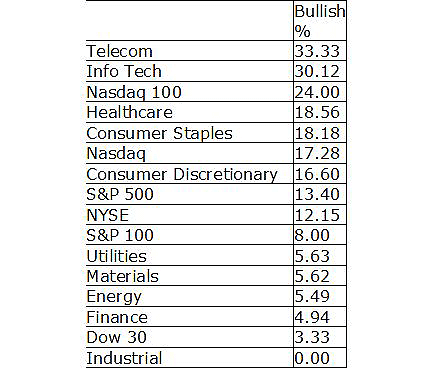
| Buried at the bottom of the Markets Summary page on StockCharts.com is data that is rarely referenced in the financial media. This website provides a bullish percent index for several indexes and sectors. This index shows the percentage of stocks that are on a point & figure buy signal. The P&F chart is a type of chart that shows only price changes, ignoring time. This allows traders to focus solely on the trend. Buy and sell signals are very easy to spot using this technique. |
| The leading sectors are telecom and information technology. The NASDAQ 100 is the most bullish index by this measure. These are the most speculative sectors and index in the market. The Dow Jones Industrial Average (DJIA) and industrial stocks are the weakest areas of the market at this time. |

|
| FIGURE 1: THE BPI. The bullish percent index is showing a speculative trading atmosphere. |
| Graphic provided by: StockCharts.com. |
| |
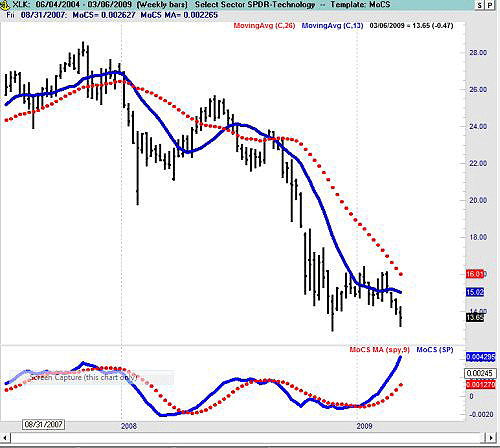
| The traditional price chart of the technology sector shows that this sector has a great deal of relative strength (Figure 1). In a bear market, strong performance usually means losing less than the overall market. That is the case for most tech stocks. But in a new bull market, the stocks that declined the least in the bear market are usually among the early winners. (See Figure 2.) |

|
| FIGURE 2: XLK. The Select Sector SPDR-Technology exchange traded fund (ETF) is the best relative performer among sector ETFs. |
| Graphic provided by: TradeNavigator. |
| |
| Technically, the market is at historically oversold extremes. There are some breadth and momentum divergences present that give room for optimism. The fact that investors seem to bidding growth stocks higher is a sign that trader sentiment is more optimistic than media and public sentiment may indicate. |
Mike Carr, CMT, is a member of the Market Technicians Association, and editor of the MTA's newsletter, Technically Speaking. He is also the author of "Smarter Investing in Any Economy: The Definitive Guide to Relative Strength Investing," and "Conquering the Divide: How to Use Economic Indicators to Catch Stock Market Trends."
| Website: | www.moneynews.com/blogs/MichaelCarr/id-73 |
| E-mail address: | marketstrategist@gmail.com |
Click here for more information about our publications!
Comments

Request Information From Our Sponsors
- StockCharts.com, Inc.
- Candle Patterns
- Candlestick Charting Explained
- Intermarket Technical Analysis
- John Murphy on Chart Analysis
- John Murphy's Chart Pattern Recognition
- John Murphy's Market Message
- MurphyExplainsMarketAnalysis-Intermarket Analysis
- MurphyExplainsMarketAnalysis-Visual Analysis
- StockCharts.com
- Technical Analysis of the Financial Markets
- The Visual Investor
- VectorVest, Inc.
- Executive Premier Workshop
- One-Day Options Course
- OptionsPro
- Retirement Income Workshop
- Sure-Fire Trading Systems (VectorVest, Inc.)
- Trading as a Business Workshop
- VectorVest 7 EOD
- VectorVest 7 RealTime/IntraDay
- VectorVest AutoTester
- VectorVest Educational Services
- VectorVest OnLine
- VectorVest Options Analyzer
- VectorVest ProGraphics v6.0
- VectorVest ProTrader 7
- VectorVest RealTime Derby Tool
- VectorVest Simulator
- VectorVest Variator
- VectorVest Watchdog
