HOT TOPICS LIST
- MACD
- Fibonacci
- RSI
- Gann
- ADXR
- Stochastics
- Volume
- Triangles
- Futures
- Cycles
- Volatility
- ZIGZAG
- MESA
- Retracement
- Aroon
INDICATORS LIST
LIST OF TOPICS
PRINT THIS ARTICLE
by Mike Carr, CMT
The market may be setting up for a period of consolidation.
Position: N/A
Mike Carr, CMT
Mike Carr, CMT, is a member of the Market Technicians Association, and editor of the MTA's newsletter, Technically Speaking. He is also the author of "Smarter Investing in Any Economy: The Definitive Guide to Relative Strength Investing," and "Conquering the Divide: How to Use Economic Indicators to Catch Stock Market Trends."
PRINT THIS ARTICLE
VOLATILITY
Volatility Dominant Theme In Stocks
02/19/09 08:38:22 AMby Mike Carr, CMT
The market may be setting up for a period of consolidation.
Position: N/A
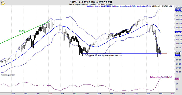
| From a technical perspective, the biggest factor in the markets is volatility (Figure 1). Since the large down move last autumn, price action has settled into a consolidation pattern. While some technical indicators show signs of strength, others indicate further weakness. Bollinger bands are a technical trading tool developed by John Bollinger in the early 1980s. This indicator quantifies the observation that volatility is dynamic, described by Bollinger as meaning that periods of low volatility are inevitably followed by periods of high volatility and vice versa. |

|
| FIGURE 1: S&P 500, MONTHLY. Volatility is returning to lower levels. |
| Graphic provided by: TradeNavigator.com. |
| |
| Bollinger bands consist of a set of three lines drawn relative to price. The middle band is a measure of the intermediate-term price trend, a simple moving average. The upper band can be found by adding two standard deviations of that average to the average; subtracting two standard deviations from the average yields the lower band. While the math is complex, the important point to remember is that wide bands indicate wild markets and are usually followed by narrow bands and calm markets. |
| The Bollinger Bandwidth is a relative measure of the width of the Bollinger bands, calculated as: Bandwidth = (Bollinger Upper Band - Bollinger Lower Band) / Bollinger Middle Band In Figure 1, we see that for most of the past three years, the Bollinger Bandwidth has had a value near 10. In late 2008, that value spiked above 50. It is now headed lower, and if history is a guide, we should see more subdued market action than we have in the recent past. This would mean that it is likely that prices will remain in a relatively narrow range; a low near 7500 on the Dow Jones Industrial Average (DJIA) has served as a strong support level since 1997 and 9,000 will offer serious resistance to the upside. |

|
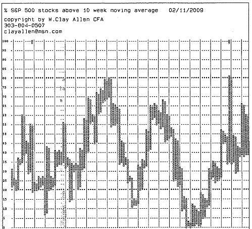
| FIGURE 2: S&P 500 STOCKS ABOVE 10-WEEK MOVING AVERAGE. Breadth has also displayed unusual volatility. |
| Graphic provided by: Market Dynamics. |
| |
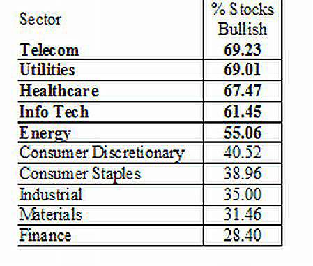
| Market volatility is also evident in market breadth (Figure 2). Breadth is used to determine how many stocks are participating in the market average's up or down move. Looking at this indicator allows investors to examine price trends of a large group of stocks. In this case, a point & figure chart is used to clearly identify the trends. This chart shows the percentage of stocks in the Standard & Poor's 500 that are in uptrends, defined as being above their 10-week moving average. At the market lows in November 2008, no stocks were above their average, but more than 80% traded through that level in the last week of the year. Since that extreme price action, the number of stocks in uptrends has fallen and sits at 31% as of February 11. The trend of breadth is also consolidating, although decidedly more bearish than bullish. Within individual market sectors, consolidation is also evident. Standard & Poor's assigns all stocks to one of 10 sectors. At the market close of February 13, most stocks were in uptrends in five sectors, and five sectors showed most stocks in downtrends (Figure 3). |

|
| FIGURE 3: SECTOR BREADTH. Sector breadth shows no clear trend. |
| Graphic provided by: StockCharts.com. |
| |
| The market overall appears to be near fair value and looks to have little upside. On the bright side, there are individual stocks and individual sectors with strength. This is a stock-picking environment rather than the time for a buy & hold indexing strategy that worked so well in the 1990s. As we see the market consolidate, relative strength will be useful for finding buys and sells. Active management is important for preservation of capital and should maximize gains as they are available. |
Mike Carr, CMT, is a member of the Market Technicians Association, and editor of the MTA's newsletter, Technically Speaking. He is also the author of "Smarter Investing in Any Economy: The Definitive Guide to Relative Strength Investing," and "Conquering the Divide: How to Use Economic Indicators to Catch Stock Market Trends."
| Website: | www.moneynews.com/blogs/MichaelCarr/id-73 |
| E-mail address: | marketstrategist@gmail.com |
Click here for more information about our publications!
Comments

Request Information From Our Sponsors
- StockCharts.com, Inc.
- Candle Patterns
- Candlestick Charting Explained
- Intermarket Technical Analysis
- John Murphy on Chart Analysis
- John Murphy's Chart Pattern Recognition
- John Murphy's Market Message
- MurphyExplainsMarketAnalysis-Intermarket Analysis
- MurphyExplainsMarketAnalysis-Visual Analysis
- StockCharts.com
- Technical Analysis of the Financial Markets
- The Visual Investor
- VectorVest, Inc.
- Executive Premier Workshop
- One-Day Options Course
- OptionsPro
- Retirement Income Workshop
- Sure-Fire Trading Systems (VectorVest, Inc.)
- Trading as a Business Workshop
- VectorVest 7 EOD
- VectorVest 7 RealTime/IntraDay
- VectorVest AutoTester
- VectorVest Educational Services
- VectorVest OnLine
- VectorVest Options Analyzer
- VectorVest ProGraphics v6.0
- VectorVest ProTrader 7
- VectorVest RealTime Derby Tool
- VectorVest Simulator
- VectorVest Variator
- VectorVest Watchdog
