

HOT TOPICS LIST
- MACD
- Fibonacci
- RSI
- Gann
- ADXR
- Stochastics
- Volume
- Triangles
- Futures
- Cycles
- Volatility
- ZIGZAG
- MESA
- Retracement
- Aroon
INDICATORS LIST
LIST OF TOPICS
PRINT THIS ARTICLE
by James Kupfer
Looking back in history may show us what the future will look like for the Dow Jones Industrial Average.
Position: Sell
James Kupfer
Mr. Kupfer is a market professional and amateur stock market commentator. Disclosure: It is likely that Mr. Kupfer has or will enter a position in any security he writes about.
PRINT THIS ARTICLE
CYCLES
DJ Vu
02/18/09 02:08:07 PMby James Kupfer
Looking back in history may show us what the future will look like for the Dow Jones Industrial Average.
Position: Sell
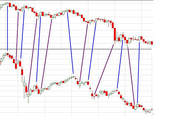
| The combined chart in Figure 1 is a weekly view of the Dow Jones 30 from two different time periods. Blue lines have been drawn between relative tops and purple lines have been drawn between low points. As can be seen, highs and lows occur within close proximity with one another. While the similarities are obviously not perfect, we could be forgiven for thinking that the charts shown here are from two correlated stocks over the same time period. |
|
| FIGURE 1: DOW JONES INDUSTRIAL AVERAGE, 2007 AND 1929. Blue marks cycle highs, purple cycle lows. |
| Graphic provided by: Wealth-lab. |
| |
| In fact, the charts are almost 80 years apart. The chart on top starts at the 2007 market top. The chart beneath starts at the 1929 market top. Before dismissing this as a coincidence, keep in mind that the stock market is cyclical in nature, and therefore it is not at all surprising that the charts from so long ago are eerily similar to what is happening now. |
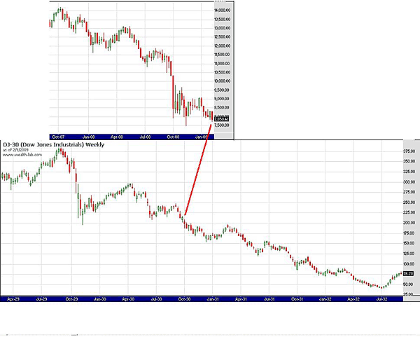
| If we accept 1929 as a generalized guide as to what may happen in the DJ30 going forward then, the picture is bleak indeed. It is also interesting to note that from the 2007 high until today the market is down 44.7%; from the 1929 top until where in the corresponding cycle we are (based on my rough estimate) the market of 1929-30 was down 43.7%. From October 1930, the Dow fell another 81% over another year and a half. For us today, that would equate to a Dow low of about 1500 sometime in 2010-11. |
|
| FIGURE 2: SIGN OF THINGS TO COME? Is the red line an indicator of where we are today relative to 1930? |
| Graphic provided by: Wealth-lab. |
| |
| While it may seem impossible to us now to comprehend a Dow Jones 30 of 1500, I'm sure it seemed equally unlikely to a stock jobber in 1930 that the market would eventually hit a low of 40 from a high of 380. This forecast certainly may not happen -- and hopefully won't -- but it may be worth keeping in mind. See Figure 2; is the red line an indicator as to where we are today relative to 1930? |
Mr. Kupfer is a market professional and amateur stock market commentator. Disclosure: It is likely that Mr. Kupfer has or will enter a position in any security he writes about.
Click here for more information about our publications!
Comments
Date:�02/18/09Rank:�5Comment:�

Request Information From Our Sponsors
- StockCharts.com, Inc.
- Candle Patterns
- Candlestick Charting Explained
- Intermarket Technical Analysis
- John Murphy on Chart Analysis
- John Murphy's Chart Pattern Recognition
- John Murphy's Market Message
- MurphyExplainsMarketAnalysis-Intermarket Analysis
- MurphyExplainsMarketAnalysis-Visual Analysis
- StockCharts.com
- Technical Analysis of the Financial Markets
- The Visual Investor
- VectorVest, Inc.
- Executive Premier Workshop
- One-Day Options Course
- OptionsPro
- Retirement Income Workshop
- Sure-Fire Trading Systems (VectorVest, Inc.)
- Trading as a Business Workshop
- VectorVest 7 EOD
- VectorVest 7 RealTime/IntraDay
- VectorVest AutoTester
- VectorVest Educational Services
- VectorVest OnLine
- VectorVest Options Analyzer
- VectorVest ProGraphics v6.0
- VectorVest ProTrader 7
- VectorVest RealTime Derby Tool
- VectorVest Simulator
- VectorVest Variator
- VectorVest Watchdog