HOT TOPICS LIST
- MACD
- Fibonacci
- RSI
- Gann
- ADXR
- Stochastics
- Volume
- Triangles
- Futures
- Cycles
- Volatility
- ZIGZAG
- MESA
- Retracement
- Aroon
INDICATORS LIST
LIST OF TOPICS
PRINT THIS ARTICLE
by Ron Walker
Technical analysis can offer us a glimpse into the future when we spot a divergence or candlestick reversal patterns and they offer clues to potential price swings and fluctuations. Either signal has credibility on its own merits, but when they have a bullish divergence on more than one intraday chart, while the daily chart puts in a reversal candlestick, it could be a winning combination for a successful trade.
Position: N/A
Ron Walker
Ron Walker is an active trader and technical analyst. He operates an educational website dedicated to the study of Technical Analysis. The website offers free market analysis with daily video presentations and written commentaries. Ron is a video pioneer, being one of the first to utilize the internet producing Technical Analysis videos. His website is thechartpatterntrader.com
PRINT THIS ARTICLE
REVERSAL
The Dow's Dragonfly Doji And Double Dose Divergences
02/17/09 12:06:32 PMby Ron Walker
Technical analysis can offer us a glimpse into the future when we spot a divergence or candlestick reversal patterns and they offer clues to potential price swings and fluctuations. Either signal has credibility on its own merits, but when they have a bullish divergence on more than one intraday chart, while the daily chart puts in a reversal candlestick, it could be a winning combination for a successful trade.
Position: N/A
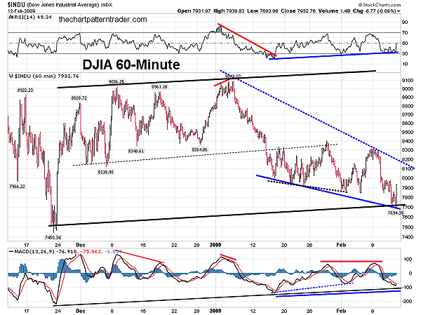
| After the Dow Jones Industrial Average (DJIA) peaked at 9087 in early January 2009, the floor fell out, as it put in its worst January performance in history. For January 2009, the DJIA lost 775 points or 8.84%. The First Divergence The Dow Jones Industrial Average (DJIA) broke the sound barrier on its steep ride down from its January high and moved on to February with a series of lower lows. In Figure 1, a divergence appeared on the DJIA hourly chart in early February that gave prices a short-term pop back up to resistance near the 8400 level, which was the minor high made in late January. Braced for another impact at resistance, the DJIA was dealt another severe blow that sent it crashing back down, falling below the cracks and crevasses of support to make yet another lower low. The moving average convergence/divergence (MACD) (12, 26, 9) was unsuccessful in moving above its previous peak, bringing about a lackluster rally. The moving average convergence/divergence (MACD) couldn't break above its previous peak, subsequently stalling the rally. It also revealed that momentum to the upside was flat, and that it would be difficult to gain any traction here at resistance. |

|
| FIGURE 1: DJIA, 60-MINUTE. Note how the first divergence completed in early February (black dotted line on the price chart) with the MACD. But the MACD failed to push above its previous peak made in late January, causing prices to make new lows. The new lows completed a larger divergence (solid blue lines) while simutaneously testing the support of the rising MACD trendline off the November 21st lows. |
| Graphic provided by: StockCharts.com. |
| |
| Needless to say, the DJIA retreated, and fell below the lows it made in early February, on its way down to test the November low. But while prices were busy making lower lows, the MACD held above its prior low, forming a much larger divergence than one that formed in early February. In addition to the divergence, the MACD has a long-term trendline off the November lows, killing two birds with one stone. Moreover, the formation of the divergence has allowed a very large bullish falling wedge pattern to form on the hourly chart. Prices need to move above the 8100 area in order for the pattern to break out. But the fact that the pattern hasn't broken out yet is irrelevant; the important thing here is that the 60-minute chart has a bullish divergence. |

|
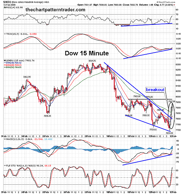
| FIGURE 2: DJIA, 15-MINUTE. The DJIA has a divergence with the MACD, TRIX, and the RSI. The divergence forced the breakout of the bullish falling wedge, which was so powerful that a bullish three white soilders candlestick pattern appeared at the breakout (circled in black). |
| Graphic provided by: StockCharts.com. |
| |
| The Second Divergence Now we also have a divergence on the 15-minute chart. On the DJIA 15-minute chart, we can see on a larger scale, the rally that occurred from the early February lows. In Figure 2, we can see that prices rallied up to 8314 on February 9, but then the rally stalled and prices rolled over and began to decline once again. Over the course of the next three trading sessions, prices forged lower, forming a bullish falling wedge, just like the hourly chart. Note that both the MACD and the relative strength index (RSI) formed a divergence with the price. This bullish divergence led to the pattern's breakout on February 12 where the DJIA embarked on a journey back up to overhead resistance near the 7975 area. With both 15- and 60-minute intraday charts sporting a bullish divergence, examine the candlesticks on the daily chart for evidence of a reversal. That will help us gauge what kind of odds we are up against for the divergences to play out. If a potential reversal pattern has formed, the odds significantly increase that the divergences will play out. |

|
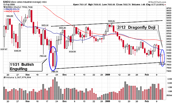
| FIGURE 3: DJIA, DAILY. With a reversal dragonfly doji candlestick on the daily chart, the DJIA has formed a orderly rising minor price channel. A dragonfly doji is usually associated with a turning point in price. So it is very possible that the DJIA could begin a journey back to the upper boundary of this channel toward the 9200 level. |
| Graphic provided by: StockCharts.com. |
| |
| The Dragonfly Doji In Figure 3, we can see that a dragonfly doji candlestick has formed on the DJIA daily chart, which is a reversal one-day candle pattern. A dragonfly doji occurs when the open and the close are at the high end of the day. This doji signifies a turning point for the DJIA. Note that a progressive rising channel has been completed with the appearance of the dragonfly doji. In addition, note how the rising minor trendline runs parallel with the upper level of rising resistance, which forms the upper boundary or a trend channel. |
| With a divergence on the 15-minute chart and on the 60-minute chart, the dragonfly doji will likely get a follow-through confirming the pattern, as prices close above the highest peak on the doji. This pattern must be confirmed by prices closing above the highest point on the pattern. Volume should increase on the confirmation, and once it is confirmed it should resurrect a rally and silence the bears. With the confluence of support in these multiple time frames, the DJIA may lick its wounds and begin the healing process. But keep in mind that not every divergence plays out; there is no sure thing. This market is volatile, and whipsaws have occurred frequently in this emotional trading environment. Whipsaws occur when a buy signal is given but quickly reversed. But the scales of balance are clearly shifting the odds in favor of the bulls for the short term. |
Ron Walker is an active trader and technical analyst. He operates an educational website dedicated to the study of Technical Analysis. The website offers free market analysis with daily video presentations and written commentaries. Ron is a video pioneer, being one of the first to utilize the internet producing Technical Analysis videos. His website is thechartpatterntrader.com
| Website: | thechartpatterntrader.com |
| E-mail address: | thechartpatterntrader@gmail.com |
Click here for more information about our publications!
Comments
Date:�02/18/09Rank:�2Comment:�

Request Information From Our Sponsors
- StockCharts.com, Inc.
- Candle Patterns
- Candlestick Charting Explained
- Intermarket Technical Analysis
- John Murphy on Chart Analysis
- John Murphy's Chart Pattern Recognition
- John Murphy's Market Message
- MurphyExplainsMarketAnalysis-Intermarket Analysis
- MurphyExplainsMarketAnalysis-Visual Analysis
- StockCharts.com
- Technical Analysis of the Financial Markets
- The Visual Investor
- VectorVest, Inc.
- Executive Premier Workshop
- One-Day Options Course
- OptionsPro
- Retirement Income Workshop
- Sure-Fire Trading Systems (VectorVest, Inc.)
- Trading as a Business Workshop
- VectorVest 7 EOD
- VectorVest 7 RealTime/IntraDay
- VectorVest AutoTester
- VectorVest Educational Services
- VectorVest OnLine
- VectorVest Options Analyzer
- VectorVest ProGraphics v6.0
- VectorVest ProTrader 7
- VectorVest RealTime Derby Tool
- VectorVest Simulator
- VectorVest Variator
- VectorVest Watchdog
