HOT TOPICS LIST
- MACD
- Fibonacci
- RSI
- Gann
- ADXR
- Stochastics
- Volume
- Triangles
- Futures
- Cycles
- Volatility
- ZIGZAG
- MESA
- Retracement
- Aroon
INDICATORS LIST
LIST OF TOPICS
PRINT THIS ARTICLE
by Ron Walker
The ailing financial sector successfully derailed and shelved the recent market rally off the November lows. The market has become important from the weakening financial sector. XLF has helped lead the assault on the bulls, but now that XLF is testing its November lows, it may be time to break ranks with the bears and look for evidence of a reversal. In this cutthroat market, XLF will have its work cut out for it as it attempts to claw its way upward.
Position: N/A
Ron Walker
Ron Walker is an active trader and technical analyst. He operates an educational website dedicated to the study of Technical Analysis. The website offers free market analysis with daily video presentations and written commentaries. Ron is a video pioneer, being one of the first to utilize the internet producing Technical Analysis videos. His website is thechartpatterntrader.com
PRINT THIS ARTICLE
DOUBLE BOTTOMS
Banking On A Double Bottom For XLF
01/27/09 09:57:51 AMby Ron Walker
The ailing financial sector successfully derailed and shelved the recent market rally off the November lows. The market has become important from the weakening financial sector. XLF has helped lead the assault on the bulls, but now that XLF is testing its November lows, it may be time to break ranks with the bears and look for evidence of a reversal. In this cutthroat market, XLF will have its work cut out for it as it attempts to claw its way upward.
Position: N/A
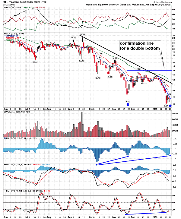
| The exchange traded fund (ETF) for the financial sector SPDR (XLF) has been under a great deal of distress, having had more than its share of grief in recent days after XLF put in a bottom at $8.67 in November as seen in its daily chart (Figure 1). Prices rose aggressively in the early part of December and then began a wayward drift sideways. After prices initially peaked in early December at $13.82, two additional rallies attempted to break above that minor high, one in mid-December and another that began in late December, which lasted until early January. Each rally brought a lower high for XLF, which was clearly a sign of weakness. With two failed rallies behind, XLF took the path of least resistance and slid sharply lower, falling below the support at $11.50 that had been developing after prices rallied off the November lows |

|
| FIGURE 1: XLF, DAILY. Here we see two distinct bottoms. The MACD histogram has put in a higher low and has a rising slope, while the stochastic has formed a divergence and is recycling back up after its recent bullish cross. Those two indicators may allow the MACD to eventually get a bullish cross and complete a divergence with the price chart. The ADX is still bearish here in the early stages of a potential double bottom. |
| Graphic provided by: StockCharts.com. |
| |
| So XLF migrated its way back down to test the November low as prices settled near $8, slightly overreaching the November low during this test of support. But during this abrupt and jarring ride lower, a steep sloping decelerated trendline formed that is clearly visible on the XLF daily and hourly charts. |

|
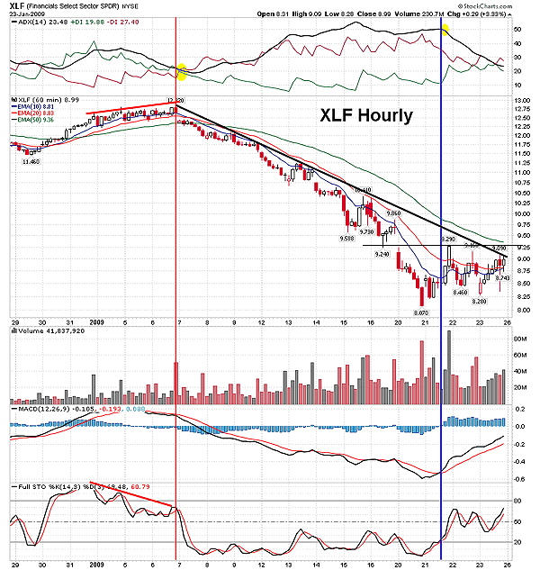
| FIGURE 2: XLF, HOURLY. Note how the sell signal (red vertical line) on the MACD corresponded so well with the divergence between price and the stochastic. The DI lines on the ADX got a bearish cross shortly thereafter, confirming the sell signal (highlighted in yellow). The MACD buy signal came on January 21, slamming prices back into the decelerated trendline. The ADX line peaked (highlighted in yellow) right after the MACD flashed a buy signal. |
| Graphic provided by: StockCharts.com. |
| |
| In Figure 2, the hourly chart of XLF bottomed on January 20, and prices then began to gravitate back up to that decelerated trendline for a test. Then finally on January 23, a rally occurred on XLF, slamming prices right into the decelerating trendline present on the 60-minute chart in Figure 2. With a bullish moving average convergence/divergence (MACD) (14, 26, 9) and stochastic (14, 3, 3) on XLF's hourly chart, it may have the necessary moment needed in order to break the decelerated trendline and move above gap resistance. Moreover, the 10- and 20-day exponential moving averages (EMAs) are converging back together, with the 10-day EMA poised to cross back above the 20-day EMA. Now if XLF were to break above gap resistance at $9.29, then the odds strongly increase that a second bottom is being chiseled out on the daily chart. Should those bullish events take place, XLF will gain traction, making a fast and furious move toward the intermediate trendline on the daily chart near $11. If XLF can manage to break the downtrend, it may form a double bottom pattern on the daily chart, with the confirmation line being the highest peak between the two trough lows at $13.82 (Figure 1). |
| Now even though XLF has stumbled slightly below the low made in November, it still falls within the guidelines of a double-bottom pattern, according to veteran trader Thomas Bulkowski in his book The Encyclopedia Of Chart Patterns. In that book, he notes the various types of double-bottom patterns. But overall, Bulkowski found that the smaller price variation between the two bottoms, the better performance. But if the bottom-to-bottom percentage is too large, it tends to hinder price performance. Often, when the right bottom falls below the left bottom, performance tends to improve once the pattern has broken out. So if XLF does form a second bottom, it will be evident by a reversal of the current downtrend. It is imperative that a trader wait for a reversal to occur before entering a position. This pattern runs the risk of declining further, especially if price has already penetrated the first bottom, which is acting as support. |
| Another signature characteristic of the pattern is two well-defined bottoms. But how far apart should the two bottoms be? Bulkowski's research found that the average length of a double bottom is approximately two to three months. But patterns that take a shorter time to form, usually under six to seven weeks, tend to outperform long drawn out patterns. Apparently, patterns longer than eight weeks have a tendency to underperform short ones. The two bottoms should have different areas of congestion that clearly mark a distinct individual bottom, which XLF obviously has. The double-bottom pattern must rise above its confirmation line in order to be a valid pattern. If prices fail to push above the confirmation line, there may be a backlash, causing additional bottoms to form (such as triple or quadruple bottom), or the support level that formed the double bottom may eventually be taken out altogether as XLF scrambles to look for a bottom. Incidentally. This potential double-bottom pattern measures $5.75 and has a projected target of $19.57. |
Ron Walker is an active trader and technical analyst. He operates an educational website dedicated to the study of Technical Analysis. The website offers free market analysis with daily video presentations and written commentaries. Ron is a video pioneer, being one of the first to utilize the internet producing Technical Analysis videos. His website is thechartpatterntrader.com
| Website: | thechartpatterntrader.com |
| E-mail address: | thechartpatterntrader@gmail.com |
Click here for more information about our publications!
Comments
Date:�01/27/09Rank:�5Comment:�
Date:�02/03/09Rank:�5Comment:�

Request Information From Our Sponsors
- StockCharts.com, Inc.
- Candle Patterns
- Candlestick Charting Explained
- Intermarket Technical Analysis
- John Murphy on Chart Analysis
- John Murphy's Chart Pattern Recognition
- John Murphy's Market Message
- MurphyExplainsMarketAnalysis-Intermarket Analysis
- MurphyExplainsMarketAnalysis-Visual Analysis
- StockCharts.com
- Technical Analysis of the Financial Markets
- The Visual Investor
- VectorVest, Inc.
- Executive Premier Workshop
- One-Day Options Course
- OptionsPro
- Retirement Income Workshop
- Sure-Fire Trading Systems (VectorVest, Inc.)
- Trading as a Business Workshop
- VectorVest 7 EOD
- VectorVest 7 RealTime/IntraDay
- VectorVest AutoTester
- VectorVest Educational Services
- VectorVest OnLine
- VectorVest Options Analyzer
- VectorVest ProGraphics v6.0
- VectorVest ProTrader 7
- VectorVest RealTime Derby Tool
- VectorVest Simulator
- VectorVest Variator
- VectorVest Watchdog
