HOT TOPICS LIST
- MACD
- Fibonacci
- RSI
- Gann
- ADXR
- Stochastics
- Volume
- Triangles
- Futures
- Cycles
- Volatility
- ZIGZAG
- MESA
- Retracement
- Aroon
INDICATORS LIST
LIST OF TOPICS
PRINT THIS ARTICLE
by Ron Walker
The DJIA's descending triangle may turn sour if the bulls continue to thrust prices higher above key areas of resistance. However, prices could be extending their pullback.
Position: N/A
Ron Walker
Ron Walker is an active trader and technical analyst. He operates an educational website dedicated to the study of Technical Analysis. The website offers free market analysis with daily video presentations and written commentaries. Ron is a video pioneer, being one of the first to utilize the internet producing Technical Analysis videos. His website is thechartpatterntrader.com
PRINT THIS ARTICLE
CHART ANALYSIS
The DJIA's Divergence And Descending Triangle
12/01/08 02:18:52 PMby Ron Walker
The DJIA's descending triangle may turn sour if the bulls continue to thrust prices higher above key areas of resistance. However, prices could be extending their pullback.
Position: N/A
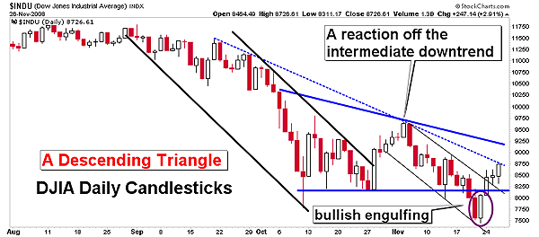
| Recently, the Dow Jones Industrial Average (DJIA) broke down from a descending triangle on its daily chart. But a pool of indicators are starting to suggest that the descending triangle could be negated and prices may begin to carve out a complex inverse head & shoulders pattern on the DJIA daily chart. On November 19, the DJIA broke down from a bearish descending triangle (Figure 1). The breakdown took the DJIA to new closing lows. But then on November 21, a bullish engulfing candlestick appeared in the daily time frame. The second day of the two-day pattern engulfed the real body of the first day of the pattern. The first day of the pattern reflected the prevailing trend, which in this case was down. The second day of the pattern should have been a long white candlestick that engulfed the first day of the pattern. The day after this pattern appeared on the daily chart, it was confirmed as the DJIA closed above the highest peak of the two candles that made up that pattern. |

|
| FIGURE 1: THE DJIA, DAILY. Here we see a descending triangle that broke down and is now experiencing an extended pullback. Prices have been advancing after a bullish engulfing candlestick pattern was confirmed. The advance has carried prices back up to the intermediate declining trendline, where key resistance comes into play. |
| Graphic provided by: StockCharts.com. |
| |
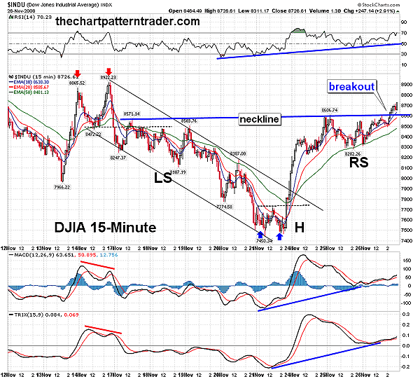
| The confirmation of the bullish engulfing pattern on November 24 took prices back above the lower boundary of the descending triangle in the daily time frame in what is called an extended pullback. This marked the first two-day winning streak, since prices reversed of the intermediate trendline on November 5, the day after the US general election. This two-day rally also broke the falling price channel that was in place on the DJIA's 15-minute chart (Figure 2). The advance continued for four consecutive sessions as the DJIA skated back up to the intermediate trendline, where it is currently residing. The intermediate trendline is an important area of resistance. If prices can break out above the intermediate downward trendline, it will energize the bulls. We have already seen prices subtly start to move higher off the November 21st minor intraday low of 7450, in a stealthy move pushing prices higher. |

|
| FIGURE 2: THE DJIA, 15-MINUTE CHART. The DJIA's 15-minute chart just broke out of a inverse head & shoulders pattern, just above the 8600 level. Note that the right side of the head formed after a small double bottom pattern broke out. That move also broke prices out of a falling price channel that began with a bearish double-top pattern. The inverse head & shoulders pattern measures approximately 1156 points, with a target of 9771. |
| Graphic provided by: StockCharts.com. |
| |
| The future of this current rally hinges on the ability of prices overcoming the intermediate trendline on the daily chart, and on the success of the DJIA's inverse head & shoulder reversal pattern in the 15-minute time frame. The runup of the last four trading sessions formed the right side of the head and the right shoulder of the pattern. The horizontal neckline of this reversal pattern broke out on November 26, the day before the US Thanksgiving. The neckline is lodged just above the 8600 level on the price chart. The measurement of the pattern is taken by subtracting the highest point of the pattern from the lowest point in the head formation. So we would take 8606, subtract 7450, and then add the difference to the breakout point on the neckline. This is done in order to establish a target projection for the price pattern. This pattern measures approximately 1156 points, with an objective price target of 9762. Here's the math: 8606 -7450 = 1156 + 8606 = 9762. |
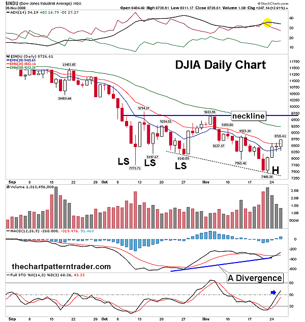
| When I measure the inverse head & shoulders on the 15-minute chart in Figure 2, bells and whistles go off. Because if that pattern target is reached, it would plow right into key overhead resistance on the daily chart between 9653-9794. This is the area where we have a potential neckline for yet another inverse head & shoulders pattern, but this one is of the complex class (Figure 3). If the bulls regain control of the market, they could run prices back up to the target to form a massive complex inverse head & shoulders pattern. Then once there, prices could get a reaction off resistance in order to form three right shoulders. In Figure 3, the pattern looks to have formed three left shoulders and usually there is symmetry among the right and left shoulders of the pattern. Once the right side of the head completes, the three right shoulders could take up to a month to carve out, because that is about how long it took for the three left shoulders to be completed. |

|
| FIGURE 3: DJIA, DAILY. If this divergence continues to build momentum, it could carry prices just above the 50-day EMA to establish a neckline in a speculative inverse head & shoulders pattern of the complex class. The ADX line (highlighted in yellow) appears to have peaked, while the stochastic has gained strength pulling above 50. Volume is good as accumulation is under way. |
| Graphic provided by: StockCharts.com. |
| |
| There are many bullish signs that have recently occurred that will likely cause this scenario to play out. In Figure 3, there is a divergence between the moving average convergence/divergence (MACD) (12, 26, 9) and the price chart on the daily chart. Moreover, the MACD got a bullish cross on November 24, the day the bullish engulfing pattern was confirmed. The full stochastic (14, 3, 3) also perked up sprinting above the value of 50, and is the first time it has moved above 50 since the selloff began on November 5. The average direction index (ADX) (14) is an exponential moving average (EMA) of the difference between the positive and negative direction movement indicators (DMI). The black average directional movement index (ADX) line appears to have peaked, which suggests that volatility is on the decline for the short term. The moving averages are also improving, as prices have managed to close above both the 10- and 20-day EMAs, which indicates that the bulls are gaining traction. Should the 10-day EMA cross above the 20-day EMA, it would bolster the bulls even more. For now, the descending triangle on the daily chart is still a force to be reckoned with, but if prices continue to surge, it will impair the pattern, rendering it useless and lacking authority. |
Ron Walker is an active trader and technical analyst. He operates an educational website dedicated to the study of Technical Analysis. The website offers free market analysis with daily video presentations and written commentaries. Ron is a video pioneer, being one of the first to utilize the internet producing Technical Analysis videos. His website is thechartpatterntrader.com
| Website: | thechartpatterntrader.com |
| E-mail address: | thechartpatterntrader@gmail.com |
Click here for more information about our publications!
Comments
Date:�12/03/08Rank:�5Comment:�

Request Information From Our Sponsors
- StockCharts.com, Inc.
- Candle Patterns
- Candlestick Charting Explained
- Intermarket Technical Analysis
- John Murphy on Chart Analysis
- John Murphy's Chart Pattern Recognition
- John Murphy's Market Message
- MurphyExplainsMarketAnalysis-Intermarket Analysis
- MurphyExplainsMarketAnalysis-Visual Analysis
- StockCharts.com
- Technical Analysis of the Financial Markets
- The Visual Investor
- VectorVest, Inc.
- Executive Premier Workshop
- One-Day Options Course
- OptionsPro
- Retirement Income Workshop
- Sure-Fire Trading Systems (VectorVest, Inc.)
- Trading as a Business Workshop
- VectorVest 7 EOD
- VectorVest 7 RealTime/IntraDay
- VectorVest AutoTester
- VectorVest Educational Services
- VectorVest OnLine
- VectorVest Options Analyzer
- VectorVest ProGraphics v6.0
- VectorVest ProTrader 7
- VectorVest RealTime Derby Tool
- VectorVest Simulator
- VectorVest Variator
- VectorVest Watchdog
