

HOT TOPICS LIST
- MACD
- Fibonacci
- RSI
- Gann
- ADXR
- Stochastics
- Volume
- Triangles
- Futures
- Cycles
- Volatility
- ZIGZAG
- MESA
- Retracement
- Aroon
INDICATORS LIST
LIST OF TOPICS
PRINT THIS ARTICLE
by Dennis D. Peterson
An alternative to drawing price channels that uses pivot points
Position: N/A
Dennis D. Peterson
Market index trading on a daily basis.
PRINT THIS ARTICLE
ANDREWS PITCH-FORK
Andrews Pitchfork
07/13/01 04:31:40 PMby Dennis D. Peterson
An alternative to drawing price channels that uses pivot points
Position: N/A
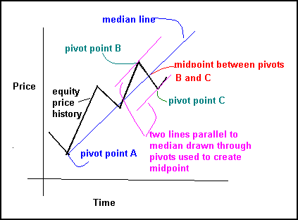
| An Andrews pitchfork is named after Alan Hall Andrews. The pitchfork portion of the name is derived from the appearance of three straight parallel lines. To draw the three parallel lines select three pivot points. The middle line called the median line is half way between the two parallel outside lines. A pitchfork is very much like a price channel and the difference is often very small. The drawing technique is illustrated in Figure 1. For an uptrend find an initial pivot (Figure 1: pivot point A) and then look for a pivot this is a high point pivot (a price bar surrounded by lower price bars), and then look for a low point pivot (a price bar surrounded by higher price bars) following the high point pivot. In Figure 1 these are labeled as A, B, and C. Next calculate the midpoint between pivots B and C, which is simply (B+C)/2. Now connect the initial pivot with the midpoint between pivots B and C (Figure 1: blue line): this is the median line. Now draw lines parallel to the median line going through pivots B and C. |
| What do you have? Given that B and C are representative of the amount of retracement associated with the uptrend, then the two lines parallel to the median form an envelope, which if broken is likely saying a new trend has formed. The reverse is done for analyzing a downtrend (initially pick a high point pivot, then go to a low and then another high). Using pivots to establish a price channel is a comfortable approach because previous pivots often mark points of decision for future price moves. The technical interpretation is that prices reach the median line 80% of the time. When prices don't reach the median line it is often a sign that a reversal has or will occur. The first problem is of course how do you pick the appropriate pivots? |
|
| Figure 1: Andrews pitchfork for an uptrend. |
| Graphic provided by: MetaStock. |
| Graphic provided by: Data vendor: eSignal<. |
| |
| Figure 2 is the current daily price and volume history of QQQ overlaid with both Andrews pitchforks and price channels. To create a pitchfork I started with a pivot that is the low on 4/4. I next went to a high pivot (Figure 2: green dot on 4/20) and then to a low pivot (Figure 2: green dot 4/26). I connected the two pivots and midway between the two is the point I will use to connect with the pivot point on 4/4. The connection is the median line (Figure 2: purple line drawn from low on 4/4 to blue dot midway between two green dots). I now draw two lines parallel, seen as dashed purple lines in Figure 2, to the median through the two pivots. To create the price channels, the blue dashed lines, draw lines along the pivot peaks and valleys. As you can see the price channel drawn from mid-May into July is less pessimistic about price decreases than the Andrews pitchfork envelope drawn over the same period. The green grid in the background is a Gann grid using a rise/run of 16/16 with an origin placed at 1/24/2001. In order for prices to stay within the pitchfork envelope A (Figure 2: purple dashed lines), they must stay above the bottom envelope. But prices also need to touch the median line 80% of the time. After the low pivot point on 4/26, which defines the point to draw the lower envelope line, prices barely stay above the lower envelope line, let alone approach the median. On 5/02 prices move below the envelope. A new trend has likely started. Long positions need to be reduced at this point. Some traders like to use weekly data to confirm pivot choices. The weekly chart of QQQ (Figure 3) illustrates the point and shows some of the complications. The pivots seen on the weekly chart will of course be seen on a daily chart. This is another way to determine daily pivots, but obviously not all of them. On the weekly chart of QQQ I have drawn a pitchfork from the peak on Sept '00 and what is clearly two major pivots on 1/2/01 and 1/24/01 (Figure 3: pivot pair A). When the median line is drawn, along with the parallel lines, the pitchfork (Figure 3: blue median and purple trend resistance/support lines) is effective in defining a trend channel. The two other pitchforks (Figure 3: pivot pairs B and C), seen in the April-June timeframe are the same ones seen in Figure 2. What's apparent is the amount of price change to create the two pitchforks in the April-June timeframe is a lot less. |
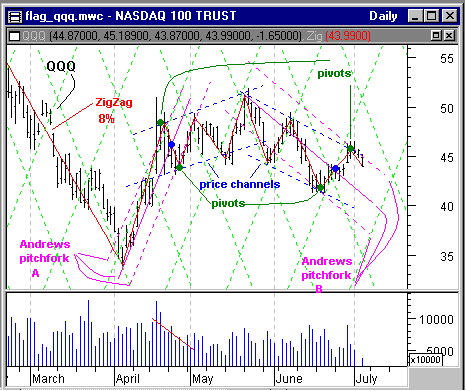 Figure 2: QQQ daily price and volume data overlaid with Andrews pitchforks and price channels. From Figures 2 and 3 it is clear that in choosing pivots you must be ready to adjust all three pivots as time goes along. The weekly chart is often helpful in defining the initial pivot point. The key is to keep moving the pitchforks as shown in Figure 2 as new pivots develop. If in an uptrend the lower envelope is broken then it is likely a new trend has developed - as it did on 5/02 in Figure 2. In a downtrend if the upper envelope is broken then a new trend has likely developed - as it was in first week of April in Figure 3. When prices fail to touch the median 80% of the time it is also time to re-evaluate positions. When prices are continually crossing the median a sideways movement is dominant - although it could be tilted slightly up or down. 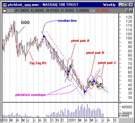 Figure 3: QQQ weekly price and volume overlaid with Andrews pitchforks. |
Another technique used to choose pivots is to use Bollinger bands. As price moves from one band to the opposite one, choose the pivots that are in opposite bands as the candidates for a pitchfork. Using a 20-day simple moving average with a two standard deviation Bollinger band shows pivot pair B (see Figures 3 and 4) are biased to the upside - and sure enough prices do not continue on up - the pivots are not representative of price retracement. Pivot pair A (see Figure 3 - Bollinger bands not shown in figure) goes from the limit of the lower band to the limit of the upper band. Pivot pair C (see Figures 3 and 4) nearly does this as well by touching the lower band and at least getting into the upper Bollinger band.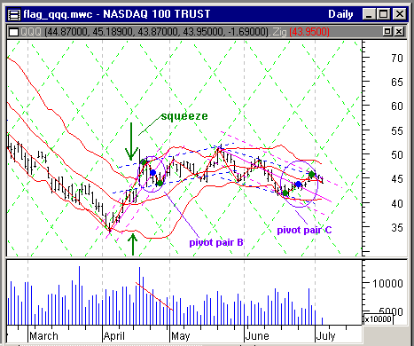 Figure 4: QQQ daily price and volume history overlaid with ZigZag (connected straight red lines), Bollinger bands (red lines), Andrews pitchfork (purple lines), price channels (dashed blue lines), and Gann grid (light green lines). I like using this technique, constructing Bollinger bands with pitchforks, because it gives me an idea of where there might be upside versus downside potential. With pivot pair B the potential is to the downside since the pivots are in the upper Bollinger band and with pivot pair C the potential is a little to the upside since the high pivot falls short of the upper Bollinger band limit. But there is another observation to be made about the pitchfork defined by pivot pair B. When a pivot fails to touch the intended upper or lower pitchfork envelope line to maintain the trend, the next pivot will move in the opposite direction as much as the miss. The pivot on 5/2 needed to touch the upper pitchfork trend line and misses by 5 points (QQQ=49 instead of QQQ =54). Where does the next pivot occur? QQQ= 44 or QQQ=49 minus miss of 5 points. The twist to this analysis is while price failed to stay within the pitchfork price/trend channels the miss is also informative. Coincidently, the Bollinger band had a squeeze just prior to the change in trend. To confirm pivots some authors suggest using ROC (rate of change) but the application is the same as ZigZag. Either will work. Or you can use an OHLC bar isolated by at least three bars on either side (to eliminate three day reversals) and forget about ZigZag and ROC. What you want to remember is the 80% rule and that your pivot choices could be biased. Use weekly data to confirm an initial pivot whenever you can - you won't always be able to. Use Bollinger bands to judge where the upside potential or downside potential might lie. Wait for price to confirm your analysis and then act in accordance to the upside/downside potential for a money management approach. |
Market index trading on a daily basis.
| Title: | Staff Writer |
| Company: | Technical Analysis, Inc. |
| Address: | 4757 California Ave SW |
| Seattle, WA 98116-4499 | |
| Phone # for sales: | 206 938 0570 |
| Fax: | 206 938 1307 |
| Website: | www.traders.com |
| E-mail address: | dpeterson@traders.com |
Traders' Resource Links | |
| Charting the Stock Market: The Wyckoff Method -- Books | |
| Working-Money.com -- Online Trading Services | |
| Traders.com Advantage -- Online Trading Services | |
| Technical Analysis of Stocks & Commodities -- Publications and Newsletters | |
| Working Money, at Working-Money.com -- Publications and Newsletters | |
| Traders.com Advantage -- Publications and Newsletters | |
| Professional Traders Starter Kit -- Software | |
Click here for more information about our publications!
Comments
Date:�08/06/01Rank:�3Comment:�
Date:�10/08/02Rank:�4Comment:�I use Projection Bands to get rid of deviation not Bolly Bands. If you try it you will find it works much better.

Request Information From Our Sponsors
- StockCharts.com, Inc.
- Candle Patterns
- Candlestick Charting Explained
- Intermarket Technical Analysis
- John Murphy on Chart Analysis
- John Murphy's Chart Pattern Recognition
- John Murphy's Market Message
- MurphyExplainsMarketAnalysis-Intermarket Analysis
- MurphyExplainsMarketAnalysis-Visual Analysis
- StockCharts.com
- Technical Analysis of the Financial Markets
- The Visual Investor
- VectorVest, Inc.
- Executive Premier Workshop
- One-Day Options Course
- OptionsPro
- Retirement Income Workshop
- Sure-Fire Trading Systems (VectorVest, Inc.)
- Trading as a Business Workshop
- VectorVest 7 EOD
- VectorVest 7 RealTime/IntraDay
- VectorVest AutoTester
- VectorVest Educational Services
- VectorVest OnLine
- VectorVest Options Analyzer
- VectorVest ProGraphics v6.0
- VectorVest ProTrader 7
- VectorVest RealTime Derby Tool
- VectorVest Simulator
- VectorVest Variator
- VectorVest Watchdog