HOT TOPICS LIST
- MACD
- Fibonacci
- RSI
- Gann
- ADXR
- Stochastics
- Volume
- Triangles
- Futures
- Cycles
- Volatility
- ZIGZAG
- MESA
- Retracement
- Aroon
INDICATORS LIST
LIST OF TOPICS
PRINT THIS ARTICLE
by Ron Walker
The intraday charts could be suggesting that there is further downside risk for the DJIA. The one- and 15-minute time frames have now gotten a lower high and lower low. There is still hope for the bulls, but if the market doesn't get a shot of capital soon, it will lose a coveted key area of support. Accumulation with expanding volume at key support is the only thing that will keep the DJIA from hemorrhaging further.
Position: N/A
Ron Walker
Ron Walker is an active trader and technical analyst. He operates an educational website dedicated to the study of Technical Analysis. The website offers free market analysis with daily video presentations and written commentaries. Ron is a video pioneer, being one of the first to utilize the internet producing Technical Analysis videos. His website is thechartpatterntrader.com
PRINT THIS ARTICLE
CHART ANALYSIS
Further Downside Risks Lurk Over The DJIA
11/20/08 09:06:39 AMby Ron Walker
The intraday charts could be suggesting that there is further downside risk for the DJIA. The one- and 15-minute time frames have now gotten a lower high and lower low. There is still hope for the bulls, but if the market doesn't get a shot of capital soon, it will lose a coveted key area of support. Accumulation with expanding volume at key support is the only thing that will keep the DJIA from hemorrhaging further.
Position: N/A
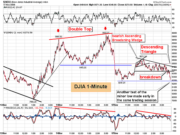
| On November 14, the Dow Jones Industrial Average (DJIA) formed a small double top on its one-minute intraday chart (Figure 1) after two failed attempts to rise above key resistance near the 8900 level. The double top pattern on the DJIA one-minute chart broke down early in the next trading session, slipping more than 250 points. Then a recovery rally carried prices back up to backtest the broken confirmation line of the double-top pattern between 11:30 a.m. to 1:00 p.m. ET, considerably trimming those losses, which is clearly visible on the one-minute chart in Figure 1. This advance failed as an ascending broadening wedge formed on the DJIA one-minute chart at the confirmation line of the double top pattern. |

|
| FIGURE 1: DJIA, ONE-MINUTE. A double-top pattern sends prices back to support. Then a rally fizzles out after a bearish ascending broadening wedge appears. Prices then move sideways, forming another bearish pattern, a descending triangle. The pattern runs its course, taking prices back to the support level that held up earlier that same session. |
| Graphic provided by: StockCharts.com. |
| |
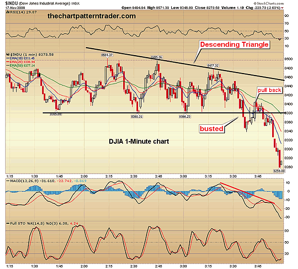
| Once the broadening wedge pattern broke to the downside, prices sifted lower to test support near 8380. After that support level was successfully tested, the DJIA moved sideways and formed a descending triangle pattern on the one-minute chart. The descending triangle pattern finally broke down during the last 25 minutes of trading (Figure 2), sending prices lower to test the previous lows made earlier that session at 8247. Major support comes into play between the 8200 to 8250 area. Should that level be violated, the DJIA could fall to test the recent November 13 low at 7966. |

|
| FIGURE 2: DJIA, ONE-MINUTE. Here we can see the last couple of hours of trading as the descending triangle formed, maintaining support at the 8380 level. Finally, the pattern broke down the last half-hour of trading. Prices got an extended pullback into the triangle right before they completely collapsed during the last few minutes of trading. |
| Graphic provided by: StockCharts.com. |
| |
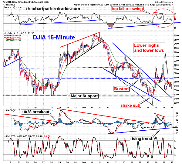
| The breakdown of the descending triangle on the one-minute chart has further increased the downside risks, by allowing a lower high and a lower low to form on the one- and 15-minute charts. In Figure 3, prices on the DJIA 15-minute chart formed a bullish falling wedge pattern that got a brief intraday shakeout on November 13, breaking a strong level of support to flush out weak longs. Immediately after that, prices shot up higher, breaking out of the bullish falling wedge pattern, taking out the declining trendline. Then prices rose, forming that miniature double top mentioned earlier with reference to the one-minute time frame. |

|
| FIGURE 3: DJIA, 15-MINUTE. The newly formed lower high and lower low sent traders a red flag after two failed attempts to move above resistance near the 8900 level. Note how the previous levels of support now act as reliable points of resistance. The rising trendlines on the RSI and the MACD are crucial levels of support. |
| Graphic provided by: StockCharts.com. |
| |
| Again, after two unsuccessful attempts to move above the 8900 area on the 15-minute chart, the double-top pattern drove prices down below its confirmation line. The reaction off of resistance caused prices to fall to the next level of support just below 8600 (Figure 3). The DJIA then successfully backtested the previous declining trendline, mounting a counterattack against the bears with a new advance. But the recovery stalled once prices tagged resistance near that 8600 level. Prices then retreated back to test the 8247 minor mention above on the one-minute chart. If that level is violated, the DJIA will have a series of successive lower lows in place, which may bring about more headwinds for the bulls. |

|
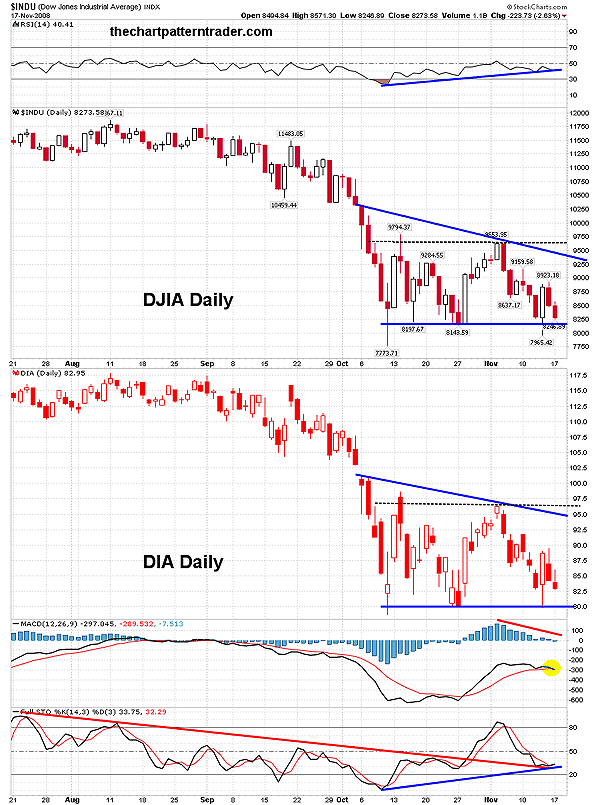
| FIGURE 4: DJIA, DIA, DAILY. Criteria for descending triangle and rectangle patterns are both valid on the daily chart. The rectangle can be a continuation pattern of the previous trend or a reversal pattern. A descending triangle pattern is bearish. The histogram has moved below zero and may cause the MACD to fall below its signal line and turn bearish. Ironically, the stochastic got a bullish cross at support, which may reenergize the bulls. |
| Graphic provided by: StockCharts.com. |
| |
| In Figure 4, the daily chart of the DJIA shows that the moving average convergence/divergence (MACD) histogram (12,26,9) just broke down below its zero line. That move could bring about a bearish cross on the MACD (12,26,9). As I write this, the MACD came within microscopic range of crossing below its signal line. But indicators are giving some mixed signals as the stochastic (14,3,3) actually got a bullish cross, and it is now testing the recent broken downtrend while the relative strength index (RSI) is testing its rising trend. In addition, the bounce off support on the daily chart has two patterns in play, a rectangle and a bearish descending triangle. The triangle is a bit hard to see on the DJIA, and it is much clearer on the DJIA's exchange traded fund (ETF), the diamonds (DIA) (Figure 4). If the intraday charts continue their plunge downward, it could allow for these bearish descending triangles to play out. The bulls must support the 8000 to 8150 level on the DJIA, and $81 to $81.50 on DIA, or a whole host of technical damage will occur. There is still hope for the bulls as prices are rangebound in a rectangle pattern, which is a valid pattern as well, but they need to send in the cavalry quickly before the descending triangle has a chance to play out. If support holds, the bulls need to break above overhead resistance and then take out the upper boundary on the descending triangles. |
Ron Walker is an active trader and technical analyst. He operates an educational website dedicated to the study of Technical Analysis. The website offers free market analysis with daily video presentations and written commentaries. Ron is a video pioneer, being one of the first to utilize the internet producing Technical Analysis videos. His website is thechartpatterntrader.com
| Website: | thechartpatterntrader.com |
| E-mail address: | thechartpatterntrader@gmail.com |
Click here for more information about our publications!
Comments

Request Information From Our Sponsors
- StockCharts.com, Inc.
- Candle Patterns
- Candlestick Charting Explained
- Intermarket Technical Analysis
- John Murphy on Chart Analysis
- John Murphy's Chart Pattern Recognition
- John Murphy's Market Message
- MurphyExplainsMarketAnalysis-Intermarket Analysis
- MurphyExplainsMarketAnalysis-Visual Analysis
- StockCharts.com
- Technical Analysis of the Financial Markets
- The Visual Investor
- VectorVest, Inc.
- Executive Premier Workshop
- One-Day Options Course
- OptionsPro
- Retirement Income Workshop
- Sure-Fire Trading Systems (VectorVest, Inc.)
- Trading as a Business Workshop
- VectorVest 7 EOD
- VectorVest 7 RealTime/IntraDay
- VectorVest AutoTester
- VectorVest Educational Services
- VectorVest OnLine
- VectorVest Options Analyzer
- VectorVest ProGraphics v6.0
- VectorVest ProTrader 7
- VectorVest RealTime Derby Tool
- VectorVest Simulator
- VectorVest Variator
- VectorVest Watchdog
