HOT TOPICS LIST
- MACD
- Fibonacci
- RSI
- Gann
- ADXR
- Stochastics
- Volume
- Triangles
- Futures
- Cycles
- Volatility
- ZIGZAG
- MESA
- Retracement
- Aroon
INDICATORS LIST
LIST OF TOPICS
PRINT THIS ARTICLE
by Donald W. Pendergast, Jr.
At first glance, the Oil Service Index/Bank Index Ratio chart
would seem to imply strength in the banking sector, but that's not the case.
Position: N/A
Donald W. Pendergast, Jr.
Donald W. Pendergast is a financial markets consultant who offers specialized services to stock brokers and high net worth individuals who seek a better bottom line for their portfolios.
PRINT THIS ARTICLE
ELLIOTT WAVE
Oil Services Vs. Banks -- Who's Stronger?
11/05/08 11:17:04 AMby Donald W. Pendergast, Jr.
At first glance, the Oil Service Index/Bank Index Ratio chart
would seem to imply strength in the banking sector, but that's not the case.
Position: N/A
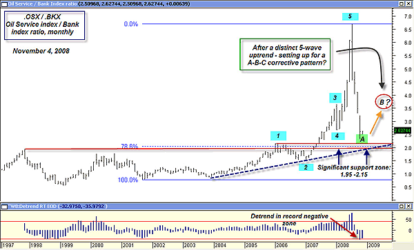
| It may seem odd to refer to "strength" in the market currently, given the brutal liquidations since late last year, unless we use the term in the context of "relative" strength. As the ratio chart in Figure 1 demonstrates, first impressions can be deceptive. Only thoughtful analysis of the component charts can reveal the true nature of each index. For those unfamiliar with ratio charts, the first component's value is divided by the second component's value. So, in this case, the value of the Oil Service Index is divided by the value of the Bank Index. |

|
| FIGURE 1: OSX/BKX: MONTHLY. Is a major A-B-C corrective wave setting up? |
| Graphic provided by: MetaStock. |
| Graphic provided by: WB Detrend RT EOD from Profit Trader for MetaStock. |
| |
| The monthly Oil Service/Bank ratio chart displays a general Elliott wave progression that features an extended fifth wave. Given that extended fifth waves are most common in commodities rather than stocks, it's still a valid Elliott pattern, as the oil service stocks (which outperformed banks throughout most of 2004-07) are, in essence, commodity-linked stocks. Similar to other indexes, this one has also stopped falling just above its 78.6% Fibonacci retracement and several key support barriers, even as its detrend oscillator plunged toward record lows. The long-term up trendline is still intact, a positive sign. Of course, after such an incredible plunge, there remains an inordinate amount of energy that needs to be dissipated, and one of the more likely paths that this ratio index may follow is that of a large A-B-C corrective pattern, one that could take months and/or years to play out. |

|
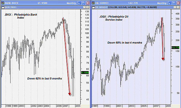
| FIGURE 2: BKX/OSX. Oil service stocks collapsed much faster than bank stocks. |
| Graphic provided by: MetaStock. |
| |
| Now we move to a side-by-side view of the Oil Service Index and Bank Index charts, and the action on the previous ratio chart takes on a completely new perspective (Figure 2). The plunge in the ratio chart was not due to weak oil service stocks and strong bank stocks, but due to extremely weak oil service stocks and weak bank stocks. Even though both indexes were falling (the bank index down 62% in nine months and oil services down 68% in only four months), the rate of change was far, far worse in the oil service index. This is why those who use ratio or spread charts need to examine the component charts used to create the ratio chart. |
| So what's next for the Oil Service Index/Bank Index ratio? Given that the broad markets seem to be in rally mode, it simply depends on whether oil service stocks like Halliburton and Atwood Oceanics outperform banking giants like Bank of America and Wells Fargo. Given the long-term fundamentals of the energy market and the pressure on global oil supply as Asia continues to grow, it may just be that the oil service stocks will be leading that B corrective wave higher. Regardless, watch this important ratio chart, because it is a fantastic barometer of global economic growth! |
Donald W. Pendergast is a financial markets consultant who offers specialized services to stock brokers and high net worth individuals who seek a better bottom line for their portfolios.
| Title: | Writer, market consultant |
| Company: | Linear Trading Systems LLC |
| Jacksonville, FL 32217 | |
| Phone # for sales: | 904-239-9564 |
| E-mail address: | lineartradingsys@gmail.com |
Traders' Resource Links | |
| Linear Trading Systems LLC has not added any product or service information to TRADERS' RESOURCE. | |
Click here for more information about our publications!
PRINT THIS ARTICLE

Request Information From Our Sponsors
- StockCharts.com, Inc.
- Candle Patterns
- Candlestick Charting Explained
- Intermarket Technical Analysis
- John Murphy on Chart Analysis
- John Murphy's Chart Pattern Recognition
- John Murphy's Market Message
- MurphyExplainsMarketAnalysis-Intermarket Analysis
- MurphyExplainsMarketAnalysis-Visual Analysis
- StockCharts.com
- Technical Analysis of the Financial Markets
- The Visual Investor
- VectorVest, Inc.
- Executive Premier Workshop
- One-Day Options Course
- OptionsPro
- Retirement Income Workshop
- Sure-Fire Trading Systems (VectorVest, Inc.)
- Trading as a Business Workshop
- VectorVest 7 EOD
- VectorVest 7 RealTime/IntraDay
- VectorVest AutoTester
- VectorVest Educational Services
- VectorVest OnLine
- VectorVest Options Analyzer
- VectorVest ProGraphics v6.0
- VectorVest ProTrader 7
- VectorVest RealTime Derby Tool
- VectorVest Simulator
- VectorVest Variator
- VectorVest Watchdog
