

HOT TOPICS LIST
- MACD
- Fibonacci
- RSI
- Gann
- ADXR
- Stochastics
- Volume
- Triangles
- Futures
- Cycles
- Volatility
- ZIGZAG
- MESA
- Retracement
- Aroon
INDICATORS LIST
LIST OF TOPICS
PRINT THIS ARTICLE
by Ron Walker
The DJIA marked the week of October 10 as the worst in its 112-year history. Friday, October 10, also marked its largest swing in history with 1,019 points. In contrast, the DJIA has now started this week by breaking a record to the upside. On October 13, 2008, it put in a record one-day rise, gaining 935.42 points.
Position: N/A
Ron Walker
Ron Walker is an active trader and technical analyst. He operates an educational website dedicated to the study of Technical Analysis. The website offers free market analysis with daily video presentations and written commentaries. Ron is a video pioneer, being one of the first to utilize the internet producing Technical Analysis videos. His website is thechartpatterntrader.com
PRINT THIS ARTICLE
CHART ANALYSIS
A Record Rise
10/15/08 01:32:07 PMby Ron Walker
The DJIA marked the week of October 10 as the worst in its 112-year history. Friday, October 10, also marked its largest swing in history with 1,019 points. In contrast, the DJIA has now started this week by breaking a record to the upside. On October 13, 2008, it put in a record one-day rise, gaining 935.42 points.
Position: N/A
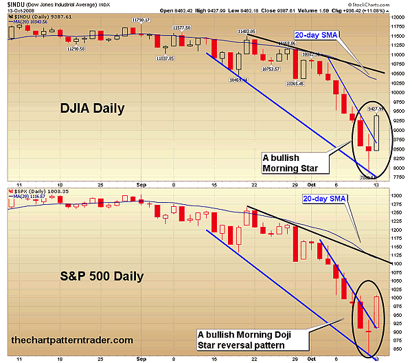
| Another record breaking day occurred on the DJIA as it put in a record one-day gain, rising 936.42 points or 11.08%, the largest percentage gain for the DJIA since 1933. Meanwhile, the Standard & Poor's 500 gained 104.13 points or 11.58%, posting its largest percent gain in 69 years. The market responded positively when the UK government threw a $64 billion lifeline to three UK banks, with expectations that the US would do the same for its own. After ending eight consecutive down days on the DJIA and the S&P 500, the stock market could now be poised for a short-term rally. The rally comes just as stocks are down for the count after last week's knockout punch. The market is now showing signs that it is waking up out of the stupor that laid it flat on its back as morning star candlestick reversal patterns materialized in this market meltdown. Both averages have formed three-day candlestick reversal patterns. The DJIA got a long black day (red candlestick) last Thursday October 9, followed by a spinning top on Friday. The spinning top formed as the price gapped lower and then produced wild swings throughout the session, which can be observed by the long shadows above and below the spinning top candlestick. A spinning top is similar to a doji in that it represents indecision among investors. The third day of the pattern completed as a huge rally opened the trading session on Monday, October 13. |
|
| FIGURE 1: DJIA AND S&P 500, DAILY. Both averages have formed three-day candlestick reversals, allowing them to break out of their bullish falling wedge patterns. The upper boundary of the falling wedges are decelerated trendlines. Prices may rise back up to previous original trendlines (black lines) that could be forming a larger pattern known as a descending broadening wedge. |
| Graphic provided by: StockCharts.com. |
| |
| The S&P 500 had previously formed a two-day reversal pattern last Friday on October 10 called a doji star. A bullish doji star is the first two candlesticks that make up a morning doji star reversal pattern. On the third day, the S&P 500 gapped higher at the opening bell and rallied deep into the candlestick of the first day, with the two-day pattern evolving into a three-day morning doji star. The pattern is confirmed once prices close above the highest point of the three-day pattern. The difference between a morning star pattern and a morning doji star pattern is that the second day of the pattern is a doji. A doji forms when prices have a wide range swing, and essentially, the close and the open are the same. Shadows form when prices fluctuate, moving higher and then lower, or vice versa. A doji looks similar to a cross. |
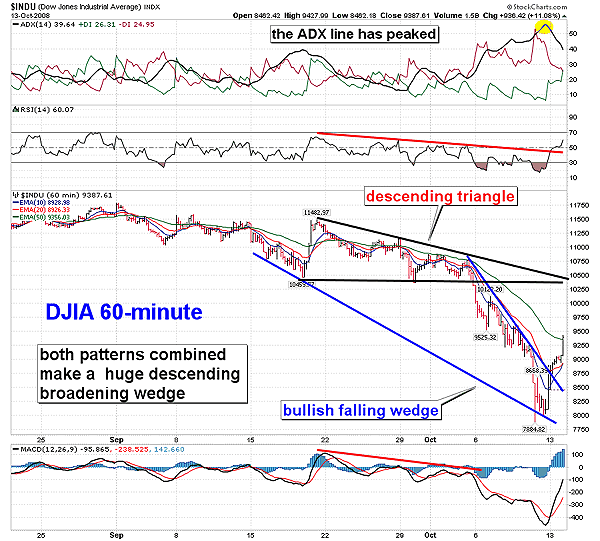
| As the averages were putting in these morning star reversal patterns, they also managed to break out of their decelerating downtrends. A decelerated trendline forms when prices fall too quickly and the downward momentum becomes unsustainable. Often, when a decelerating trendline breaks, prices rally back up like a magnet to the 20-day simple moving average (SMA). In a downtrend, the 20-day SMA serves as resistance and prices usually find it a tough hurdle to rise above. The decelerating trendlines are visible on both the daily charts and the 60-minute charts. It is noteworthy that the DJIA formed a bullish falling wedge on the hourly chart and that the decelerated trendline served as the upper boundary to that falling wedge. The falling wedge formed as a result of the bearish descending triangle that emerged in early October 2008. |
|
| FIGURE 2: DJIA, HOURLY. The bullish falling wedge manifested due to a selloff after a bearish descending triangle broke down. Note the ADX has turned down as the positive and negative DI lines got a bullish cross. |
| Graphic provided by: StockCharts.com. |
| |
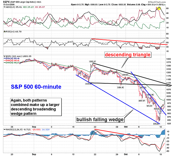
| But what is really fascinating about the price patterns on the DJIA and S&P 500 60-minute charts is that both patterns on the charts (the descending triangle and the falling wedge) make a much larger pattern called a descending broadening wedge. A descending broadening wedge is usually classified as a reversal pattern or a continuation pattern, according to The Encyclopedia Of Chart Patterns by Thomas Bulkowski. If prices rally back up to the upper boundary of the descending broadening wedge pattern, we could see a move that will begin a rally back to the 10,250-10,300 area on the DJIA, and 1075-1100 on the S&P 500. |
|
| FIGURE 3: S&P 500, HOURLY. Both MACDs on the DJIA and the S&P 500 are rising toward the zero line. If they break above it, we may see the original downward trendline on the daily chart tested. Here, the S&P 5009 and the DJIA have carved out similar price patterns. |
| Graphic provided by: StockCharts.com. |
| |
| Some other bullish signs have appeared on the DJIA and S&P 500 60-minute charts, such as the relative strength index (RSI) breaking its downtrend simultaneously with the price charts. The average directional movement indicator (ADX) saw the ADX line (black line) peak and then turn south, while the direction movement indicator (DMI) began converging and getting a bullish cross by the end of the session. When the ADX line peaks and turns lower, it signals that volatility is on the decline and prices will likely rise off oversold levels. Key resistance is at the lower boundary of the descending triangle near the 10,250-10,300 area. It is again noteworthy that the downward trendline of the descending broadening wedge and the lower boundary of the descending triangle intersect near the 10,300 area forming a double dose of resistance. The moving average convergence/divergence (MACD) also got a bullish cross and could see a move above the zero line. However, any rally could be met with more selling pressures once resistance is reached. With the recent wild swings in the market, swing trading is a viable alternative to long-term position trading. |
Ron Walker is an active trader and technical analyst. He operates an educational website dedicated to the study of Technical Analysis. The website offers free market analysis with daily video presentations and written commentaries. Ron is a video pioneer, being one of the first to utilize the internet producing Technical Analysis videos. His website is thechartpatterntrader.com
| Website: | thechartpatterntrader.com |
| E-mail address: | thechartpatterntrader@gmail.com |
Click here for more information about our publications!
Comments
Date:�10/16/08Rank:�3Comment:�

Request Information From Our Sponsors
- StockCharts.com, Inc.
- Candle Patterns
- Candlestick Charting Explained
- Intermarket Technical Analysis
- John Murphy on Chart Analysis
- John Murphy's Chart Pattern Recognition
- John Murphy's Market Message
- MurphyExplainsMarketAnalysis-Intermarket Analysis
- MurphyExplainsMarketAnalysis-Visual Analysis
- StockCharts.com
- Technical Analysis of the Financial Markets
- The Visual Investor
- VectorVest, Inc.
- Executive Premier Workshop
- One-Day Options Course
- OptionsPro
- Retirement Income Workshop
- Sure-Fire Trading Systems (VectorVest, Inc.)
- Trading as a Business Workshop
- VectorVest 7 EOD
- VectorVest 7 RealTime/IntraDay
- VectorVest AutoTester
- VectorVest Educational Services
- VectorVest OnLine
- VectorVest Options Analyzer
- VectorVest ProGraphics v6.0
- VectorVest ProTrader 7
- VectorVest RealTime Derby Tool
- VectorVest Simulator
- VectorVest Variator
- VectorVest Watchdog