HOT TOPICS LIST
- MACD
- Fibonacci
- RSI
- Gann
- ADXR
- Stochastics
- Volume
- Triangles
- Futures
- Cycles
- Volatility
- ZIGZAG
- MESA
- Retracement
- Aroon
INDICATORS LIST
LIST OF TOPICS
PRINT THIS ARTICLE
by James Kupfer
As I write this, the S&P 500 is down more than 3% to 1172. With the broad market continuing to fall, when might we see some relief?
Position: Sell
James Kupfer
Mr. Kupfer is a market professional and amateur stock market commentator. Disclosure: It is likely that Mr. Kupfer has or will enter a position in any security he writes about.
PRINT THIS ARTICLE
FIBONACCI
Further To Fall On The S&P 500
09/29/08 12:05:51 PMby James Kupfer
As I write this, the S&P 500 is down more than 3% to 1172. With the broad market continuing to fall, when might we see some relief?
Position: Sell
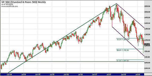
| As seen on the weekly S&P chart in Figure 1, it is clear that we are in an established downtrend. I've drawn two trendlines on this chart, both in purple. Both are drawn using either the highs or lows, as I tend to do that instead of using closing prices. If you overlay the trendlines they both have almost an identical slope, which is relatively common. In this instance, they create a nicely defined channel in which future price action can be expected to occur within. |

|
| FIGURE 1: S&P 500, WEEKLY. The two trendlines on this chart are both drawn using either highs or lows. If they are overlaid, you would see that they both have almost an identical slope. |
| Graphic provided by: Wealth-Lab. |
| |
| Also shown on the chart are two additional features. The first are the Fibonacci retracement levels drawn from the September 2002 lows to the recent market top. We have clearly already broken through the initial support at 38.2%. The market did drop through the 50% retracement, but then bounced above it. Next comes the 61.8% retracement level that is still significantly below the market's current price levels. The other chart feature is the dark green line drawn at the August 2004 low. |
| Given that it is improbable that the market will hold the 50% retracement level support zone, we need to identify the next likely zone for a bounce. In my estimation, the next logical zone is where the 61.8% Fibonacci level and the August 2004 bounce coincide at roughly 1070. Assuming this occurs over the next few weeks, I think we are likely to also see the bottom (purple) channel line having extended itself down to this same price zone as well. That convergence of three levels of support would provide a natural place for prices to reverse, if only for a few weeks or months. |
Mr. Kupfer is a market professional and amateur stock market commentator. Disclosure: It is likely that Mr. Kupfer has or will enter a position in any security he writes about.
Click here for more information about our publications!
Comments
Date:�10/02/08Rank:�4Comment:�

Request Information From Our Sponsors
- StockCharts.com, Inc.
- Candle Patterns
- Candlestick Charting Explained
- Intermarket Technical Analysis
- John Murphy on Chart Analysis
- John Murphy's Chart Pattern Recognition
- John Murphy's Market Message
- MurphyExplainsMarketAnalysis-Intermarket Analysis
- MurphyExplainsMarketAnalysis-Visual Analysis
- StockCharts.com
- Technical Analysis of the Financial Markets
- The Visual Investor
- VectorVest, Inc.
- Executive Premier Workshop
- One-Day Options Course
- OptionsPro
- Retirement Income Workshop
- Sure-Fire Trading Systems (VectorVest, Inc.)
- Trading as a Business Workshop
- VectorVest 7 EOD
- VectorVest 7 RealTime/IntraDay
- VectorVest AutoTester
- VectorVest Educational Services
- VectorVest OnLine
- VectorVest Options Analyzer
- VectorVest ProGraphics v6.0
- VectorVest ProTrader 7
- VectorVest RealTime Derby Tool
- VectorVest Simulator
- VectorVest Variator
- VectorVest Watchdog
