HOT TOPICS LIST
- MACD
- Fibonacci
- RSI
- Gann
- ADXR
- Stochastics
- Volume
- Triangles
- Futures
- Cycles
- Volatility
- ZIGZAG
- MESA
- Retracement
- Aroon
INDICATORS LIST
LIST OF TOPICS
PRINT THIS ARTICLE
by Koos van der Merwe
Gold is a US$ play. Take a look.
Position: Sell
Koos van der Merwe
Has been a technical analyst since 1969, and has worked as a futures and options trader with First Financial Futures in Johannesburg, South Africa.
PRINT THIS ARTICLE
GANN
Is Gold Do Or Die?
03/10/08 09:40:09 AMby Koos van der Merwe
Gold is a US$ play. Take a look.
Position: Sell
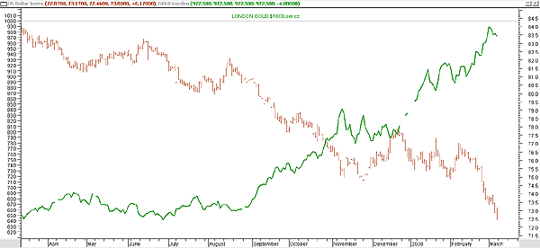
| If the price of gold is a US dollar play, and the pundits are calling for gold to test $1,000, where does that put the US dollar? Figure 1 is a chart of the US$ Index (bar chart) and the London gold price (green line chart). We can see how the two have moved opposite each other. I have also shown the $1,000 target for gold, but will gold reach that target? To determine this, I look at two charts. Figure 3 is the US Dollar Index, on its own. Figure 4 is Newmont Mining, a mining company that epitomizes gold's movement. |

|
| FIGURE 1: US DOLLAR INDEX VS. LONDON GOLD. See how the two tradables have moved against each other. |
| Graphic provided by: MetaStock. |
| |
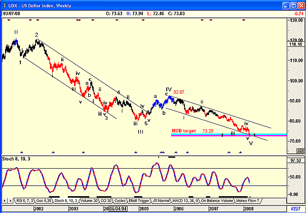
| The US$ Index (UDX) chart shown in Figure 2 is a weekly chart. The Elliott wave count suggests that the index is completing a fifth wave at the make or break (MOB) line. The MOB study is an excellent tool that can help you find the target price area for the end of an Elliott wave 5, or for any pattern that has an impulse-correction-impulse pattern. It is drawn from the bottom (market moving down) of the starting impulse pattern that is closest to the current market movement. Wave 5 is the area that the MOB will show a support area that will either "make" the end of wave 5 or "break" wave 5 into an extension. Should a price move extend beyond the MOB level, it will usually extend the same distance as it entered. The chart is suggesting that the US Dollar Index could be finding support at the MOB level, and this is confirmed by the stochastic oscillator shown on the chart. However, closer examination shows that the UDX has penetrated the MOB slightly, and that the oscillator has on previous occasions given buy signals that did not follow through. The index could therefore be at a very decisive phase, either finding support at the present level or falling to a 53.71 (92.87 - 73.29 = 19.58; 73.29 - 19.58 = 53.71). |

|
| FIGURE 2: US DOLLAR INDEX, WEEKLY. The Elliott wave count suggests that the index is completing a fifth wave at the MOB line. |
| Graphic provided by: AdvancedGET. |
| |
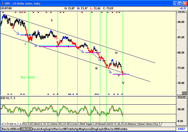
| Figure 3 is a daily chart of the US Dollar Index, showing how the MOB indicator worked in the past. I have shown the indicator at various levels, and the arrows shown indicate the levels they were forecast from. The chart also shows the relative strength index (RSI), with the buy levels indicating a reversal in the US$ Index, even if that reversal was temporary. The RSI is suggesting strength at the moment. |

|
| FIGURE 3: US DOLLAR INDEX, DAILY. Here are the MOB levels and support at the present level. |
| Graphic provided by: AdvancedGET. |
| |
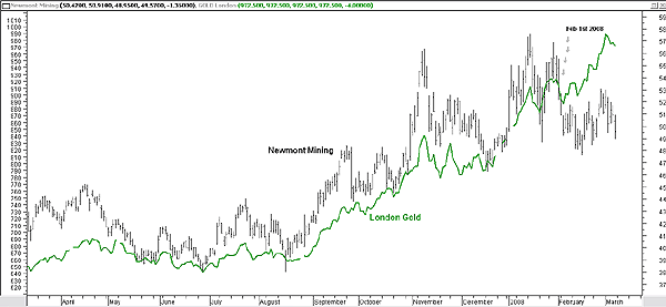
| Figure 4, of Newmont Mining, shows how the price always followed the London gold price, but started deviating from the gold price on February 1, 2008. As a chartist, to (more or less) quote, "It is not to reason why, it is simply to do or die." Another reason why could be that gold could have reached its peak, or for that matter, that the US dollar has found a support level. |

|
| FIGURE 4: LONDON GOLD VS. NEWMONT MINING. Newmont seems to have followed gold, but then started deviating from the price of gold on February 1, 2008. |
| Graphic provided by: MetaStock. |
| |
Has been a technical analyst since 1969, and has worked as a futures and options trader with First Financial Futures in Johannesburg, South Africa.
| Address: | 3256 West 24th Ave |
| Vancouver, BC | |
| Phone # for sales: | 6042634214 |
| E-mail address: | petroosp@gmail.com |
Click here for more information about our publications!
Comments
Date:�03/11/08Rank:�3Comment:�
Date:�03/12/08Rank:�4Comment:�
Date:�03/18/08Rank:�1Comment:�

Request Information From Our Sponsors
- StockCharts.com, Inc.
- Candle Patterns
- Candlestick Charting Explained
- Intermarket Technical Analysis
- John Murphy on Chart Analysis
- John Murphy's Chart Pattern Recognition
- John Murphy's Market Message
- MurphyExplainsMarketAnalysis-Intermarket Analysis
- MurphyExplainsMarketAnalysis-Visual Analysis
- StockCharts.com
- Technical Analysis of the Financial Markets
- The Visual Investor
- VectorVest, Inc.
- Executive Premier Workshop
- One-Day Options Course
- OptionsPro
- Retirement Income Workshop
- Sure-Fire Trading Systems (VectorVest, Inc.)
- Trading as a Business Workshop
- VectorVest 7 EOD
- VectorVest 7 RealTime/IntraDay
- VectorVest AutoTester
- VectorVest Educational Services
- VectorVest OnLine
- VectorVest Options Analyzer
- VectorVest ProGraphics v6.0
- VectorVest ProTrader 7
- VectorVest RealTime Derby Tool
- VectorVest Simulator
- VectorVest Variator
- VectorVest Watchdog
