HOT TOPICS LIST
- MACD
- Fibonacci
- RSI
- Gann
- ADXR
- Stochastics
- Volume
- Triangles
- Futures
- Cycles
- Volatility
- ZIGZAG
- MESA
- Retracement
- Aroon
INDICATORS LIST
LIST OF TOPICS
PRINT THIS ARTICLE
by Gary Grosschadl
Such a high number seems absurd. but then so is oil near $100 per barrel. With gold prices hitting a record high of $848 (continuous contract), breaking above a decades-old record, how much higher can it go?
Position: Hold
Gary Grosschadl
Independent Canadian equities trader and technical analyst based in Peterborough
Ontario, Canada.
PRINT THIS ARTICLE
ANDREWS PITCH-FORK
Gold $1,000 Per Ounce?
12/03/07 10:39:25 AMby Gary Grosschadl
Such a high number seems absurd. but then so is oil near $100 per barrel. With gold prices hitting a record high of $848 (continuous contract), breaking above a decades-old record, how much higher can it go?
Position: Hold
| The charts for gold and silver prices on a monthly chart look sky-high and with both at record levels, the charts look too parabolic — in other words, they look like screaming sells, especially for anyone fortunate enough to have been long-term holders (Figure 1). We have to look at the gold and silver index to get any sense of future possibilities. |
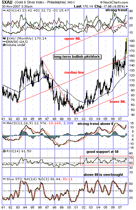
| The surprising view on this long-term monthly chart is that there is still some upside room. Usually on a pitchfork chart (the Andrews line method) the move goes from the upper or lower median line to the center median line as the trading target before correcting back into the channel. It takes a super–bull move to extend beyond the median line, toward the opposite pitchfork tine or median line. This seems to be the case here. The bullish possibilities are that the center median line now acts as future support and an eventual spike to the top median line is possible. That would entail a move to hit $1,000 per ounce of gold. The psychological barrier there as a screaming sell signal should be a no-brainer — the ultimate bragging rights of declaring, "I sold when gold hit $1,000 per ounce!" |

|
| FIGURE 1: GOLD AND SILVER INDEX, MONTHLY. The gold & silver index suggests gold price can spike higher, toward $1,000 per ounce, provided median line support holds. |
| Graphic provided by: StockCharts.com. |
| |
| Several indicators are considered. The most bullish in my view is the directional movement indicator above Figure 1. The ideal configuration is an upsloping ADX line (average directional movement index) between bullish poised DIs or positive and negative directional indexes. When the +DI rides above -DI and the ADX line is above zero and upsloping, the bulls are in charge. Below the chart, the moving average convergence/divergence (MACD) also shows a strong trend having risen above the zero-line since 2002. The relative strength index (RSI) shows similar strength staying above its key 50 support level. The stochastic oscillator is cautionary as it is considered overbought above 80 and usually shows a down leg beginning when this line turns below 80. Note the pattern has been a correction to the 50-period exponential moving average, which would entail a move below the median line. I would rather see support at the median line should I be a long-term holder not wanting to give back too much profit. |
| In summary, this pitchfork chart suggests the price of gold can still stay in a rising trend with a high-spike possibility (perhaps mirroring a spike to $1,000/ounce gold). Support at the center median line would be crucial in my view. Realistically speaking, anyone holding gold or silver stocks would look at their respective charts for direction. "Sell now or sell later," or in more trendy terms spoken by that famous Canadian celebrity Howie Mandel, "Deal or no deal?" |
Independent Canadian equities trader and technical analyst based in Peterborough
Ontario, Canada.
| Website: | www.whatsonsale.ca/financial.html |
| E-mail address: | gwg7@sympatico.ca |
Click here for more information about our publications!
Comments
Date:�12/06/07Rank:�1Comment:�

Request Information From Our Sponsors
- StockCharts.com, Inc.
- Candle Patterns
- Candlestick Charting Explained
- Intermarket Technical Analysis
- John Murphy on Chart Analysis
- John Murphy's Chart Pattern Recognition
- John Murphy's Market Message
- MurphyExplainsMarketAnalysis-Intermarket Analysis
- MurphyExplainsMarketAnalysis-Visual Analysis
- StockCharts.com
- Technical Analysis of the Financial Markets
- The Visual Investor
- VectorVest, Inc.
- Executive Premier Workshop
- One-Day Options Course
- OptionsPro
- Retirement Income Workshop
- Sure-Fire Trading Systems (VectorVest, Inc.)
- Trading as a Business Workshop
- VectorVest 7 EOD
- VectorVest 7 RealTime/IntraDay
- VectorVest AutoTester
- VectorVest Educational Services
- VectorVest OnLine
- VectorVest Options Analyzer
- VectorVest ProGraphics v6.0
- VectorVest ProTrader 7
- VectorVest RealTime Derby Tool
- VectorVest Simulator
- VectorVest Variator
- VectorVest Watchdog
