

HOT TOPICS LIST
- MACD
- Fibonacci
- RSI
- Gann
- ADXR
- Stochastics
- Volume
- Triangles
- Futures
- Cycles
- Volatility
- ZIGZAG
- MESA
- Retracement
- Aroon
INDICATORS LIST
LIST OF TOPICS
PRINT THIS ARTICLE
by Gary Grosschadl
The Toronto Stock Exchange has outpaced the Dow Jones Industrial Average since the big runup started late in 2002.
Position: Sell
Gary Grosschadl
Independent Canadian equities trader and technical analyst based in Peterborough
Ontario, Canada.
PRINT THIS ARTICLE
CHART ANALYSIS
The TSX Composite's Monthly View
08/09/07 09:22:13 AMby Gary Grosschadl
The Toronto Stock Exchange has outpaced the Dow Jones Industrial Average since the big runup started late in 2002.
Position: Sell
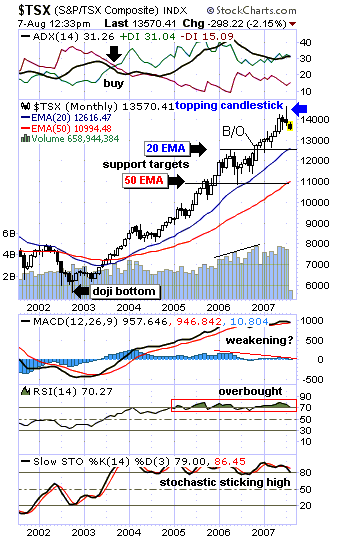
| For the first time, this Canadian index surpassed the Dow Jones Industrial Average (DJIA) as it recently hit a peak just over 14,600 vs the DJIA 14,000. The extra juice came from the heavier oil and gas weighting. These indexes will probably stay neck-and-neck for a while unless oil prices plunge. |
| A stock or an index on a strong run will stay above its 20-period exponential moving average (EMA), and this was aptly illustrated (Figure 1). Note the doji candlestick marking the bottom on this chart. Dojis often mark important turning points. Confirmation of a turnaround came in two flavors. The index finally beat overhead 20-day EMA resistance and the directional movement indicator at the top of the chart flashed a buy signal (directional indicators crossed over). Now a topping formation has appeared on this chart via a small-bodied candlestick with a long upper shadow. Whether you call this a near doji or a shooting star candlestick, the top warning remains the same. Confirmation comes with the completion of the August candlestick and subsequent ability to beat the previous high-water mark. |
|
| FIGURE 1: TORONTO STOCK EXCHANGE (S&P/TSX COMPOSITE), MONTHLY. How far will she go? Will this be a modest dip or a bigger correction? |
| Graphic provided by: StockCharts.com. |
| |
| Two downside targets are considered on this monthly chart (Figure 1). Note how the 20-day EMA and the 50-day EMA currently relate to previous support and resistance levels marked by horizontal lines. If support holds at the 20-day EMA, the strong uptrend is intact. If that support fails, the 50-day EMA may come into play, currently 11,000. Should that also fail, a major decline is likely under way under the 10,000 level. |
| The indicators under the chart show mixed sentiment. The moving average convergence/divergence (MACD) still shows a strong uptrend, but its histogram does show negative divergence. This sometimes reveals a coming change or reversal ahead. The relative strength index (RSI) shows an overbought condition not likely to continue much longer. The stochastic oscillator also reflects this overbought condition. When the market is in a strong uptrend, this oscillator will stick high, as it's considered a nontrending indicator. |
| In summary, an adage comes to mind: What goes up must come down. It's been a grand run. How far down does she go? Will this be a modest dip down or a bigger correction? Only the market knows for sure, but charts help navigate the waters and hopefully keep some of us off the rocks, should a perfect storm arise. |
Independent Canadian equities trader and technical analyst based in Peterborough
Ontario, Canada.
| Website: | www.whatsonsale.ca/financial.html |
| E-mail address: | gwg7@sympatico.ca |
Click here for more information about our publications!
PRINT THIS ARTICLE

Request Information From Our Sponsors
- VectorVest, Inc.
- Executive Premier Workshop
- One-Day Options Course
- OptionsPro
- Retirement Income Workshop
- Sure-Fire Trading Systems (VectorVest, Inc.)
- Trading as a Business Workshop
- VectorVest 7 EOD
- VectorVest 7 RealTime/IntraDay
- VectorVest AutoTester
- VectorVest Educational Services
- VectorVest OnLine
- VectorVest Options Analyzer
- VectorVest ProGraphics v6.0
- VectorVest ProTrader 7
- VectorVest RealTime Derby Tool
- VectorVest Simulator
- VectorVest Variator
- VectorVest Watchdog
- StockCharts.com, Inc.
- Candle Patterns
- Candlestick Charting Explained
- Intermarket Technical Analysis
- John Murphy on Chart Analysis
- John Murphy's Chart Pattern Recognition
- John Murphy's Market Message
- MurphyExplainsMarketAnalysis-Intermarket Analysis
- MurphyExplainsMarketAnalysis-Visual Analysis
- StockCharts.com
- Technical Analysis of the Financial Markets
- The Visual Investor