HOT TOPICS LIST
- MACD
- Fibonacci
- RSI
- Gann
- ADXR
- Stochastics
- Volume
- Triangles
- Futures
- Cycles
- Volatility
- ZIGZAG
- MESA
- Retracement
- Aroon
INDICATORS LIST
LIST OF TOPICS
PRINT THIS ARTICLE
by Koos van der Merwe
Are the events of the week ended July 27 the start of a major correction in the Dow Jones Industrial Average? A look at the chart presents conflicting evidence.
Position: Hold
Koos van der Merwe
Has been a technical analyst since 1969, and has worked as a futures and options trader with First Financial Futures in Johannesburg, South Africa.
PRINT THIS ARTICLE
OSCILLATORS
A Long-Term Analysis Of The DJIA
08/02/07 08:45:23 AMby Koos van der Merwe
Are the events of the week ended July 27 the start of a major correction in the Dow Jones Industrial Average? A look at the chart presents conflicting evidence.
Position: Hold
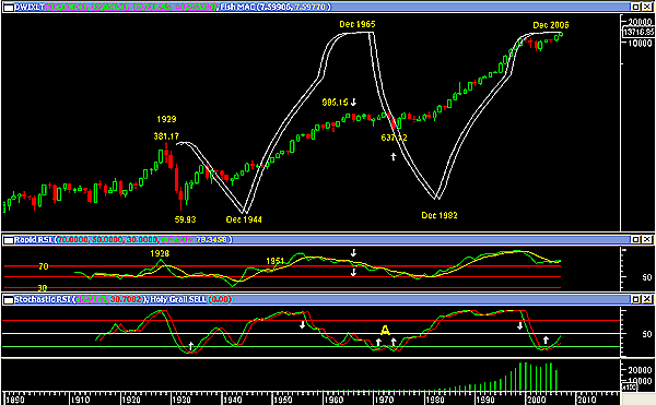
| Figure 1 is a yearly semilogarithmic chart of the Dow Jones Industrial Average (DJIA) from 1890. The indicators on the chart are as follows: a. A Fisher transform calculation of the moving average convergence/divergence (MACD) of the highs. This indicator is superimposed on the price chart and clearly shows the high of 1929, the low of 1944 followed by the high of 1965, and the low of 1982 leading to the high of 2006. Note how the bubble of 2000 appears as a small correction compared to the meltdown of the 1930s. This is because a semilogarithmic chart measures price movement relative to the movement at that time. The indicator is suggesting a correction should occur in the near future. On the chart the degree of the future correction could be minor, but the percentage correction as we know could be painful. b. The second indicator in an indicator window is the rapid RSI. This indicator called the high of 1929 as it broke above the 70 line. It then fell to the 30 line suggesting that the correction could possibly have ended, and that a new long-term bull market was starting. However, in 1951 it crossed above the 70 line once again suggesting caution, but the signal was too early, as the correction only occurred in 1965. The indicator only broke below the 70 line giving a sell signal in 1966, as shown by the two arrows. The start of the 1975 bull market was not suggested at all by the indicator, which only broke and then moved above the 50 line. Using the indicator purely as a sell indicator, we can see that it is currently above the 70 line, and a sell signal has not been given — yet. c. My final indicator is a stochastic RSI with an 8 parameter. I use this indicator as a buy indicator. Its sell side is far too early, which is why I prefer the rapid RSI as a sell indicator. As you can see, it is suggesting a buy signal at the moment, and with the rapid RSI not giving a sell signal, and the Fisher transform of the MACD highs still in a sideways movement, I would be inclined to believe that there is still some strength in the DJIA before a major correction occurs. The pattern at point A does suggest that although the stochastic RSI has given a buy signal, the other two indicators a and b above have given definite sell signals, and the index then moved sideways before drifting down. This could well occur now, but only when a sell has been given. |

|
| FIGURE 1: DOW JONES INDUSTRIAL AVERAGE, 1890 TO 2007. The start of a major correction? Or not? |
| Graphic provided by: MetaStock. |
| |
| To conclude, the DJIA, on a yearly chart, has not given a sell signal ... yet. A buy signal has been given, suggesting that the trend for the year is still up, but indications of an overbought position are present and could turn to a sell at any time. To fine-tune the trend, a weekly and daily chart should be looked at. |
Has been a technical analyst since 1969, and has worked as a futures and options trader with First Financial Futures in Johannesburg, South Africa.
| Address: | 3256 West 24th Ave |
| Vancouver, BC | |
| Phone # for sales: | 6042634214 |
| E-mail address: | petroosp@gmail.com |
Click here for more information about our publications!
PRINT THIS ARTICLE

Request Information From Our Sponsors
- StockCharts.com, Inc.
- Candle Patterns
- Candlestick Charting Explained
- Intermarket Technical Analysis
- John Murphy on Chart Analysis
- John Murphy's Chart Pattern Recognition
- John Murphy's Market Message
- MurphyExplainsMarketAnalysis-Intermarket Analysis
- MurphyExplainsMarketAnalysis-Visual Analysis
- StockCharts.com
- Technical Analysis of the Financial Markets
- The Visual Investor
- VectorVest, Inc.
- Executive Premier Workshop
- One-Day Options Course
- OptionsPro
- Retirement Income Workshop
- Sure-Fire Trading Systems (VectorVest, Inc.)
- Trading as a Business Workshop
- VectorVest 7 EOD
- VectorVest 7 RealTime/IntraDay
- VectorVest AutoTester
- VectorVest Educational Services
- VectorVest OnLine
- VectorVest Options Analyzer
- VectorVest ProGraphics v6.0
- VectorVest ProTrader 7
- VectorVest RealTime Derby Tool
- VectorVest Simulator
- VectorVest Variator
- VectorVest Watchdog
