HOT TOPICS LIST
- MACD
- Fibonacci
- RSI
- Gann
- ADXR
- Stochastics
- Volume
- Triangles
- Futures
- Cycles
- Volatility
- ZIGZAG
- MESA
- Retracement
- Aroon
INDICATORS LIST
LIST OF TOPICS
PRINT THIS ARTICLE
by Gary Grosschadl
Broadcom Corp. had wild swings in price over the past two years. Where is it headed now?
Position: Accumulate
Gary Grosschadl
Independent Canadian equities trader and technical analyst based in Peterborough
Ontario, Canada.
PRINT THIS ARTICLE
ANDREWS PITCH-FORK
Broadcom Finds Support
01/09/07 08:13:29 AMby Gary Grosschadl
Broadcom Corp. had wild swings in price over the past two years. Where is it headed now?
Position: Accumulate
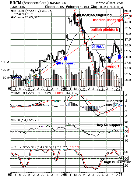
| The two-year weekly chart seen in Figure 1 shows a dramatic runup in price from $20 to $50 over 11 months. As is often the case, the correction that came cut deep in less time — in fact, in less than half the time, or five months. Note the candlestick pattern that tipped off the top was a large bearish engulfing candlestick. |
| Now that the stock has turned up from that 22.50 low, two important support lines have been established. The first is via a pitchfork chart (also known as an Andrews line). The pitchfork is charted after selecting three major turning points (20/50/22.50). The resulting bisecting and parallel lines shows lines of support and resistance. The lower median line shows this bullish pointing pitchfork is in effect as long as this line is not violated, currently at the $30 mark. Pitchfork theory holds that there will be a likely eventual thrust to challenge the median line (at the center) currently at 47.50. Therefore, traders may elect to stay bullish as long as the stock price continues to climb between these two pitchfork "tines." |

|
| FIGURE 1: BROADCOM, WEEKLY. This two-year weekly chart suggests that an upleg finds support. |
| Graphic provided by: StockCharts.com. |
| |
| The other support line is the 20-period exponential moving average (EMA). Note how this line supported the initial breakout past 22.50 back in 2005. Stocks in a healthy uptrend often are supported by this telling moving average line in most time periods, including hourly charts. When this line was eventually broken to the downside (lagging the more timely bearish engulfing sell signal), this 20-period EMA became overhead resistance. Now that the stock has risen above this same line and survived its first support test, bullish traders can find some comfort in this upleg continuing. |
| Three indicators are also considered below the chart. The MACD (moving average convergence/divergence) shows a current test of its zero-line after last summer's buy signal via a crossover of its signal line. This zero-line can act as a stall point, but even a small move above is encouraging. The relative strength index (RSI) also shows its own encouraging support test of its often key 50 area. Finally, the stochastic oscillator shows a bullish high turn at its often key 50 area, which also hints at renewed confidence of more gains. |
| In summary, this weekly chart suggests the uptrend is intact while these two support lines hold true. Looking ahead, the early warning signs of a possible support test of the lower median line would be a close below the 20-period EMA. |
Independent Canadian equities trader and technical analyst based in Peterborough
Ontario, Canada.
| Website: | www.whatsonsale.ca/financial.html |
| E-mail address: | gwg7@sympatico.ca |
Click here for more information about our publications!
Comments
Date:�01/09/07Rank:�5Comment:�

Request Information From Our Sponsors
- VectorVest, Inc.
- Executive Premier Workshop
- One-Day Options Course
- OptionsPro
- Retirement Income Workshop
- Sure-Fire Trading Systems (VectorVest, Inc.)
- Trading as a Business Workshop
- VectorVest 7 EOD
- VectorVest 7 RealTime/IntraDay
- VectorVest AutoTester
- VectorVest Educational Services
- VectorVest OnLine
- VectorVest Options Analyzer
- VectorVest ProGraphics v6.0
- VectorVest ProTrader 7
- VectorVest RealTime Derby Tool
- VectorVest Simulator
- VectorVest Variator
- VectorVest Watchdog
- StockCharts.com, Inc.
- Candle Patterns
- Candlestick Charting Explained
- Intermarket Technical Analysis
- John Murphy on Chart Analysis
- John Murphy's Chart Pattern Recognition
- John Murphy's Market Message
- MurphyExplainsMarketAnalysis-Intermarket Analysis
- MurphyExplainsMarketAnalysis-Visual Analysis
- StockCharts.com
- Technical Analysis of the Financial Markets
- The Visual Investor
