HOT TOPICS LIST
- MACD
- Fibonacci
- RSI
- Gann
- ADXR
- Stochastics
- Volume
- Triangles
- Futures
- Cycles
- Volatility
- ZIGZAG
- MESA
- Retracement
- Aroon
INDICATORS LIST
LIST OF TOPICS
PRINT THIS ARTICLE
by Gary Grosschadl
Where is Telus Corp., the second-largest telecommunications company in Canada, headed?
Position: Hold
Gary Grosschadl
Independent Canadian equities trader and technical analyst based in Peterborough
Ontario, Canada.
PRINT THIS ARTICLE
CHART ANALYSIS
Tell Us It Ain't So, Telus Corp.
06/15/06 10:11:18 AMby Gary Grosschadl
Where is Telus Corp., the second-largest telecommunications company in Canada, headed?
Position: Hold
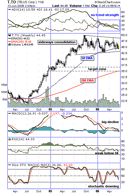
| As this multiyear weekly chart shows (Figure 1), Telus had a great 15-month run starting from July 2004. It has more than doubled to near $50. Since then, it's been in a sideways drift. |
| Looking at the chart itself, the consolidation pattern says it can break either way. Some might be tempted to see a pennant pattern, but the time frame is too long. After 12 weeks, this formation is usually considered a symmetrical triangle. While this is considered a neutral pattern, other indicators have a decidedly bearish bent. |

|
| FIGURE 1: TELUS, WEEKLY. This chart suggests a bearish tone, but the consolidation pattern indicates it could break either way. |
| Graphic provided by: StockCharts.com. |
| |
| At the top of the chart, the plunging average directional movement index (ADX) line shows no trend strength, reflecting how the previous bull trend has died. Note how the stock is also testing the 50-period exponential moving average (EMA). A close under this line that does not immediately reverse is a bearish harbinger. |
| The displayed indicators also paint a bleak picture. The moving average convergence/divergence (MACD) shows a dramatic shift south after hitting successive lower peaks (negative divergence) as the stock went in the opposite direction. A drop below the zero line would be very bearish. The relative strength index (RSI) shows a similar pattern and is already below its often key 50 area. Finally, the stochastic oscillator shows a current downleg falling below what is sometimes an area of support at 50. |
| A move below the lower trendline near $43 could set up a decline to a target zone. This represents an area of previous support and resistance in conjunction with the ever-watched 200-period EMA, currently at $35. A surprise close above the top trendline negates this bearish view. As always, time will tell. |
Independent Canadian equities trader and technical analyst based in Peterborough
Ontario, Canada.
| Website: | www.whatsonsale.ca/financial.html |
| E-mail address: | gwg7@sympatico.ca |
Click here for more information about our publications!
Comments
Date:�06/17/06Rank:�5Comment:�

Request Information From Our Sponsors
- StockCharts.com, Inc.
- Candle Patterns
- Candlestick Charting Explained
- Intermarket Technical Analysis
- John Murphy on Chart Analysis
- John Murphy's Chart Pattern Recognition
- John Murphy's Market Message
- MurphyExplainsMarketAnalysis-Intermarket Analysis
- MurphyExplainsMarketAnalysis-Visual Analysis
- StockCharts.com
- Technical Analysis of the Financial Markets
- The Visual Investor
- VectorVest, Inc.
- Executive Premier Workshop
- One-Day Options Course
- OptionsPro
- Retirement Income Workshop
- Sure-Fire Trading Systems (VectorVest, Inc.)
- Trading as a Business Workshop
- VectorVest 7 EOD
- VectorVest 7 RealTime/IntraDay
- VectorVest AutoTester
- VectorVest Educational Services
- VectorVest OnLine
- VectorVest Options Analyzer
- VectorVest ProGraphics v6.0
- VectorVest ProTrader 7
- VectorVest RealTime Derby Tool
- VectorVest Simulator
- VectorVest Variator
- VectorVest Watchdog
